Chapter 26 t Distributions
Sample means are a statistical model most appropriate when applied to groups of measured continuous data. Student’s t statistic is a transformation of measured data as a ratio of a sample mean to its standard error.
Therefore, Student’s t distributions are continuous probability models used for comparing the signal to noise ratios of sample means. The t-distribution is used widely in experimental statistics, a) for experiments that compare one or two variables with t-tests, b) for post hoc tests following ANOVA, c) for confidence intervals and d) for testing regression coefficients.
A sample for the variable \(Y\) with values \(y_1, y_2,...,y_n\), has a sample mean: \(\bar y =\sum_{i=1}^ny_i\). The degrees of freedom for the sample mean is \(df=n-1\). The sample standard deviation is \(s=\sqrt{\frac{\sum_{i=1}^n(y_i-\bar y)^2}{df}}\) and the standard error of the mean for a sample is \(sem=\frac{s}{\sqrt n}\)
The t-distribution can be scaled in three different ways, depending upon the experimental design:
The t scale units are
\(sem\) for a one sample t test: \(t=\frac{(\bar y-\mu)}{sem}\) where \(\mu\) is a hypothetical or population mean for comparison.
\(sedm\) for a two sample unpaired t test: \(t=\frac{\bar y_A-\bar y_B}{sedm}\) where \(\bar y_A\) and \(\bar y_B\) are the means the uncorrelated groups A and B comparison, \(s_p^{2}\) is the pooled variance and \(sedm=\sqrt{\frac{s_p{^2}}{n_A}+\frac{s_p{^2}}{n_B}}\) is the standard error for the difference between the two means.
\(sem_d\) for a two sample paired t test: \(t=\frac{\bar d}{sem_d}\), where \(\bar d\) is the mean of the treatment differences between correlatd pairs whose variance is \(s_d^{2}\), and \(sem_d=\sqrt\frac{s_p^{2}}{n}\).
26.1 dt
dt is a continous probability density function of the \(t\) test statistic.
\[p(t)=\frac{\Gamma(\frac{df+1}{2})}{\sqrt{df\pi}\Gamma(\frac{df}{2})}(1+\frac{t^2}{df})^{-(\frac{df+1}{2})}\]
Thedtfunction takes two arguments, a value of \(t\) derived from an experimental dataset, and also a value for the \(df\) of the sample.
Let’s assume a simple one-sample t test was performed. The sample had 3 independent replicates, and thus 2 degrees of freedom. The value for \(t\) calculated from the test is 3.3. The exact probability for that value of \(t\) is:
dt(3.3, 2)## [1] 0.0216083That is not a p-value. Alone, a single probability value from a continuous distribution such as this is not particularly useful. But a range of \(t\) values can be interesting to model. Note how this is a continuous function, thus we draw a line graph rather than columns.
df <- 2
t <- seq(-5, 5, 0.001)
data <- data.frame(dt=dt(t, df))
g <- ggplot(data, aes(x=t, y=dt))+
  geom_line()+
  scale_x_continuous(breaks=seq(-5,5,1)) +
  xlab("t") +ylab("p(t)"); g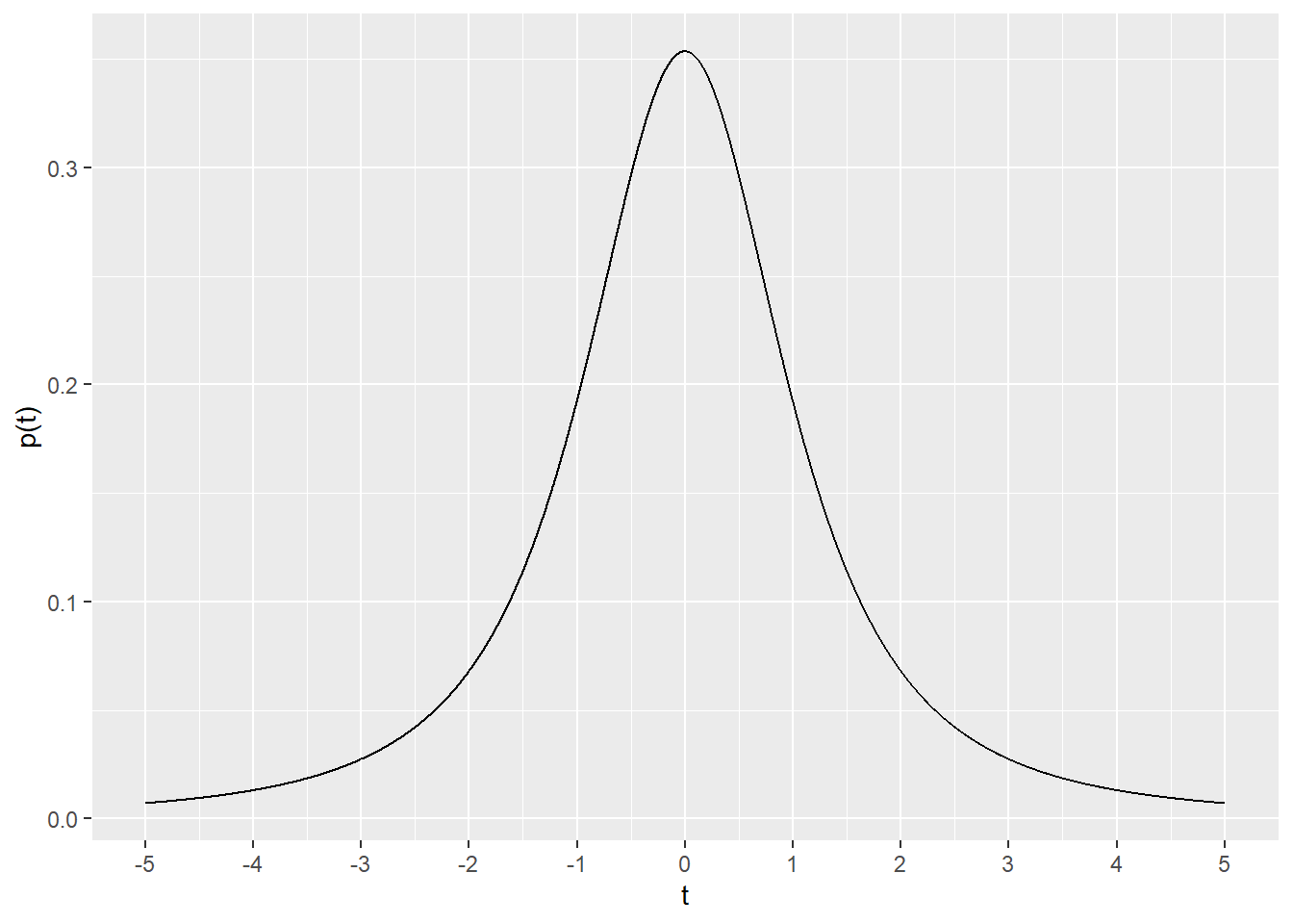
A couple of important features of the \(t\) probability density function: 1) there is a unique \(t\) distribution for every sample size, 2) the t distribution approaches the normal distribution with larger sample sizes.
Here’s a plot comparing a sample size of 3 (\(df=2\)), 6 (\(df=5\)), 51 (\(df=50\)) and the normal distribution. Relative to the normal distribution, the \(t\) distributions at these \(df\) are “heavy” shouldered. It’s as if a finger is pressing down from the top, spreading the distribution on the sides.
This has the effect of increasing the area under the curves, relative to the normal distribution, at more extreme values on the x-axis.
Increase the \(df\) for the blue-colored plot. At what values do you think it best approximates the normal distribution?
g + stat_function(fun=dnorm,
                 args=list(mean=0, sd=1),
                 color="red") +
  stat_function(fun=dt,
                args=list(df=5),
                color="blue")+
  stat_function(fun=dt,
                args=list(df=50),
                color="green")+
  annotate("text", x=2.5, y=0.35, label="N(0,1)", color="red")+
  annotate("text", x=2.5, y=0.3, label="t(df=50)", color="green")+
  annotate("text", x=2.5, y=0.25, label="t(df=5)", color="blue")+
  annotate("text", x=2.5, y=0.2, label="t(df=2)", color="black")+
  labs(x="t or z")+
  theme_bw()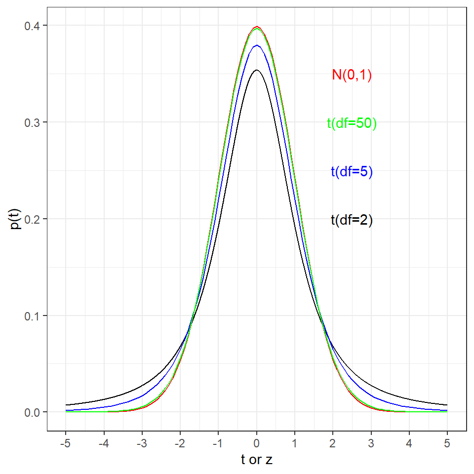
One additional feature of \(t\) distributions is the \(ncp\) argument, the non-centrality parameter. Full treatment of non-centrality is quite involved and beyond the scope here. Suffice to say that a distribution with \(ncp>0\) would differ from a null distribution. Thus, \(ncp\) is used when simulating alternative distributions, for example, for the expectation of skewed data in power analysis.
df <- 2
ncp <- 1
t <- seq(-5, 5, 0.001)
data <- data.frame(dt=dt(t, df, ncp))
g <- ggplot(data, aes(x=t, y=dt))+
  geom_line()+
  scale_x_continuous(breaks=seq(-5,5,1)) +
  xlab("t") +ylab("p(t)"); g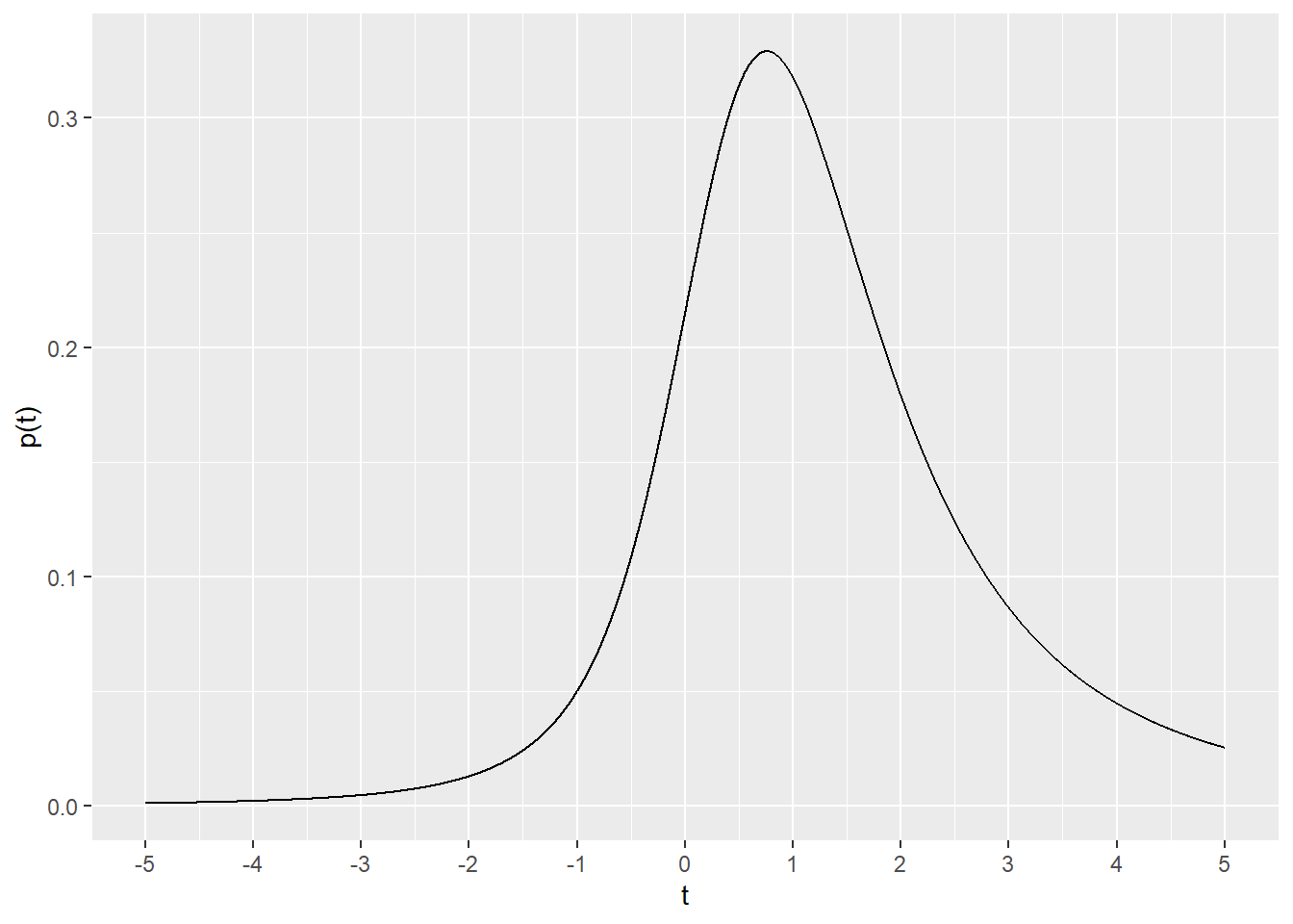
26.2 pt
If given a \(t\) ratio from a comparison and also the \(df\) for the test, pt can be used to generate a p-value.
As the cumulative probability function for the \(t\) distribution pt returns the area under the curve when given these arguments. Thus, about 96% of the area under the curve is to the left of a \(t\) value of 3.3 at \(df\)=2, and about 4% of the AUC is to the right of that value.
pt(q=3.3, df=2, lower.tail =T)## [1] 0.9595762pt(q=3.3, df=2, lower.tail=F)## [1] 0.04042385That’s precisely what is depicted graphically here, with navy representing the lower tail and green the upper tail of the cumulative function on either side of \(t_{df2}=3.3\):
ggplot(data.frame(x=c(-5,5)), aes(x)) +
  stat_function(fun=dt, args=list(df=2), geom="line", color="black") +
  stat_function(fun=dt, args=list(df=2), xlim = c(-5, 3.3), geom = "area", fill= "navy") +
  stat_function(fun=dt, args=list(df=2), xlim = c(3.3, 5), geom = "area", fill= "green") +
  scale_x_continuous(breaks=seq(-5,5,1)) +
  xlab("t") +ylab("p(t)")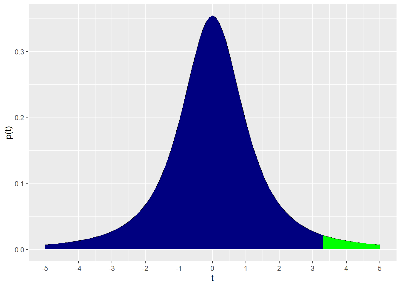
26.3 qt
The inverse cumulative function qt is most useful as a tool to generate critical value limits. This is a particularly important function given it’s use in constructing confidence intervals.
For example, the two sided, 95% critical limits for \(t_{df2}\) are:
qt(.025, 2)## [1] -4.302653qt(0.025, 2, lower.tail=F)## [1] 4.302653Whereas each of the one-sided 95% critical limits \(t_{df2}\) are:
qt(0.05, 2)## [1] -2.919986qt(0.05, 2, lower.tail=F)## [1] 2.919986The inverse cumulative distribution is shown here:
df <- 2
x <- seq(0, 1, 0.01)
data <- data.frame(qt=qt(x, df))
g <- ggplot(data, aes(x=x, y=qt))+
  geom_line()+
  scale_x_continuous(breaks=seq(0,1,.1)) +
  xlab("p") +ylab("t"); g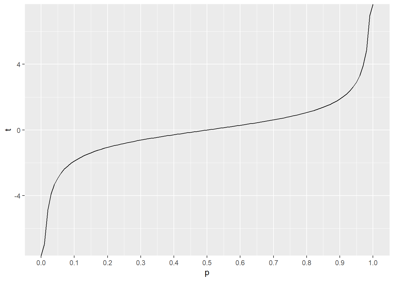
26.4 rt
Finally, the rt function can be used to simulate a random sample of t values for a distribution with \(df\) degrees of freedom.
For example, here are 5 t values from a \(df2\) and another 4 from \(df20\).
set.seed(12345)
rt(5, 2)
## [1] 0.5514286 -0.2275454 4.1377301 -1.1483718 -0.4579998rt(5, 20)## [1] -0.28197205 -0.06705986 -0.28785784 0.27207442 1.66794394