Chapter 19 Statistics for Categorical Data
library(PropCIs)
library(tidyverse)
library(knitr)
library(kableExtra)
library(binom)
library(pwr)
library(statmod)
library(EMT)
Biomedical research is full of studies that count discrete events and sort them into nominal categories.
A common mistake made by many researchers is to use statistics designed for measured (continuous) variables on discrete count variables. For example, they transform count data into scalar measures (eg, percents, folds etc) and then apply statistics designed for continuous variables to events that are fundamentally discrete by nature. The problem with that is there are inherent differences in the behaviors of continuous and discrete variables.
Recognize that there are statistical tests that can be used to analyze discrete data directly, without resorting to these transformations.
19.1 Types of categorical data
- What proportion of cells express a specific antigen and does an experimental treatment cause that proportion to change?
- What proportion of rats treated with an anxiolytic drug choose one chamber over others in a maze test?
- How many people who express a certain biomarker go on to have cancer?
In these three scenarios the primary data are counts. All of the study results have integer values. The counts are categorized with variable attributes, thus they are called categorical data.
In fact, the three scenarios above are very different experimental designs. The first represent experiments that compare simple proportions. The second compare frequencies, and the third is an association study. The analysis of these require using a common suite of statistical tools in slightly different ways.
Broadly, all of these tools boil down to dealing with proportions. A few types of proportions (eg, odds ratio, relative risk) that can be calculated from these datasets are sometimes used as effect size parameters. Other times we’d use a confidence interval as a way of conveying an effect size. Statistical tests are then used to evaluate whether these effect sizes, or frequencies, or simple proportions, are extreme enough relative to null counterparts so that we can conclude the experimental variable had some sort of effect.
19.1.1 Proportions
We might…
Inactivate a gene hypothesized to function in the reproductive pathway. To test it, mating triangles would be set up to count the number of female mice that become pregnant or not.
Implant a tumor in mice, before counting the number of survivors and non-survivors at a given point later.
Mutate a protein that we hypothesize moves in and out of an intracellular compartment, before staining cells to count the number of cells where it is and is not located in a compartment of interest.
Each of the examples above have binomial outcomes…pregnant vs not, dead vs alive, or inside vs outside.
In each case above, both the successful and the failed events are counted in the experiment. A proportion is a simple ratio of counts of success to counts of failures.
19.1.2 Frequencies
Other kinds of counted data occur randomly in space and time. The examples below illustrate this. Note how only the number of events are recorded, rather than categorizing them as successes or failures. These counts therefore have the statistical property of frequency, which are counts of events in space or time.
We can…
Expose a neuron to an excitatory neurotransmitter, then count the number of times it depolarizes.
In a model of asthma, count the number of immune cells that are washed out in a pulmonary lavage protocol after treatment with an immunosuppressive agent.
The key difference for these compared to binomial events is that their non-event counterparts are meaningless. For example, it is not possible to measure the number of depolarizations that don’t occur, or know the number of immune cells that don’t wash out in the lavage.
Importantly, the dependent variable is simple discrete counts. If we count 555 events in a 5 minute window, the recorded value and units is 555 counts, not 111 counts per minute.
19.1.3 Associations
Lastly, the examples below illustrate the design of association studies, which are based upon, according to the null hypothesis, independent predictors and outcomes.
Here are some examples of association study designs:
You might wish to
identify causal alleles associated with a specific disease phenotype by counting the number of people with and without the disease, who have or don’t have a particular allelic variant.
determine if a history of exposure to certain carcinogens is associated with a higher risk of cancer by counting people with cancer who have been exposed.
know if a drug treatment causes a higher than expected frequency of a side-effect by counting the people on the drug with the side-effect.
In the simplest (and most general) case, association studies are 2X2 in design: A predictor is either present or absent as the row factor, and an outcome was either a success for a failure as the column factor. Subjects are categorized into groups on the basis of where they fall in the 4 possible combinations that these 2X2’s allow for.
It should be noted that analysis of higher order association studies is also possible, which can be either symmetric (eg, 3x3) or non-symmetric (eg,) 9X2, 2x3, and so on.
19.1.4 Statistics Covered Here
- Confidence intervals of proportions
- One-sample proportions test
- Two-sample proportions test
- Goodness of fit tests
- Tests of associations (aka contingency testing)
- Power analysis of proportions (including Monte Carlo simulation)
- Plotting proportions with ggplot2
19.2 Exact v Asymptotic Calculations of p-values
The statistical tests for hypotheses on categorical data fall into two broad categories: exact tests (binom.test, fisher.test, multinomial.test) and asymptotic tests (prop.test, chisq.test).
Exact tests calculate exact p-values. That’s made possible using factorial math. The prop.test and chisq.test generate asymptotic (aka, approximate) p-values. They calculate a \(\chi^2\) test statistic from the data before mapping it to a \(\chi^2\) probability density function. Because that function is continuous, the p-values it generates are asymptotically-estimated, rather than exactly calculated.
That should strike you as odd that a continuous sampling distribution is used for discrete data. The reasons are historical. In the early days, it was harder to calculate exact p-values than \(\chi^2\) values. Tables existed (in text books) with critical values of the \(\chi^2\) and associated p-values.
19.2.1 Choosing exact or asymptotic
As a general rule, given the same datasets and arguments, exact and approximate hypothesis test functions will almost always give you p-values that differ, but only slightly.
That’s usually not a problem unless you’re near a threshold value.
Typically, an integrity crisis is evoked when that happens. For example, you don’t want to put yourself in a position to run the same data through two tests that generate p-values on either side of a threshold. To ask “Which test is”right???" is not the right question. Instead, if you find yourself in such a position ask yourself whether p-hacking is right (it is not).
You should use the test you said you’d use when you first designed the experiment. And if you didn’t pre-plan…or at least have some idea about where you are going…recognize that the exact tests are more accurate, even when they give you the answer you don’t want.
Another issue that arises is how well the tests perform with low count numbers. For example, as a rule of thumb, we’re advised to avoid using the chisq.test when the data have counts less than 5 in more than 20% of the cells because the accuracy of the chisq.test is less at these low cell counts. Use an exact test instead.
19.3 Overview of the types of hypothesis testing
We’ll go through each below in more detail, emphasizing practical experimental design and interpretation principles.
19.3.1 Proportion analysis
You can learn a lot about experimental statistics by thinking about proportions. Proportions are derived from events that can be classified as either successes or failures. Sometimes we want to compare simple proportions to decide if they are the same or not.
19.3.2 Goodness of fit testing
We do this when we want to compare the frequency distribution we observe in an experiment to the null expectation for that frequency distribution.
19.3.3 Contingency Analysis
Contingency analysis, otherwise known as tests of independence, are very different from goodness-of-fit test and simple proportion tests, in design and in purpose. They allow us to ask if two (or more) variables are associated with each other. Unlike a lot of the statistics we’ll deal with, there is a hint of a predictive element associated with these types of studies because the effect sizes we use to explain their results are related to odds and risk and likelihood. Which is not to say that we couldn’t use the same predictive concepts in proportions and goodness of fit testing.
Contingency tests are very common in epidemiology and in clinical science. You recognize them by their names as cohort studies, case control studies, and so forth.
19.4 Comparing proportions
In their simplest use, the tests here can be used to compare one proportion to another. Is the proportion of successes to failures that results from a treatment different from the proportion that results from control? We’ll dive into this further below.
19.4.1 A Mouse T Cell Pilot Experiment: The Cytokine-inducible antigen gradstudin
Let’s imagine a small pilot experiment to see how a cytokine affects T cells. This is a very crude thought experiment designed mostly to illustrate some principles.
A cytokine is injected into a single mouse. There is no control injection, just one mouse/one cytokine injection. A time later, blood is harvested from the mouse to measure an antigen on T cells. Let’s call the antigen gradstudin.
Assume a method exists to detect T cells that express gradstudin and that don’t express gradstudin.
That method implies some nominal criteria are established to categorize T cells as either expressing gradstudin or not. FACS machines are very useful for this. The machine typically produces continuous fluorescent data, where intensity is proportional to gradstudin levels. But we don’t care about the magnitude of the expression level, we just care whether it is there or not.
Based upon our scientific expertise, we establish cutoff gating criteria. A cell shows a level of fluorescence above which it is sorted as gradstudin positive.
The machine therefore returns simple counts of both gradstudin-positive and gradstudin-negative cells.
19.4.2 Calculating Proportions
Here’s the data, counts of cells expressing and not expressing gradstudin. It is a very simple dataset:
pos <- 5042
neg <- 18492
A proportion is the count of a particular outcome relative to the total number of events.
It’s customary to use the number of successes as the numerator. Whereas its customary to refer to the total number of events, n, as the trial number rather than as sample size, but they mean the same thing.
n <- pos+neg #trial size
prop <- pos/n
prop
## [1] 0.214243219.4.3 What A Proportion Estimates
This sample proportion is a descriptive statistic. It serves as a point estimate of the true proportion of the population we sampled.
The only way to know the true proportion would be to count every T cell in every drop of the subjects blood, which is not going to happen obviously.
This point estimate is statistically valid when our sample meets two conditions. First, that this is a random sample of the T cells in the subject’s blood. Second, if we consider every T cell in the sample as statistically independent of every other T cell.
We can safely assume those conditions are met. Strictly, as an estimate this proportion only infers the population of blood borne T cells IN THAT ONE subject. We really can’t generalize much further than that. Surely T cells are sequestered in other compartments (thymus, nodes, etc) that a blood draw cannot estimate.
Which is fine for our purposes now because we’re trying to keep this simple.
19.4.4 Confidence Intervals of Proportions
Confidence intervals (CI) have features of both descriptive and inferential statistics.
19.4.4.1 Definition of a 95% CI
The range of proportions within which we are 95% confident the true population proportion rests.
There’s a lot going on there.
The value of the proportion we measured in the sample is an indisputable mathematical fact. It is what it is. The question is, what does it represent?
Although there might be some mistake in its measurement, our single sample offers no real information about what that error might be.
What is unknown is the true proportion of gradstudin positive T cells in the population we sampled.
CI’s are designed to give us some insights into that unknown.
95% CI’s are a range estimate of what that true population proportion might be.
CI’s are calculated in part based upon the quality of the point estimate. In the case of proportions, the quality of the point estimate is driven by the size of the sample, the number of counts that are involved in calculating the proportion.
As you might imagine intuitively, the more counts we have in the sample, the better it estimates the population’s proportion.
19.4.4.2 Calculating CI with R
Their are several ways to calculate the CI for a proportion. Because of that, when publishing CI’s of proportions it is important is to state which CI method is used.
Is one better than the other? Sometimes, yes. Wilson’s score interval with continuity correction is suggested as the most accurate for proportions. YMMV.
Other methods are more commonly used than Wilson’s because they gained traction as being easier to compute by hand in the pre-computer times, and old habits die slowly.
Taking the data on cytokine induced gradstudin+ T cells, the chunk below illustrates how to use PropCIs to derive a Wilson score interval-based 95% CI:
scoreci(pos, n, conf.level=0.95)##
##
##
## data:
##
## 95 percent confidence interval:
## 0.2090 0.219519.4.4.3 Interpretation of a CI
The value of our sample proportion, 0.214, falls within this 95% CI. That’s not a big surprise, given the 95% CI was calculated from our proportion!
On the basis of the sample proportion, we can conclude from this CI that there is a 95% confidence the true proportion of gradstudin positive T cells falls within this range of 0.02090 to 0.2195.
19.4.4.4 Using the CI as a quick test of statistical significance.
Let’s say, for example, that we have experience and good reason to expect that only 15% of T cells would be gradstudin-positive. Does our sample proportion differ from that expectation?
Since a proportion of 0.15 is not within the 95% CI calculated above, we can conclude that the cytokine-induced sample proportion differs from this expectation at the 5% level of statistical significance.
We just did a statistical test, without running any software (sorta) or generating any p-values!! And it is perfectly valid inference so long as the assumptions of randomization and independence are met.
19.4.5 A One-Sample Proportion Test
Now we’ll use prop.test to run a test that generates a p-value to decide if the sample proportion we have above differs from 0.15. This may sound familiar as it is a cousin of the one sample t-test.
19.4.5.1 Hypothesis Tested in a One-Sample Proportion Test
In this test the sample antigen-positive proportion is compared to a theoretical proportion. If the typical proportion of antigen-positive T cells within a blood sample is 15%, is the result after cytokine treatment different from this proportion?
Let’s say that our scientific hypothesis is that the cytokine induces the antigen on T cells. Since we are predicting an increase, for logical coherence we should establish a one-sided alternative (thus using greater as an argument in prop.test below) as our statistical hypothesis.
Our statistical hypothesis is the null. We’ll decide whether or not to reject the null on the basis of the test results. Philosophically, we’re using a falsification method.
The statistical alternate hypothesis: \(\pi>15\%\)
The statistical null hypothesis: \(\pi\le15\%\)
Note how logically the two hypotheses are mutually exclusive and comprehensive.
We use Greek notation to represent the ‘true’ population proportion. This reminds us that a statistical hypothesis is an inferential test about the population proportion.
Again, there is no question that the sample proportion differs from a proportion of 15%. 21% does not equal 15%. That’s a simple numerical fact. Statistical tests are not necessary to make that assertion.
We use a test to draw inference on the composition of all of the T cells in the blood of the subject given this one sample. Thus, the sample p is only a point estimate of a true \(\pi\) (which we notate using Greek letters).
The chunk below lays out these arguments using R’s prop.test function:
#pos and n in the test arguments are objects that were defined above!
prop.test(
  pos, n, p=0.15,
  alternative = "greater",
  conf.level = 0.95,
  correct = TRUE
  )
##
## 1-sample proportions test with continuity correction
##
## data: pos out of n, null probability 0.15
## X-squared = 761.29, df = 1, p-value < 2.2e-16
## alternative hypothesis: true p is greater than 0.15
## 95 percent confidence interval:
## 0.2098559 1.0000000
## sample estimates:
## p
## 0.214243219.4.5.2 Interpreting one-sample prop.test output
Like all statistical tests, this one is evaluated under the assumption that the null hypothesis is true. We use the test outcome to decide whether the null hypothesis should be rejected.
The prop.test conducts a chi-square analysis. The value of \(\chi^2\) for this sample is very large, extreme. Read more about the chi-square sampling distribution in Chapter 20 to get a feel for what these values mean.
The p-value represents the probability of obtaining a \(\chi^2\) value as larger or larger from this test, if the null is true.
If the null hypothesis is true in this case, the probability of a \(\chi^2\) value as large or larger than we obtained is 2.2e-16, which is very, very low.
The 95% CI is 0.2098 to 1.0. There is 95% confidence the population proportion is within the range from 0.2098 to 1.0.
The reason it differs from the Wilson’s CI calculated above is that we used greateras a one-sided hypothesis argument in the prop.test. These CI’s from one-sided hypothesis tests are not particularly useful when attempting to use the CI as an index of accuracy. But perhaps this oddity helps you understand how CI’s are tied to the hypothesis and thus inference.
19.4.5.3 How to write this up
The proportion of gradstudin positive T cells after cytokine treatment in the subject differs from an expected value of 0.15 (one-sided one-sample proportions test, p-value=2.2e-16, 95% CI = 0.2098 to 1.0)
19.4.6 An exact test for one proportion
R’s binom.test function is an exact test for whether a proportion differs from a theoretical expectation. It compares proportions using an entirely different procedure.
As a one-proportion test the binom.test gives an exact p-value derived from the binomial distribution, whereas the prop.test gives approximate p-values because it uses the chi-square distribution.
That distinction is hard to see with our examples here, but the differences will become more noticeable when analyzing samples with far fewer events.
Here’s the binomial test run on the sample we ran above in prop.test.
binom.test(pos, n, p=0.15, alternative = "greater")##
## Exact binomial test
##
## data: pos and n
## number of successes = 5042, number of trials = 23534, p-value < 2.2e-16
## alternative hypothesis: true probability of success is greater than 0.15
## 95 percent confidence interval:
## 0.209849 1.000000
## sample estimates:
## probability of success
## 0.2142432The results are about the same and the write up would be the same as for the prop.test.
19.4.7 Comparing Two Proportions
We can stick with the T cell-cytokine-gradstudin scenario, but let’s change up the experiment a tad.
Let’s imagine we’ve withdrawn a sample of blood from a subject and enriched for T cells. Half of the sample is exposed in vitro to a cytokine for a few hours. The other half is exposed to vehicle as a control. We count the gradstudin-positive and gradstudin-negative T cells in both groups.
We now have a predictor group at two levels (treatment = vehicle or cytokine) and an outcome group at two levels (antigen = positive or negative)
19.4.7.1 Hypothesis Tested
Let’s test the hypothesis that the proportion of positive T cells in the two samples differ. The choice is not to test whether one proportion is greater than the other. We just want to know if they differ.
The statistical hypotheses here differs from the one sample hypotheses in two ways.
First, notice how we’re comparing the population proportion of cytokine- to that for vehicle-treatment.
Second, we’re making this a two-tailed (two.sided) test instead of one-tailed (greater).
The statistical alternate hypothesis: \(\pi_c\ne\pi_v\)
The statistical null hypothesis: \(\pi_c=\pi_v\)
A second way of writing these hypotheses to say the same thing:
Alternate: \(\pi_c-\pi_v\ne0\)
Null: \(\pi_c-\pi_v=0\)
19.4.7.2 Running the test
Let’s say that here are the outcome data:
The data can be passed directly into prop.test.
# note x = successes, n = successes + failures

prop.test(
  x=c(567, 412),
  n=c(1778, 1897),
  conf.level=0.99
  )
##
## 2-sample test for equality of proportions with continuity correction
##
## data: c(567, 412) out of c(1778, 1897)
## X-squared = 48.066, df = 1, p-value = 4.121e-12
## alternative hypothesis: two.sided
## 99 percent confidence interval:
## 0.06368227 0.13974295
## sample estimates:
## prop 1 prop 2
## 0.3188976 0.217185019.4.7.3 Interpretation of Two-Sample proportions test output
This test is evaluated under the assumption that the null hypothesis is true. The test results helps us decide whether the null hypothesis should be rejected. We’ll do that if the p-value is less than our type1 error threshold.
The prop.test conducts a chi-square analysis using the Yates continuity correction. This \(\chi^2\) value is very large; extremely large. You can learn more about the chisquare test statistic in Chapter @(chisquare).
The p-value represents the probability of obtaining a \(\chi^2\) value as larger or larger than that in the null distribution. If the null hypothesis is true in this case, the probability of that sized \(\chi^2\) value is 4.12e-12, which is very low, and still much lower than our type1 error threshold.
We can reject the null.
If we subtract prop2 from prop1 we get a value of about 0.1017, as a point estimate for the difference between the proportion of gradstudin=positive cells in the vehicle and cytokine treated samples. The 95% CI represents a range of values that might include the difference between the two proportions.
We are 95% confident that the difference between these proportions ranges from 0.0638 to 0.1397.
The 95% CI for the difference between two proportions does not include the value of 0. Since the 95% CI does not overlap with 0, we can conclude from it alone that there is a statistical difference between the two proportions, so long as all counts are indepedent and randomly collected.
We have to use scientific judgment to assess whether the lower and upper ranges of the CI represent values that are scientifically meaningful or relevant. It is possible for a CI to include values that are scientifically unremarkable, even if the value of zero is not included.
19.4.7.4 Write Up
The proportion of gradstudin positive T cells after cytokine differs from that in vehicle treated cells (two-sided two-sample proportions test, p-value=4.12e-12, the 95% CI for proportion difference is 0.0638 to 01397)
Note how we don’t say “statistically significantly different.”
19.5 Exact tests for two proportions
An alternative to prop.test to compare two proportions is the fisher.test, which like the binom.test calculates exact p-values.
The fisher.test requires that data be input as a matrix or table of the successes and failures, so that involves a bit more munging.
In R a matrix differs from a dataframe in many ways. The cells within the matrix must all be of the same data type. In this case, numerical values. The matrix can be labeled with dimension names. Finally, it helps to understand that the matrix world operates in a row by column way. Thus, the vector of 4 values below fills the rows before filling the columns.
We need to make a matrix of the data first, then perform the fisher.test on that matrix:
Notice below how to enter the successes and the failures in the matrix. The matrix is also labeled with some dimension (row and column) names so it doesn’t get confusing.
The Fisher test is run by passing the matrix into the fisher.test function:
M <- matrix(
  c(567, 412, 1211, 1485),
  nrow=2,
  dimnames = list(
    Treat=c("Cytokine", "Vehicle"),
    Antigen=c("Positive", "Negative")
    )
  )
M
## Antigen
## Treat Positive Negative
## Cytokine 567 1211
## Vehicle 412 1485fisher.test(M)##
## Fisher's Exact Test for Count Data
##
## data: M
## p-value = 3.433e-12
## alternative hypothesis: true odds ratio is not equal to 1
## 95 percent confidence interval:
## 1.451760 1.962188
## sample estimates:
## odds ratio
## 1.687312Notice the output differs from the prop.test. In addition to a p-value, the Fisher test produces an odds ratio and its confidence interval. The p-value leads to the same result and write-up as for the two proportion test.
As for the odds ratio…
Recall that the odds of an event that has a probability \(p\) are \[odds = \frac{p}{1-p}\]
Thus, the odds of gradstudin-positive cells are \[odds = \frac{positive}{negative}\]
An odds ratio is the ratio of two odds. Here, it is the ratio of the odds of gradstudin-positive cells in response to cytokine to the odds of gradstudin-positive cells after vehicle.\[OR = \frac{odds_{cyto}}{odds_{veh}}\]
It is probably best to leave the the OR as is. Report the ratio per se as the effect size as in the write up below.
However, one way to think of the OR is as a percent by multiplying the OR by 100. Thus, the odds of gradstudin positive cells in the cytokine group are 168% of their odds in the vehicle group.
19.5.0.1 Write up
The cytokine increases the odds of gradstudin-positive T cells by 1.687 compared to vehicle treatment (Fisher’s Exact Test for Count Data, p = 3.433e-12, OR 95% CI = 1.45 to 1.96).
19.6 Goodness of fit Tests
Goodness-of-fit tests are useful for testing hypotheses about patterns of counts in time or space. The tests questions whether the distribution of their observed frequencies differs from expectations of a null case. In other words, do the count patterns occur in a non-random pattern?
The shape of these datasets in their simplest form is either as 1 row or 1 column, where every data cell represents a time or space or nominal feature and the cell value is the the number of counts that occurred in that time or space or have that nominal feature.
Either the multinomial.test (for exact p-values) or the chisq.test (for approximate p-values) can be used for Goodness-of-fit testing. The latter is most commonly used, but may be less accurate when the number of counts in cells is low.
These designs compare the distribution of events to a hypothetical (or expected) model null distribution of those events.
These expected counts are entered in the test script as a prop or p argument.
This can be confusing. It’s important to recognize you should enter a vector of null probabilities in p or prop! Don’t enter the counts you hope to see if the test were positive!!! You always test the null.
Say we had a spatial memory test in which 28 independent subjects (rats) are placed into a maze for testing (one at a time) and we count which of 4 chambers they enter first. The results indicate they do so at the following frequencies: A=14, B=3, C=7, D=4.
Does this frequency distribution differ from the null expectation, A=7, B=7, C=7, D=7, where no chamber is more likely to be entered than another?
Failure is not an option in this design! Only successes are counted. Given enough time, a subject will always choose one of the 4 chambers. If a subject fails the task and never enters a chamber, it should be censured. If failure to enter a chamber is a fairly common outcome, then perhaps it should be the fifth nominal option.
Let’s test this at the 5% type1 error threshold:
19.6.1 An Exact Goodness of Fit test
NB:The multinomial.test function form the EMT package requires you to assert the null frequency distribution explicitly and as fractions whose sum is 1. This is unlike using the chisq.test, which coerces expected values for you unless you argue otherwise. Also note that in this example the probabilities are uniform. That need not be the case. The only requirement is that the sum of the probabilities equals one. The multinomial test shines brightest when you expect varied probs.
x <- c(A=14, B=3, C=7, D=4)
prob <- c(A=.25, B=.25, C=.25, D=.25)

multinomial.test(
  x,
  prob=prob
  )
##
## Exact Multinomial Test, distance measure: p
##
## Events pObs p.value
## 4495 1e-04 0.0235Note on the multinomial.testoutput: Please see this site for further reading for further information on what is represented by events. In this case the value for Events is choose(28+3-1,4-1). pObs is a (rounded) multinomial probability for observing that exact permutation (dmultinom(x=c(14,3,7,4), prob = c(0.25,0.25,0.25,0.25))), which serves as a critical value. The p.value is the sum of all pObs for other permutations that are lower (more extreme) than this pObs.
We’re only interested in the p-value, since we’re using this function as an exact goodness-of-fit hypothesis test for the null hypothesis.
Why use an exact test rather than a chisq.test? Because we have two cells in the dataset with counts < 5. An exact p-value test will be more accurate than chisq.test.
The test compares our sample frequency distribution to that in the null model. We actually wrote the latter explicitly in the function argument: null is a uniform distribution–the subjects are equally likely to enter each chamber.
H0: The probability of choice is equal for each chamber. \(\pi_A=\pi_B=\pi_C=\pi_D\) H1: The probability of choice is not equal for each chamber. \(\pi_A\ne\pi_B\ne\pi_C\ne\pi_D\)
Note: this is an omnibus test. It doesn’t explicitly tell us which chambers are preferred by the subjects.
Because the observed p-value is less than a pre-chosen threshold of 0.05, we reject the null hypothesis and conclude that the chamber choice is not equitable across the four options.
19.6.1.1 Write up
In a 4 chamber maze test, the subjects displayed a non-uniform chamber preference (Exact Multinomial Test, n=28, p=0.0235)
Note how this phrasing implies the null hypothesis.
19.6.2 An Approximate Goodness of Fit test
The \(\chi^2\) test of the same data is really simple to execute. We pass into the function the same vector of observed counts, x, that we configured above.
It offers the same conclusion, but note how the p-value is very different.
Note also that we didn’t enter the null frequency argument. The chisq.testfunction will coerce the null distribution if it is not entered as an argument explicitly, as you can see from the output for the second line. If for some reason to test against a non-uniform null distribution, you’ll need to write that in your argument explicitly (eg, p = c(A=0.5, B=0.25, C & D = 0.125).
chisq.test(x)##
## Chi-squared test for given probabilities
##
## data: x
## X-squared = 10.571, df = 3, p-value = 0.0142819.6.2.1 Write up
The interpretation is no different than for the exact test. The write up is:
In a 4 chamber maze test, the subjects displayed a nonuniform chamber preference (Chi square test for uniform probabilities, \(\chi^2\)=10.571, df=3, p=0.01428)
19.6.2.2 Post hoc: which chamber is the preferred?
The result of the multinomial test can be unsatisfying in the sense that it only indicates the observed frequency pattern differs from that expected by chance. It doesn’t say which chamber preference explains the overall outcome.
This can be answered using a series of binomial tests. These would address whether a given choice differs from all the others.
The key here is that multiple comparisons will be made. Therefore an adjustment must be made to the type1 error threshold. Using a Bonferroni correction, if the experiment-wise type1 threshold is 5%, and 4 comparisons are to be made, then the threshold for any one comparison would be 5%/5, or 1.25%.
In later chapters (on ANOVA) we will talk about this adjustment in more detail.
Of the following four tests, you see that only the frequency of the A chamber differs from the null expectation. The test p-value of 0.004099 is lower than that for the reset type1 threshold of 0.0125.
# A chamber
binom.test(x=14, n=28, p=0.25)
##
## Exact binomial test
##
## data: 14 and 28
## number of successes = 14, number of trials = 28, p-value = 0.004099
## alternative hypothesis: true probability of success is not equal to 0.25
## 95 percent confidence interval:
## 0.306471 0.693529
## sample estimates:
## probability of success
## 0.5# B chamber
binom.test(3, 28, p=0.25)##
## Exact binomial test
##
## data: 3 and 28
## number of successes = 3, number of trials = 28, p-value = 0.123
## alternative hypothesis: true probability of success is not equal to 0.25
## 95 percent confidence interval:
## 0.02266509 0.28226440
## sample estimates:
## probability of success
## 0.1071429# C chamber
binom.test(7, 28, p=0.25)##
## Exact binomial test
##
## data: 7 and 28
## number of successes = 7, number of trials = 28, p-value = 1
## alternative hypothesis: true probability of success is not equal to 0.25
## 95 percent confidence interval:
## 0.1069080 0.4487155
## sample estimates:
## probability of success
## 0.25# D chamber
binom.test(4, 28, p=0.25)##
## Exact binomial test
##
## data: 4 and 28
## number of successes = 4, number of trials = 28, p-value = 0.2738
## alternative hypothesis: true probability of success is not equal to 0.25
## 95 percent confidence interval:
## 0.04033563 0.32665267
## sample estimates:
## probability of success
## 0.1428571Another way to report p-values from multiple comparisons is to state them as adjusted.
p.adjust(p=0.004099, method="bonferroni", n=4)## [1] 0.016396Thus, a p-value of 0.004099 when adjusted for 4 multiple comparisons is equivalent to a p-value of 0.016396. This value yet remains below the pre-chosen threshold of 0.05.
19.6.2.3 Write-up including post hoc test
In a 4 chamber maze test, the subjects display a clear chamber preference (Chi square test for uniform probabilities, \(\chi^2\)=10.571, df=3, p=0.01428). Multiple post hoc tests indicate only the chamber A frequencies differ from the null (Exact binomial test, adjusted p-value= 0.016396).
19.7 Contingency Testing
Contingency testing is for deciding whether two or more variables are associated or not. These either explicitly (ie, when using fisher.text) or implicitly (ie, when using chisq.test) use ratio’s of proportions–the odds ratio, or relative risk, or the likelihood ratio, or sometimes other proportions–as parameters that express the magnitude of these associations.
In other words, the hypothesis test asks whether these ratio’s of proportions are more extreme than the null (which would be 1).
Let’s take the cancer marker data from the contingency analysis lecture. As you recall, a biomarker has been discovered that is hoped to be strongly associated with cancer. 100 people were tested for whether or not they have the marker, and whether or not they also go on to have cancer.
We’ll create a simple matrix then pass it through the fisher.test function to illustrate the procedure and interpretation.
x <- matrix(
  c(14, 16, 6, 64),
  ncol=2,
  dimnames = list(
    Marker=c("Present", "Absent"),
    Cancer = c("Present", "Absent")
    )
  )
x
## Cancer
## Marker Present Absent
## Present 14 6
## Absent 16 64fisher.test(x) ##
## Fisher's Exact Test for Count Data
##
## data: x
## p-value = 3.934e-05
## alternative hypothesis: true odds ratio is not equal to 1
## 95 percent confidence interval:
## 2.762514 33.678765
## sample estimates:
## odds ratio
## 9.061278#more argument customization than this is possible 19.7.1 Interpretation of Contingency Results
The odds of a person with the marker having cancer are 9.06 times greater than the cancer odds for those who don’t have the marker.
There is 95% confidence the true odds ratio in the population is between 2.76 and 33.68.
This is consistent with an association between the presence of this marker and the probability that cancer occurs.
19.7.2 Write Up
The large OR indicates the presence of this marker is strongly associated with cancer (n=100, OR = 9.06, 95% CI = 2.76 to 33.68, Fisher’s Exact Test for Count Data, p = 3.934e-05).
The word “strongly” is used to emphasize the effect size, which is OR, not the smallness of the p-value.
Here are the other tests you might use to conduct for a contingency analysis, to illustrate how they differ. First, a proportion test and a sort of proof that the prop test is just a chisquare test:
x <- matrix(
  c(14, 16, 6, 64),
  ncol=2,
  dimnames = list(
    Marker=c("Present", "Absent"),
    Cancer = c("Present", "Absent")
    )
  )
x
## Cancer
## Marker Present Absent
## Present 14 6
## Absent 16 64prop.test(x)##
## 2-sample test for equality of proportions with continuity correction
##
## data: x
## X-squared = 16.741, df = 1, p-value = 4.284e-05
## alternative hypothesis: two.sided
## 95 percent confidence interval:
## 0.2496194 0.7503806
## sample estimates:
## prop 1 prop 2
## 0.7 0.2chisq.test(x)##
## Pearson's Chi-squared test with Yates' continuity correction
##
## data: x
## X-squared = 16.741, df = 1, p-value = 4.284e-05chisq.test(x, correct=F)##
## Pearson's Chi-squared test
##
## data: x
## X-squared = 19.048, df = 1, p-value = 1.275e-05First, note that the prop.test is just the chisq.test. You get the same \(\chi^2\) value and p-value from both. They just differ in parameter output and input options. If you’d like a confidence interval use prop.test.
Second, note how turning off the Yates continuity correction changes the \(\chi^2\) value and the p-value. That’s to be expected, it changes the calculation! Both the prop.test and chisq.test use Yates by default. The best way to think about Yate’s is that it acts as a smoothing function to take off some of the jigger in the calculation of the \(\chi^2\) value.
19.7.3 Interpretation of chi-square output
There is an association between the presence of this marker and the probability that cancer occurs.
We could take the prop test’s calculation of the proportions and their difference, along with the 95% CI of their difference and make some hay out of that (the probability of getting cancer with the marker is 70%, and without the marker is 20%). But it’s more customary to use the odds ratio or relative risk rather than differences between probabilities to make effect size assertions in association studies.
19.7.4 Write Up
You would want to derive the odds ratio and its 95% CI, even though the \(\chi^2\) test doesn’t produce it for you. The easiest way to do that is with fisher.test.
Having that:
The large OR indicates the presence of this marker is strongly associated with cancer (n=100, OR = 9.06, 95% CI = 2.76 to 33.68, Pearson’s Chi-square test with Yate’s continuity correction, p = 4.284e-05).
As before, the word “strongly” is used to emphasize the effect size, which is the OR, rather than the extremeness of the p-value.
19.7.5 Which contingency test is best?
With so many options, the question I’m sure you are asking is which is best to use for contingency analysis?
The answer is,
* be sure to make this decision in advance and use what you said you would use before you started the experiment.
* when it comes to p-values, are you an exactophile or an exactophobe? Use exact tests if the former.
* for datasets with low cell numbers (eg, counts less than 5 in a cell), exact tests tend to provide more accurate p-values.
* the fact that fisher.test generates the OR and its CI is very, very convenient.
I prefer the fisher.exact test. However, in R you’ll need to understand how to configure its arguments to get it to work on higher dimension contingency tables (eg, 2x3, 3x2, 3x3, etc).
19.7.6 Higher dimension contingency analysis
Not infrequently we have studies with more than one level of a predictor variable and with two or more categorical outcomes (eg, 7x2, 2x3, 5x4, etc). In these instances we are interested in comparing a few to several combinations of outcomes.
A step-wise approach for these more complex analyses is to first run an omnibus chisq.test or fisher.test on the fully intact dimension. If the test is positive (the p-value is lower than a pre-chosen threshold), analyze 2x2 segments of the grid post hoc. That is accomplished by using one of the exact or the chisq.test on more discrete groupings. These tests can explain which of the proportions or associations explain the overall skew detected by the initial omnibus test. These post hoc analyses must include correction for multiple comparisons (eg, the Bonferroni correction) when drawing inference. To do this, collect a vector of p-values, on from each post hoc test, and pass it into R’s p.adjust function.
Here’s an example of a higher dimension array:
Gammaherpesviruses, such as EBV and KSHV, establish lifelong infection in B cells. At the peak of infection the cells have either germinal center B cell or plasma cell phenotypes. Very little is known about the immunoglobulins expressed in gammaherpesvirus infected cells. In a study using a mouse model of viral exposure to YFP-tagged gammherpesvirus, immunoglobulin isotypes (IG) were determined in randomly collected single cell clones that include both germinal center B cells and in plasma cells that were either infected or not (YFP+ or YFP-).
As a first step, the data are constructed as a matrix.
counts <- matrix(c(3,0,0,0,10,9,15,29,17,11,40,50,3,2,2,13,25,59,61,43),
                 nrow=4, ncol=5,
dimnames=list(Cell=c("YFP- GC B", "YFP+ GC B", "YFP- plasma", "YFP+ plasma"), IG =c("G1", "G2b", "G2c", "G3", "M")))

counts
## IG
## Cell G1 G2b G2c G3 M
## YFP- GC B 3 10 17 3 25
## YFP+ GC B 0 9 11 2 59
## YFP- plasma 0 15 40 2 61
## YFP+ plasma 0 29 50 13 43paste("Total number of unique cells isotyped =", sum(counts))## [1] "Total number of unique cells isotyped = 392"Next, an omnibus Fisher test run at a type1 threshold of 5%. The combination calculations necessary to solve for an exact p-value in these higher order matrices won’t always converge to a solution. The simulate.p.value argument is often necessary in these cases. The p-value is not exact.
fisher.test(counts, simulate.p.value = T)##
## Fisher's Exact Test for Count Data with simulated p-value (based on
## 2000 replicates)
##
## data: counts
## p-value = 0.0004998
## alternative hypothesis: two.sided19.7.6.1 Post hoc testing of higher dimensions
A 4x5 matrix contains 20 groups, \(k\). The total possible comparisons is \(c=\frac{k(k-1)}{2}\), or 190 in this case. Many of these would be uninteresting.
Let scientific reasoning guide the posthoc testing. Thinking about the experiment two sets of comparisons seem good. The first set ask whether two rows differ in isotype frequencies. A second, and larger, set asks whether two rows differ in frequency for a specific isotype. In one sense, the first of these sets can serve as a sub-omnibus to guide the comparisons made in the second set.
Here are two examples for what the first set of comparisons might look like.
- Does viral infection affect immunoglobin isotype frequencies in germinal center cells?
fisher.test(counts[1:2,1:5])##
## Fisher's Exact Test for Count Data
##
## data: counts[1:2, 1:5]
## p-value = 0.002753
## alternative hypothesis: two.sided- Do isotype frequencies differ between virally-infected germinal center and plasma cells?
fisher.test(counts[c(2, 4), 1:5])##
## Fisher's Exact Test for Count Data
##
## data: counts[c(2, 4), 1:5]
## p-value = 9.09e-08
## alternative hypothesis: two.sidedA few other questions could be asked.
Here’s an example of what the second set of questions would look like which focus on the frequencies of specific isotypes.
Although the p-value is unadjusted, the exact test result to the second question above suggests isotype frequencies do differ between virally-infected germinal center and plasma cells.
To focus on the isotype(s) that might explain this difference we would compare a series of two proportions, These would compare the counts for a given isotype to the sum of the counts for all other isotypes. Although the matrix-making code below looks a bit chunky, it clearly illustrates what ‘Other’ counts represent:
- Does viral infection cause a difference in M isotype expression between germinal center and plasma cells?
m15 <- matrix(
  c(counts[2,5],
    counts[4,5],
    sum(counts[2,1:5])-counts[2,5],
    sum(counts[4,1:5])-counts[4,5]),
  nrow=2,ncol=2,
  dimnames=list(YFp=c("+ GC B", "+ plasma"),
                serotype=c("M", "Other")
                ))
ftm15 <- fisher.test(m15)
ftm15
##
## Fisher's Exact Test for Count Data
##
## data: m15
## p-value = 5.056e-09
## alternative hypothesis: true odds ratio is not equal to 1
## 95 percent confidence interval:
## 2.998242 11.094080
## sample estimates:
## odds ratio
## 5.686205Although this p-value is also unadjusted, it certainly appears that gammaherpesvirus infection causes a difference in M isotype expression between germinal center and plasma cells.
19.7.7 Other experimental designs involving categorical data
Imagine an experiment to compare two or more conditions (eg, placebo v drug, wildtype vs mutant) and the outcome variable is discrete (eg, frequency counts or success and failure counts). The experiment involves several independent replications.
For example, cell depolarizations are counted both in the absence or presence of a condition on several different occasions.
| replicate | predictor | counts |
|---|---|---|
| one | wildtype | 102 |
| two | wildtype | 95 |
| three | wildtype | 96 |
| one | mutant | 151 |
| two | mutant | 164 |
| three | mutant | 155 |
Alternately, the fraction of cells in a culture dish that have died in the absence or presence of a condition is repeated a handful of times.
| replicate | predictor | alive | dead |
|---|---|---|---|
| one | wildtype | 26 | 77 |
| two | wildtype | 21 | 81 |
| three | wildtype | 31 | 74 |
| one | mutant | 60 | 38 |
| two | mutant | 54 | 37 |
| three | mutant | 63 | 42 |
The key distinction here, compared to what’s been discussed in this chapter up to this point, is that within each replicate, all of the events are intrinsically-linked. Through replication we’re establishing whether the frequencies of these counts are repeatable.
Logistic (for dichotomous data) or Poisson (for frequency data) regression are the appropriate analytical tools for these designs. These involve using the generalized linear model, conducted with the function glm or the function glmer (for so-called mixed models). These are discussed later in the logistic regression chapter.
19.8 Power analysis for proportion tests
Power analysis should be done before starting an experiment. The purpose of a conducting power calculations a priori is to determine the number of trials, or subjects or sample size, to use for the study.
This is a two step process.
Step 1: What effect size will you test? Using scientific judgement, decide what is the value of a null proportion and an alternate that you think would be a scientifically meaningful proportion to observe. You need to have some insight into the system you’re studying to make these decisions. Often that comes from pilot studies or from previously published (or unpublished) work. What’s important is to establish an expectation of what a minimally scientifically significant outcome would look like.
Step 2: Calculate the number of subjects (or trials) you’ll need to study, given these proportions (and also given some type1 and type2 error tolerances).
There are several options in R for the second step.
In the examples below, we’re declaring a 5% difference between the null (0.15) and alternate (0.20) proportions would be a scientifically meaningful. We’re also using 5% for type1 error and 20% for type2 error (80% power) as error tolerance thresholds.
19.9 Power analysis functions for proportion tests
The function pwr.p.test is for one-sample proportion tests. The calculations below return a sample size n that should be used in the study, given a null and an alternate proportions, in addition to error rates.
NB: Since pwr.p.test takes a Cohen’s effect size as an argument, you 1st must calculate a Cohen effect size, h, given the alternate and null proportions you expect. The function Es.h() in the pwr package is useful for this. Then plug that effect size, h, into the proportion test power calculator.
h <- ES.h(p1=0.2, p2=0.15)
h
## [1] 0.1318964pwr.p.test(
h,
sig.level=0.05,
power=0.8,
alternative="two.sided"
)##
## proportion power calculation for binomial distribution (arcsine transformation)
##
## h = 0.1318964
## n = 451.1706
## sig.level = 0.05
## power = 0.8
## alternative = two.sidedThe output indicates that a total of 450 random, independent events will be necessary for 80% power to detect a difference between a sample proportion of 0.2 to a hypothetical proportion of 0.15.
binom.power is a function from the binom package. Instead of returning sample size, this function returns power, given sample size. As an a priori test, one iterates through (by hand) entering sample sizes until it returns an acceptable power. Then run the experiment at that sample size.
Note that it doesn’t give exactly the same result as pwr.p.test. The calculation differs, but the result is close.
binom.power(
  0.2,
  n=451,
  p=0.15,
  alpha=0.05,
  alternative = "two.sided",
  method="exact"
  )
## [1] 0.7908632To estimate sample size needed for a two-sample proportion test design, for example, to compare a negative control to a treatment, use the power.prop.test function.
power.prop.test(
  p1=0.15,
  p2=0.2,
  sig.level = 0.05,
  power=0.8
  )
##
## Two-sample comparison of proportions power calculation
##
## n = 905.3658
## p1 = 0.15
## p2 = 0.2
## sig.level = 0.05
## power = 0.8
## alternative = two.sided
##
## NOTE: n is number in *each* groupFinally, the statmod package has the power.fisher.test, which returns the power for a Fisher’s exact test, given arguments of proportion, trial size and type1 error. Note how it is in close but not exact agreement with power.prop.test.
power.fisher.test(
  0.15, 0.2, 905, 905, 0.05,
  alternative = "two.sided"
  )
## [1] 0.7219.9.0.1 Monte Carlo power simulations
The Monte Carlo is a general technique in statistical computing to randomly repeat some calculation or process. Monte Carlo is the basis of all sorts of things, like permutation analyses, machine learning, fitting Bayesian models to datasets and more.
Monte Carlo’s are very simple.
Monte Carlo power simulations is the insane thing you would never do in real life, which is to repeat the same full experiment replete with random, independent replicates thousands of times. Just to get a long run average of how well it works.
The basic gist is to simulate and test a very large number of experiments. Each of these experiments is comprised of a random sample of some size, corresponding to your minimal effect size you define as scientifically meritorious.
Sample responses are randomly generated. These are run through the test of significance, to calculate a p-value. The fraction of simulations that are “hits”–for example, that have p-values < 0.05, is the power of the experiment!
Simulations are re-run by adjusting the sample size until a desired power is achieved.
That’s the sample size you’d take for use in a real experiment!
The question the script addresses is this: What is the power of an experiment, given this trial size n, the null and alternate proportions evaluated, and the type1 error threshold?
If n is too low, the test will return a power below the threshold you set, meaning it is not adequately powered to test the difference between the null and alternate proportions.
Iterate through some a few sample sizes (n) until you arrive at an acceptable value for power.
19.9.0.1.1 Monte Carlo simulation for prop.test power
#these first few objects are the initializers

#number of experiments to simulate, each of trial size n
sims <- 1000
#expected null proportion
null <- 0.15
#expected minimal effect proportion
alternate <- 0.20

#binomial trial size, just a guess, ha!
n <- 450
#type 1 error threshold
alpha <- 0.05

#s1 is a random sample vector
#each value is the number of
#successes observed in a trial
#of size n, given the alternate proportion.
#it simulates the outcome of one experiment "sims" times

s1 <- rbinom(sims, n, alternate)

#t1 is a vector of p-values,
#derived from a one sample proportion test
#on each of the values in s1.
#read from inside the function to see the logic

t1 <- unlist(
  lapply(
    s1,
    function(s1){
      prop.test(
        s1, n, null,
        alternative="two.sided",
        conf.level=1-alpha,
        correct=T)$p.value
      }
    )
  )

power <- length(which(t1 < alpha))/sims
power
## [1] 0.80319.10 Graphing Proportions
Here’s a few ggplot2-based ways of visualizing proportion data.
First thing is to create a dataframe of the proportion data since data fed into ggplot2 must be in dataframe format.
prop.df <- tibble(
  group=c("positive", "negative"),
  value=c(pos, neg)
  )
prop.df
## # A tibble: 2 x 2
## group value
## <chr> <dbl>
## 1 positive 5042
## 2 negative 1849219.10.0.0.1 Simple stacked bar chart
These certainly emphasize proportion differences well, but make it difficult to visually estimate the differences between the two groups.
ggplot(
  prop.df,
  (aes(x="",
       y=value,
       fill=group)
   )
  ) +
  geom_bar(stat="identity", fill=c("red", "blue"))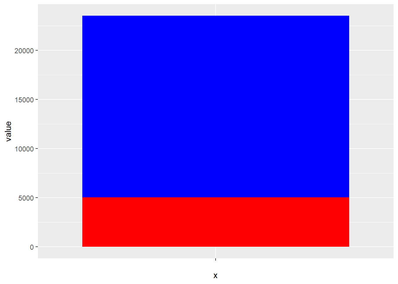
Figure 19.1: Stacked bar plots of raw counts can be difficult to interpret
19.10.0.0.2 Side-by-side bar chart
The gold standard for clear presentation of total counts and differences in counts between groups.
Note: When comparing independent counts there is no error to report. There’s no variation. Cells were classified as either having or not having the antigen. Every count is independent of all other counts.
ggplot(
  prop.df,
  (aes(
    x=group,
    y=value,
    fill=group)
   )
  ) +
  geom_bar(stat="identity", fill = c("red", "blue"))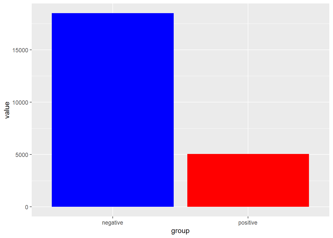
Figure 19.2: Side-by-side bar charts make it easier to see difference between raw counts.
19.10.0.0.3 Plot proportions with confidence intervals
However, adding confidence intervals to bar plots of proportions is a good way to visualize the uncertainty of counted data and comparing to other proportions.
| group | pos | neg |
|---|---|---|
| Control | 38 | 192 |
| Cytokine1 | 46 | 184 |
| Cytokine2 | 63 | 167 |
Munge the data directly within ggplot function to calculate values for the proportion and its upper and lower 95% confidence intervals. Proportions with overlapping CIs do not differ from each other. Note how the CIs are adjusted for the 3 possible comparisons using the Bonferroni correction (adjusted 95% confidence level = 1-0.05/3).
Note that the rowwise function is necessary for certain ‘legacy’ functions like scoreci.
ggplot(myCounts %>% rowwise() %>%
  mutate(
    prop=pos/(pos+neg),
    lower=scoreci(pos, pos+neg, 0.98333)$conf.int[1],
    upper=scoreci(pos, pos+neg, 0.98333)$conf.int[2]), aes(x=group))+
  geom_bar(aes(y = prop), stat ="identity", fill="blue")+
  geom_errorbar(aes(ymin=lower, ymax=upper), width=0.2, size=2)+
  ylab("Proportion of gradstudin positive cells")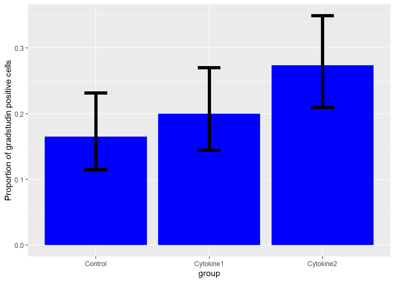
Figure 19.3: You can infer two proportions differ from plots when their confidence intervals do not overlap.
19.10.0.0.4 Pie charts and mosaic plots
I suggest you explore these options on Google. They can be visually appealing for showing relative differences in some cases, but they make it more difficult to easily see absolute counts and differentials.
19.11 Key Takeaways
- Sorted variables have nominal values that are classified into categories and that are quantified as discrete integer counts.
- Each count must be an independent replicate.
- Sorted events can be modeled using
rbinomorrmultinom. The latter is used when the event has more than two discrete outcomes. - The three basic types of experimental designs are questions about proportions, or about frequencies, or about associations.
- The test functions mostly differ in whether they generate approximate or exact p-values. To avoid p-hacking, choose the test in advance.
- When designing an experiment perform a power analysis to determine the number of independent events that will be necessary. When testing for small differences or effect sizes, these numbers needed for a stringent test can be surprisingly high.