Chapter 9 Data Classification
library(datapasta)
library(tidyverse)
library(viridis)
The starting point in any statistical design is to understand the types of data that are involved.
First ask whether the variables are discrete or continuous.
Then ask if they measured, ordered or sorted?
Then ask which variables are controlled by the researcher and which are observed?
The answers will point in the proper analytic direction.
I cannot emphasize enough the importance of understanding data classification for mastering a statistical framework. It is the foundation. Therefore, this material covers perhaps the most important learning objectives in this course:
Given an experimental data set, be able to
- Describe the variables that are dependent or independent.
- Describe each variable as either continuous (measured) or discrete (ordered or sorted).
A second focus of this chapter is on introducing some of the more common data handling procedures we’ll do. The several scripts provide examples for how to import, inspect, subset, transform and visualize different types of data variables.
9.1 Dependent and independent variables
The experimental researcher has two basic types of variables.
An independent variable is the predictor or explanatory variable controlled by the researcher. Independent variables are chosen, not collected. Nevertheless, they have values just like the values of collected data.
For example,
- In a blood glucose drug study, the independent variable “Treatment” would come in two levels, “Placebo” and “Drug.” The values of the “Treatment”variable are “Placebo” and “Drug”
- In a study on how a gene influences behavior, the independent variable is “Genotype,” with three values: “wild-type,” “heterozygous” and “knockout”
- In an enzyme activity assay, the independent variable is substrate concentration, with a dozen or so values ranging over two orders of magnitude.
Conventionally, when graphing the independent variable is plotted on the abscissa, or x-axis. But YMMV.
A dependent variable is the response or outcome variable collected in an experiment. The values that dependent variables can take on are determined by, or are dependent upon, the level of the independent variables.
For example,
The variable “blood_glucose,” collected from blood samples, has units of glucose concentration, with values over a large continuous range.
In a Morris Water Maze test, memory is represented by a “time” variable, which is the time taken to find a remembered location, with unit values in seconds, over a wide range.
Levels of product from an enzyme reaction are measured with an assay the emits fluorescence, in relative units. The dependent variable “RFU/mg” represents activity controlled by the amount of enzyme added and takes on many values over a continuous range.
Most of the time the dependent variable is plotted on the ordinate, or y-axis, of some graph.
9.1.1 Statistical notation
Variables are abstracted in statistical modeling.
In the convention I’ll use, the dependent variable is usually depicted by the uppercase symbol \(Y\), to represent a variable name. Subscripts \(i\) and \(j\) are indexes for variables.
Here \(j\) represents the number of dependent variables and can have values from 1 to \(k\). Sometimes experiments (eg, anything with an -omics) generate multiple dependent variables. \(Y_j\) is the \(j^{th}\) dependent variable.
The values a dependent variable can assume are symbolically represented as lowercase symbol \(y_i\). By convention \(y_i\) is the value for the \(i^th\) replicate. The values of \(i\) range from 1 to \(n\) independent replicates.
Univariate experiments will generate \(y_i\) measurements from \(1 \times n\) independent replicates, whereas multivariate experiments will generate \(y_{ij}\) measurements from \(k \times n\) independent replicates.
Similarly, the independent variable is usually depicted by uppercase \(X\) (or some other letter) whereas the values are represented by lowercase \(x_i\).
I’m going to use that convention but with a twist. Independent variables denoted using \(X\) will represent continuous scaled variables, whereas independent variables denoted using \(A\) or \(B\), or \(C\), will represent discrete, factorial variables. Factorial variables will take on values denoted by lowercase, eg, \(a_i\), \(b_i\), \(c_i\)).
Multivariable experiments have more than one independent variables. For example, \(X_j\) represents the name of the \(j^{th}\) independent variable, where \(j = 2\ to\ k\).
To illustrate dependent and independent variables think about a linear relationship between two continuous variables, \(X\) and \(Y\). This relationship can be expressed using the model \(Y=\beta_0 + \beta_1 X\).
\(X\) is the variable the researcher manipulates, for example, time or the concentration of a substance. \(Y\) would be a variable that the researcher measures, such as absorption or binding or fluorescence. Each has multiple values.
The parameters \(\beta_0\) and \(\beta_1\) are fixed population constants (thus the Greek symbols) that define the linear relationship between the two variables. Here they represent the y-intercept and slope, respectively, of a straight regression line.
Thus, \(Y\) takes on different values as the researcher manipulates the levels of \(X\). Which explains why \(Y\) depends on \(X\).
For example, here’s how the data for a protein standard curve experiment would be depicted. In the R script below the variable \(X\) represents known concentrations of an immunoglobulin protein standard in \(\mu g/ml\). The researcher builds this dilution series from a stock of known concentration, thus it is the independent variable.
The variable \(Y\) represents \(A_{595}\), light absorption in a spectrophotometer for each of the values of the standard protein. The \(A_{595}\) values depend upon the immunoglobulin concentration. Estimates for \(\beta_0\) and \(\beta_1\) are derived from running a linear regression on the data with the lm(Y~X) script.
#Protein assay data, X units ug/ml, Y units A595.
X <- c(0, 1.25, 2.5, 5, 10, 15, 20, 25)
Y <- c(0.000, 0.029, 0.060, 0.129, 0.250, 0.371, 0.491, 0.630)
#derive the slope and intercept by linear regression
lm(Y~X)
##
## Call:
## lm(formula = Y ~ X)
##
## Coefficients:
## (Intercept) X
## -0.0008033 0.0249705The output indicates the regression line intercepts the y-axis at a value very close to zero, and that every one ug/ml increment in the value of the standard protein, \(X\), predicts a 0.0249705 increment in the absorbance at 595 nm value, \(Y\).
Fortunately, R functions rarely forces us to abstract by the mathematical statistics convention, X and Y. We can name variables in more comfortable terms.
This helps make the data we are working with a bit more clear.
For example,
#Protein assay data, standard units ug/ml, absorption units A595.
standard <- c(0, 1.25, 2.5, 5, 10, 15, 20, 25)
A595 <- c(0.000, 0.029, 0.060, 0.129, 0.250, 0.371, 0.491, 0.630)
#derive the slope and intercept by linear regression
lm(A595 ~ standard)
##
## Call:
## lm(formula = A595 ~ standard)
##
## Coefficients:
## (Intercept) standard
## -0.0008033 0.02497059.1.2 When there is no independent variable
The problem of drawing causal inference from studies in which all of the variables are observed, as is common in public health and other social sciences, is beyond the scope of this course. Pearl offers an excellent primer on considerations that must be applied to extract causality from observational data here.
9.2 Discrete or continuous variables
No matter if they are dependent or independent variables, all variables can be subclassified further into two categories. They are either discrete or continuous.
Discrete variables can only take on discrete values, while continuous variables can take on values over a continuous range. This distinction is discussed further below.
Variables can be subclassified further as either measured, ordered, or sorted. This subdivision fulfills a few purposes.
First, it’s alliterative so hopefully easier to remember. It reminds me of Waffle House hash browns, which can be either scattered, smothered or covered.
Different authors/software give these three types of variables different names, which creates some confusion. SPSS users must click buttons to classify data as either scalar, ordinal, or nominal, which correspond to measured, ordered and sorted. Another fairly common descriptive for the three types is interval, integer, and categorical. Conceptually, they mean the same things.
| measured | ordered | sorted |
|---|---|---|
| scalar | ordinal | nominal |
| interval | integer | categorical |
| numeric | factor/character/string/numeric | factor/character/string |
| continuous | discrete | discrete |
Even if we can’t agree on names, everybody seems to agree that all variables can be reduced to three fundamental subtypes.
Second, this taxonomy forms the basis for drawing a pragmatic statistical modeling heuristic to help you keep the relationship between variable type and experimental design (and analysis) straight.
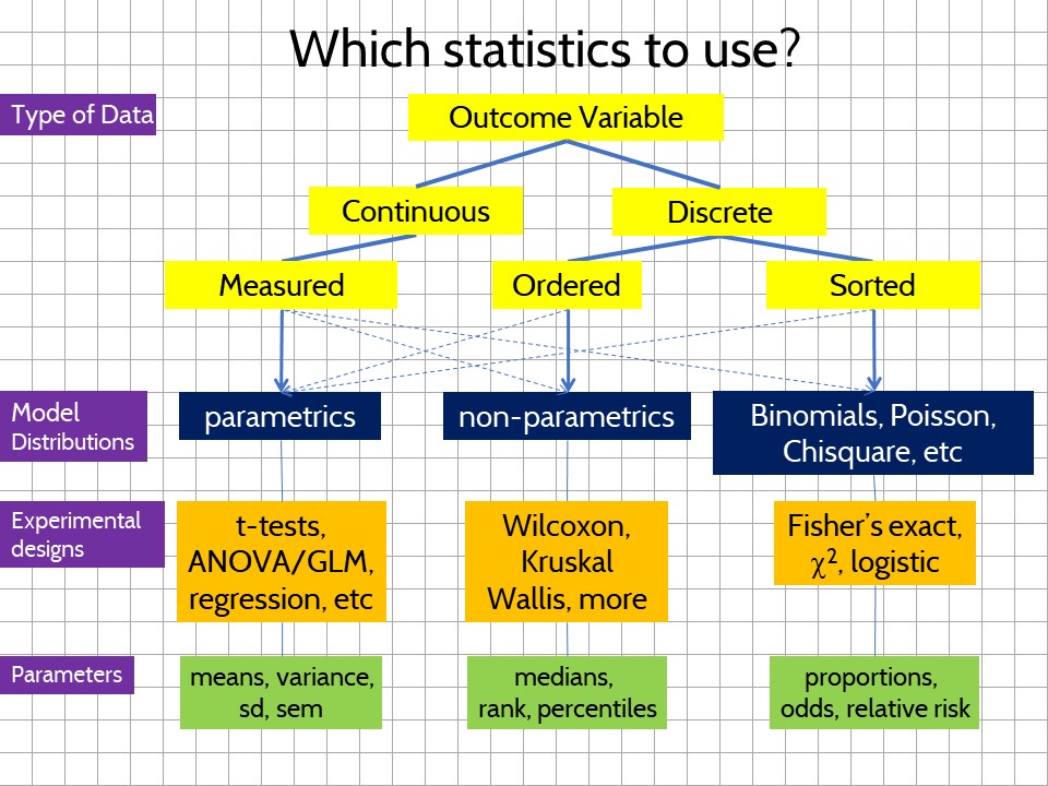
Figure 9.1: The type of data dictates how the experiment should be modeled and analyzed.
Third, the “measured, ordered, sorted” scheme classifies variables on the basis of their information density, where measured > ordered > sorted. You’ll see below how discrete variables lack the kind of information density of continuous variables.
More pragmatically, measured, ordered and sorted variables behave differently because they represent different kinds of information. They tend to have very different probability distributions. As a result statisticians have devised statistical models that are more appropriate for one or the other.
9.2.1 Measured variables
Measured variables are fairly easy to spot. Any derivative of one of the seven base SI units will be a measured variable.
The gang of seven are the ampere, second, mole, kilogram, candela, Kelvin, and meter. When in doubt, a working hack is that these variables tend to need instruments to take measurements. So if you’re using some instrument to measure something, and it is not counting events, it is a measured variable.
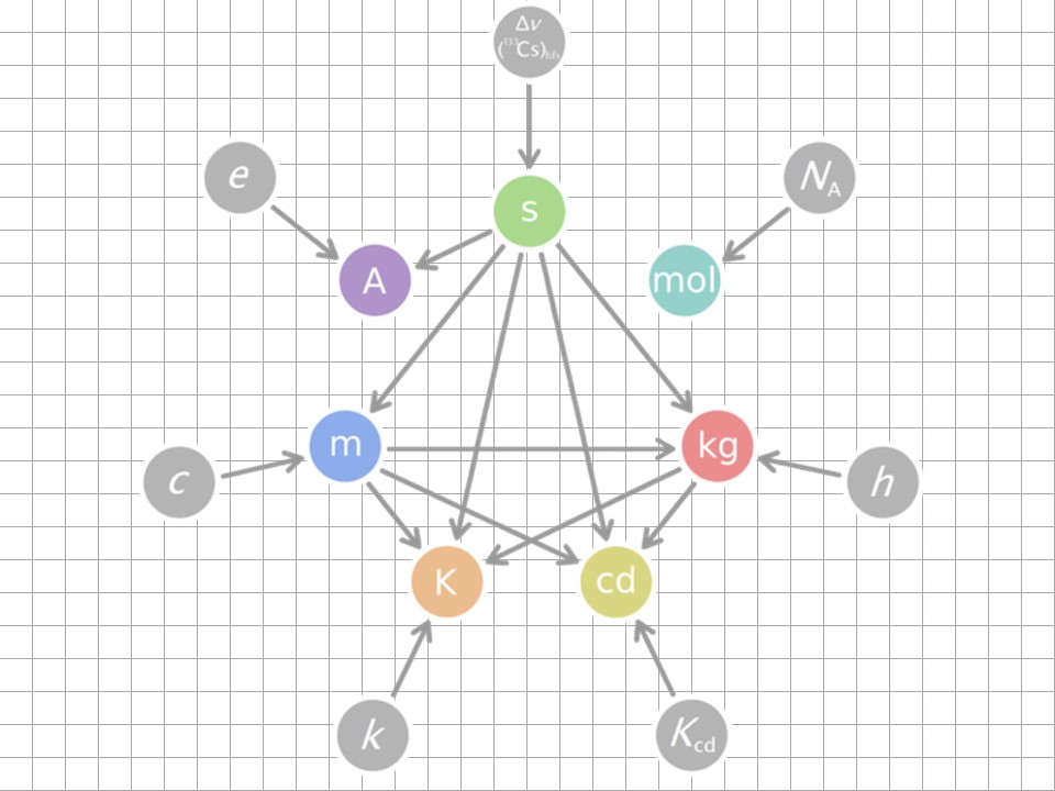
Figure 9.2: The seven SI units
Take mass as an example. The masses of physical objects can be measured on a continuous scale of sizes ranging from super-galaxian to subatomic. Variables that are in units of mass take on a smooth continuum of values over this entire range because mass scales are infinitesimally divisible.
Here’s a thought experiment for what that means. Take an object that weighs a kilogram, cut it in half and measure what’s left. You have two objects that are each one half a kilogram. Now repeat that process again and again.
After each split something with mass always remains. Even when you arrive at the point where only a single proton remains it can be smashed into even smaller pieces in a supercollider, yielding trails of subatomic particles….most of which have observable masses.
But here’s what’s most different about continuous variables: That continuity between gradations means that continuous variables carry more information than other types of variables.
On a scale of micrograms, objects weighing one kilogram would have one billion subdivisions. If you have an instrument that can weigh the mass of kilogram-sized objects at microgram precision, you would say that one kilogram is comprised of a billion bits of information.
That’s more information than sorting an object by naming it “heavy” or “light.”
9.2.1.1 Visualizing measured variables
In the precourse survey biostats students self-reported their height, in cm, which is a continuous scale. Height is a measured variable.
Viewed in scatter plots, it is easy to see how the height variable takes on many different values on the y-scale. (The points have been colored by sex, mostly to illustrate how cool it is to segment one variable (height) using another (sex)).
pcd <- read_csv("datasets/precourse.csv")
# omit heights <125 cm and >250 cm as unreliable entries
# nobody that short or tall has ever taken the course!
ggplot(data = pcd %>%
         filter(height > 125 & height < 250)) +
  geom_jitter(aes(x=factor(0), y = height, color = sex),
              height = 0, width = 0.4, size = 4, alpha = 0.8) +
  scale_color_viridis_d(begin= 0.1, end = 0.6)+
  scale_y_continuous(breaks = seq(140, 200, 10)) +
  xlab("biostats students") +
  ylab("height(cm)") +
  theme(axis.ticks.x = element_blank(),
        axis.text.x = element_blank()
        )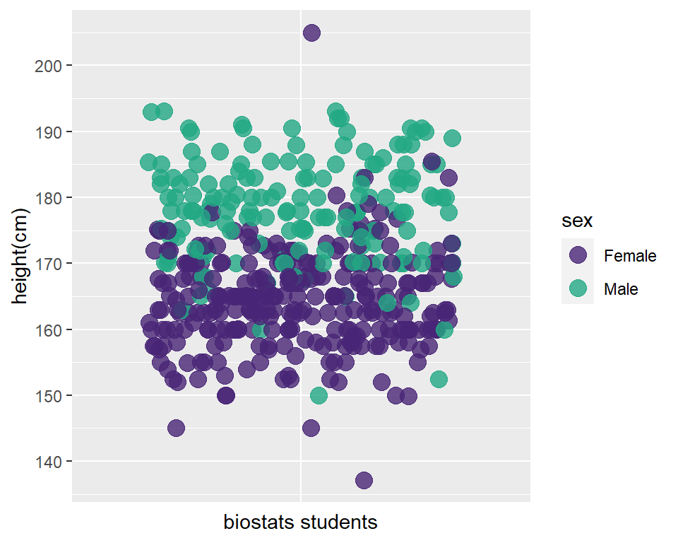
Figure 9.3: Scatterplot of biostat student heights segmented by sex
It’s always important to do a quick histogram of measured data. Histograms categorize height values into bins of a given number or width. The geom_histogram then counts the number of values in each bin. Histograms therefore show the frequency distribution of a variable.
ggplot(data=pcd %>% filter(height > 125 & height < 250)) +
  geom_histogram(aes(x=height), binwidth = 2.5, color = "#f2a900", fill = "#012169")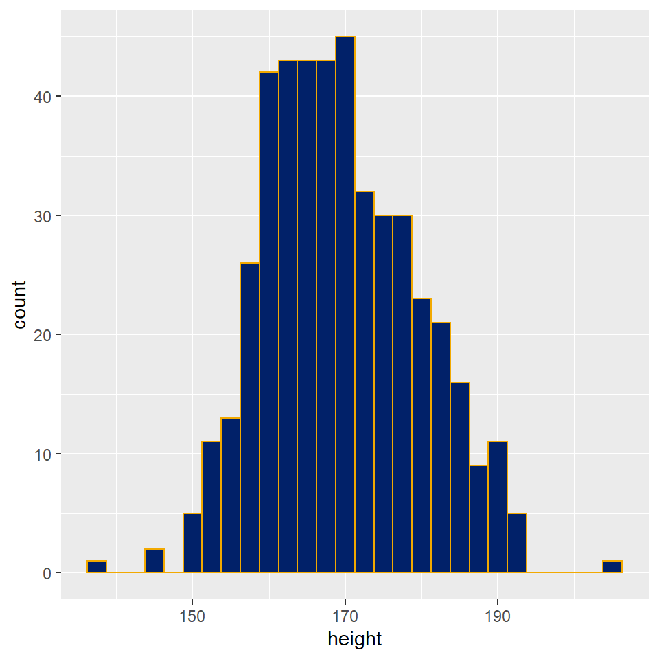
Figure 9.4: Histogram of biostat student heights, the most frequent height value is 170 +/- 1.25 cm.
9.2.2 Discrete categorical and ordinal variables
Discrete variables are discontinuous. The units of discrete variables are indivisible. Unlike continuous variables, discrete variables have no information between their unit values.
There are two types of discrete variables, either ordered or sorted.
9.2.2.1 Sorted data
These variables represent objects somehow scored as belonging to one nominal category of attributes or some other. In other words, the objects are sorted into categories. You can also think of this as being sorted into buckets or bins based upon some common feature(s). The scoring process can be based upon either objective or subjective criteria.
Statisticians generally frown at researchers who sort replicates on the basis of perfectly good measured data. For example, sorting people into low, mid and high blood pressure on the basis of a cuff blood pressure measurement. These instruments generate continuous variables on inherently more informative scales. Statisticians hold that sorting after measurement discards valuable information. And cut offs can be arbitrary.
In a survey biostats students identify their sex as either male or female. The name of the variable is sex. The values that sexcan have are either male or female. The variable has only two nominal levels (or two categories): male and female.
Perhaps most important, sorted variables have no intrinsic numeric value. Male is neither higher nor lesser than female; the values of the sex variable are just different. Wanting more of one or the other shouldn’t be conflated with a variables inherent properties.
Sorted variables are also called factors. That’s the dominant jargon in R. We’ll find ourselves converting variables to factors at times.
In stats jargon, sorted, nominal, categorical, and factor are words used to represent the same kind of variable. Sorry
Try not to let the jargon confuse you. What’s most important to understand is that sorted variables lack numeric values. So we count how many are sorted into one category or the other. That changes everything about the statistical methods we apply to experiments involving sorted variables.
A count is an integer value. The count cannot take on any values other than integer values. For example, we don’t have cases where there is a partial student of one sex or the other. These counts exist as discrete, discontinuous values.
Of course, the categorization of sex is sometimes ambiguous. When important to accommodate more than two categories, we would add additional categories to account for all possible outcomes. For example, the sex variable could be set to take on values of male, female, and other.
9.2.2.2 Visualizing sorted data
Let’s look at the precourse survey data frame we imported above. Each row represents the data for one biostats student. Notice how the values for the sex variable are characters. There are no numbers to plot!!
I could assign them numbers if I wished, for example \(Male = 0\) and \(Female = 1\), but that is just arbitrary numeric coding, using numbers rather than characters. The numeric values are meaningless. I could just as easily code one \(1.2345\) and the other \(0.009876\) and accomplish the same thing. The point being the values of sorted variables are arbitrary.
head(pcd)## # A tibble: 6 x 6
## term enthusiasm height friends sex fav_song
## <dbl> <dbl> <dbl> <dbl> <chr> <dbl>
## 1 2014 6 170 685 Female NA
## 2 2014 7 158. 154 Female NA
## 3 2014 7 163. 1333 Female NA
## 4 2014 10 168 0 Female NA
## 5 2014 7 168. 250 Female NA
## 6 2014 5 157 476 Female NAWe’ll plot the sex variable data using a function, geom_bar. This geom not only makes bars, it also sums up the number of Male and Female instances in the variable sex. Note there are no error bars. Counts are just a sum, there is no variation.
In this course, we’ll avoid bar plots for everything other than visualizing variables that summarize as counts. We could have also used pie charts or stacked bars, but those are harder to read. The chosen method is a better way to illustrate the magnitude of the counts and the difference between the two levels within the sex variable.
Note how this bar plot is, effectively, a histogram of the sex variable. Here the bins are defined by the two values of the variable.
ggplot(pcd)+
  geom_bar(aes(x=sex), width = 0.5)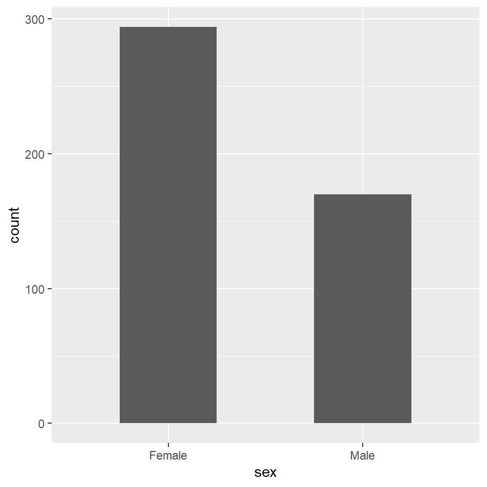
Figure 9.5: Use bar plots to display the relative counts of sorted variable values.
Many biomedical experiments generate discrete sorted data, too.
Imagine the following:
- Neurons are poked with an electrode. Counts are recorded of the number of times they depolarize over a certain time period. Counts are compared between various treatments, such activating an upstream neuron at different levels.
- Cells are stained for expression of a marker protein. The number of cells in which the protein is detected are counted. Counts are compared between various treatments, such as a knockdown and its control.
- By some criteria, cells are judged to be either alive or dead and counted as such. The number of alive cells are counted after manipulating expression of a tumor suppressor gene, and compared to a control.
- By some criteria, mice are judged to either show a disease phenotype or not, and counted as such. Disease incidence is counted in response to levels of a therapeutic agent, or a background genotype, or in response to some stressor.
There are an infinite number of examples for experiments that can be performed in which a dependent variable is sorted. For each replicate the researcher decides what nominal category it should be sorted into.
Sometimes sorting occurs after some fairly sophisticated biological manipulation, instrumentation or biochemical analysis, where in the end all the researcher has are a count of the number of times one thing happened or some other.
9.2.2.3 Ordered data
Ordered data is, in one sense, a hybrid cross of sorted and measured data. Ordinal is another common jargon term used to describe such variables.
If you’ve ever taken a poll in which you’ve been asked to evaluate something on a scale ranging from something akin to “below low” to “super very high”…then you’ve experienced ordinal scaling (such scales are called Likert scales).
The ordered variable’s values are, in one sense, categorical: “low,” “med,” and “high” differ qualitatively. Each lacks a precise quantitative value. In that sense, they are like sorted variables.
However, there is a quantitative, if inexact, relationship between the values. “High” implies more than “med” which implies more than “low.” An underlying gradation exists in the variable’s scale. This is not just the absence or presence of an attribute. Rather, the scale allows for some amount of the attribute relative to other possible amounts of the attribute.
Ordinal variables are discrete, because no values exist between the categories on the scale.
The precourse survey is chock full of questions that generate data on an ordered scale. For example, one asks students about their enthusiasm for taking the course. They can select answers ranging from 1 (“Truly none”) to 10 (“Absolutely giddy with excitement”).
Even though numbers are used as categories, their values are arbitrary, not quantitative, except to imply a 2 means more enthusiasm than a 1, and so on. The variable values could just as easily be: “Truly none,” “Very little,” “Slightly more than very little,” … and so on.
In a survey, the participant selects the level for the variable. When we do an experiment, replicates are evaluated and then categorized to one of the values of the ordinal scale.
Disability status scales are classic ordinal scales. These are used to assess neurological abnormalities, for example, those associated with experimental multiple sclerosis. Each replicate in a study is evaluated by trained researchers and assigned the most appropriate value given its condition: 0 for no disease, 1 for limp tail, 2 for mild paraparesis, 3 for moderate paraparesis, 4 for complete hind limb paralysis, and 5 for moribund.
Obviously, in this ordinal scale, as the numeric value increases so to does the severity of the subject’s condition.
Here’s what a very small set of ordinal data might look like. Imagine doing a small pilot study to determine whether ND4 gene deletion causes neurological impairment. Here’s how the data from a lab notebook would be transcribed into an R script to make a summary table:
genotype <- c(rep("wt", 3), rep("ND4", 3))
DSS_score <- as.integer(c(0,1,1,5,3,5))
results <- tibble(genotype, DSS_score); results
## # A tibble: 6 x 2
## genotype DSS_score
## <chr> <int>
## 1 wt 0
## 2 wt 1
## 3 wt 1
## 4 ND4 5
## 5 ND4 3
## 6 ND4 5Let’s make sure we understand the variables.
The independent variable is genotype, a factorial variable that comes in two nominal levels, wt or ND4. DSS_score is a dependent variable that comes in 6 levels (integer values ranging from 0 to 5). I’m forcing R to read DSS_score for what it is, an integer rather than as a numeric.
However, the values 0 to 5 are nominally arbitrary. This only differs from a sorted variable because a value of 1 means more than zero, 2 means more than 1, and so on.
9.2.2.4 Visualizing ordered variables
Let’s visualize the enthusiasm biostats students have for taking a course.
Here’s a bar plot. Here again, geom_bar not only draws bars, it also counts the total number of biostat students who voted for each of the 10 levels. A bar plot of counted data is just a poor man’s histogram.
ggplot(pcd) +
  geom_bar(aes(x=enthusiasm))+
  scale_x_continuous(breaks=seq(1, 10, 1))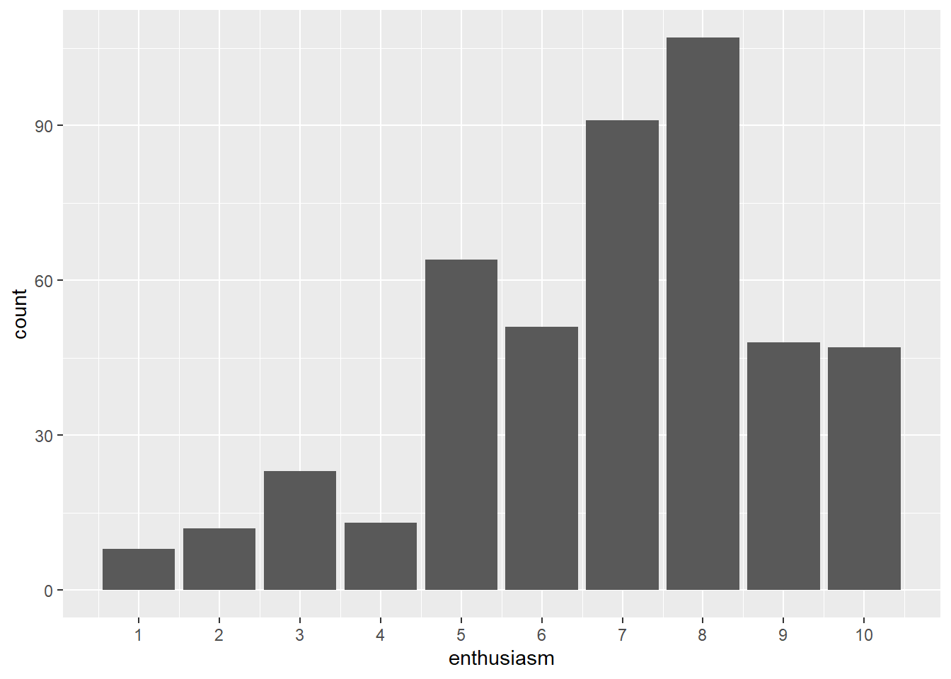
Viewed using the histogram function, we see the same thing, if we dial the binwidth to the unit of the ordinal scale or the number of bins to the length of the ordinal scale.
It is easy to see the data are skewed a bit to the right of the scale center. I mention this because ordered data are frequently skewed. Variables of counts should not be expected to obey a symmetrical normal distribution.
Although it is tempting to compute descriptives like means and standard deviations and even run t-tests and ANOVA on such data, slow down and have a thought about that. The values are arbitrary.
If instead of 1, 2, 3,… the variable values were “Truly none,” “Very little,” “Slightly more than very little,” …, how exactly would you compute a mean and standard deviation?
You could not.
A cognitive bias is equating numeric discrete yet arbitrary scale with a continuous, equal interval scale.
ggplot(pcd) +
  geom_histogram(aes(x=enthusiasm),
                 binwidth = 1, color = "#f2a900", fill = "#012169") +
  scale_x_continuous(breaks=seq(1, 10, 1))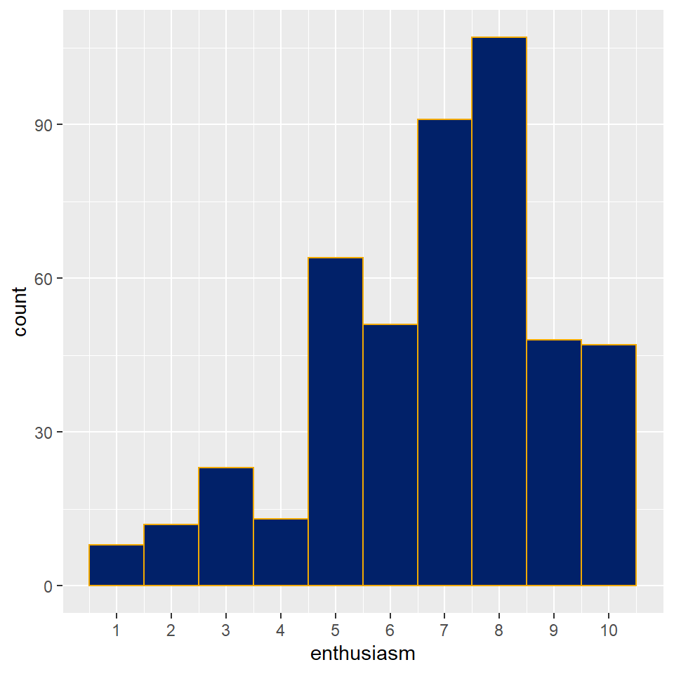
Figure 9.6: An ordered variable plotted as histogram.
Viewing scatter plots of discrete data really brings forth their discreteness. They show how there is obviously no information between levels of the ordered scale used in this survey instrument.
# the height argument in geom_jitter is crucial to seeing this pattern
# adjust the height value to see what happens

ggplot(pcd) +
  geom_jitter(aes(x=factor(1), y=enthusiasm),
              height=0, width = 0.4, size = 4, alpha = 0.6) +
  scale_y_discrete(limits = c(1:10)) +
  xlab("biostats students") +
  theme(axis.ticks.x = element_blank(),
        axis.text.x = element_blank()
        )
## Warning: Continuous limits supplied to discrete scale.
## Did you mean `limits = factor(...)` or `scale_*_continuous()`?## Warning in (function (kind = NULL, normal.kind = NULL, sample.kind = NULL) :
## non-uniform 'Rounding' sampler used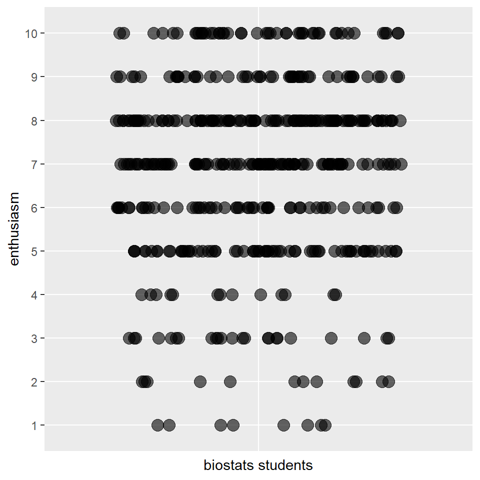
Although you can calculate an mean for a variable such as this, whether you should report it to one significant digit or beyond is fraught with portent.
9.2.3 Rescaling variables
Commonly researchers transform discrete variables onto a continuous scale or continuous variables onto a discrete scale.
Rescaling requires some judgment. We should always be concerned that rescaling might be counterproductive.
The most frequent discrete to continuous transformation is probably sorted count data to percents. This usually has good descriptive utility. The problems usually arise when the transformed variable is used for statistical testing.
For example, the two percent values for the sex variable in the table below are useless for asking whether there is a statistical difference from, say, 50%. The transformation converted plenty of useful count data (386 bits of information) into 2 bits of information.
By keeping the variable values as numeric counts we can readily test whether the proportion of 144/242 differs from 50/50, by performing a proportion test (covered in Chapter 19).
pcd %>%
  count(sex) %>%
  mutate(total=sum(n), percent=100*n/total)
## # A tibble: 2 x 4
## sex n total percent
## <chr> <int> <int> <dbl>
## 1 Female 294 464 63.4
## 2 Male 170 464 36.6Another common rescaling is treating ordinal variables as if they are, in fact, on a measured equal interval scale.
In addition to the fact that ordinal scales are often arbitrary, there are a couple of other problems that should be thought through before rescaling.
First, an ordinal variable like enthusiasm is bounded. Values below 1 and above 10 are not possible. Continuous sampling distributions, such as the Normal, are premised upon variables that have no bound.
Another major question that arises with ordinal scales is whether it is safe to assume the intervals between the units are equal. Is the difference between a 1 and a 2 score on the enthusiasm variable the same as the difference between a 9 and a 10 score?
When these issues cannot be validated, the nonparametric tests provide perfectly good inferential tools for ordinal data (covered in Chapter 21).
9.3 Summary
We’re going to talk about data a lot more the rest of the semester. So far we’ve covered these fundamentals.
- An experimental researchers collects measures for dependent variables after imposing independent variables on a system.
- Both dependent and independent variables can be either discrete or continuous.
- Discrete variables can be either ordered or sorted.
- Continuous variables are measured.
- Statistical treatment depends upon the type of variables involved in the experiment.
- Working with data with software demands that we understand data structure