Chapter 21 Nonparametric Statistical Tests
library(tidyverse)
library(PMCMR)
library(PMCMRplus)
library(PropCIs)
library(knitr)
Non-parametric statistical tests are quite versatile with respect to the dependent variables they tolerate and the experimental designs.
Nonparametric tests allow for statistical analysis of discrete ordinal data, such as likert survey data or other assessment instruments comprised of discrete scoring levels. Nonparametric tests can also be used for data on measured, equal interval scales, particularly when the normality and equal variance assumptions of parametric statistical testing are not satisfied or cannot be assumed.
Nonparametric statistics are parameter-less. They don’t compare means, or even medians. Though people frequently treat nonparametrics as tests of medians, that is not strictly true. They don’t involve least squares calculations, or standard deviations, or variance, or SE’s.
They do compare distributions of data. This happens by transforming the data into a standardized measure of ranks–either into signs, or sign ranks or rank sums. The experimental design dictates which of these measures of ranks is used for testing.
The tests, essentially, evaluate whether the distribution of ranks in an experimental outcome differs from a null distribution of ranks, given a sample size. That can seem pretty abstract. But it’s actually a simple and elegant way to think about these tests.
With the exception of the Sign Test, which has a probability as an effect size, strictly speaking there really isn’t an effect size that describes non-parametric outcomes other than the value of the test statistic.
However, it is possible to use confidence interval arguments in R’s tests to coerce them into providing effect size output as estimates of medians. This can be sometimes useful in write ups of the results.
Non-parametric analogs exist for each of the major parametric statistical tests (t-tests and one-way completely randomized anova and one-way repeated/related measures anova). Which nonparametric analog to use for a given data set analysis depends entirely upon the experimental design.
- Sign Test -> analog to the binomial Test -> when events are categorized as either successes or failures.
- Wilcoxon Sign Rank Test for one group -> analog to the one sample t-test -> compare the values of a one group data set to a standard value.
- Mann Whitney Rank Sum Test for 2 independent groups -> analog to the unpaired t test -> for comparing two groups in a data set.
- Wilcoxon Sign Rank Test for paired groups -> analog to the paired t-test -> comparing a group of paired outcomes in a data set to no effect null.
- Kruskal-Wallis Test -> analog to one way completely randomized ANOVA -> comparing 3 or more groups
- Friedman Test -> analog to one way repeated/related measures ANOVA -> comparing 3 or more differences.
In R, the wilcox.testfunction is a work horse for non-parametric analysis. By simply changing the function’s arguments it can do either a WSRT, or MW, or a WSRT for paired groups analysis. For the Sign Test, we’ll just use the binom.test function in R which was discussed previously in chapter @(categorical).
21.1 Nonparametric sampling distributions
As for other statistical tests, when conducting nonparametric analysis the experimental data are transformed into a test statistic that represents the signal-to-noise in the results. The question, as always, is whether this signal-to-noise is too extreme for a null effect.
The key nonparametric test statistics are the Wilcoxon Signed Rank (see chapter @(signrank)) and the Wilcoxon Rank Sum (see chapter @(ranksum)). For each, there is a unique distribution for every sample size and the p-values are themselves discrete.
21.2 Experiments involving discrete data
Discrete data can be either sorted or ordered. Discrete data arises from counting objects or events, which is sorted data. They also occur when measurements taken from the experimental units are assigned discrete values, which is ordinal data.
Counted objects are easy to spot—they are indivisible. They belong in one bucket or some other bucket(s). Dependent variables that have discrete values are also easy to spot. On scatter plots they exist as discrete rows. There is no continuum of values between the rows.
21.2.1 Ordered data
When planning an experiment ask whether the data will be sorted into categories on the basis of nominal characteristics (eg, dead vs alive, in vs out).
Or will the data be categorized on some ordered basis. For example, a score of 1 = the attribute, a score of 2 = more of the attribute, a score of 3= even more of the attribute, …and so on.
The sum of the discrete counts within one category of an ordered scale mean that they have more or less of some feature than do the counts in another category in the ordered group.
Thus, compared to nominal sorted data, ordered data have more information. Whereas nominal events are just sorted into one bucket or another, ordered events are inherently categorized by rank.
Ordered data are common in survey instruments. These are likert scales. For example, you might take a survey that asks you to rate your enthusiasm for taking a biostats course. Your choice options are discrete values, on a scale of 1 to 10, where 1= “undetectable enthusiasm” and 10 = “giddy with excitement.” Obviously, a selection of 2 implies more enthusiasm than 1, and so on up the scale. The values are ordered.
Certain experimental designs generate inherently ordered data as well.
For example, imagine a test that scores dermal inflammatory responses.
Given a subject, * Score 1 if we don’t see any signs of inflammation. * Score 2 if there was a faint red spot. * Score 3 for a raised pustule. * Score 4 for a large swollen area that feels hot to the touch. * Score 5 for anything worse than that, if it is possible!
Using that ordered scale system, we’d run experiments, for example, to compare a steroid treatment that might reduce inflammation compared to a vehicle control. Or we’d look at a gene knockout, or CRISP-R fix, or whatever, and score an outcome response compared to a control group. After an evaluation by a trained observer, each experimental unit receives a score from the scale.
In quantifying effect sizes for such studies, a mistake you often see is parametric analysis. The researcher uses parameters such as means, and standard deviations, performs t-tests, and so forth on the scored rank values.
This isn’t always bad, but it assumes a couple of things. First, that the distribution of the residuals for the data is approximately normal, as is the population that was sampled. Second, the scoring scale is equal interval. That is to say, “the difference between inflammation scores of 1 and 2 is the same as the difference between scores 2 and 3, and so on….”
Suffice to say that researchers should validate whether these assumptions are true before resorting to parametric tests. If the assumptions cannot be validated nonparametric tests are perfectly suitable for such data.
It happens the other way, too. Sometimes we take measurements of some variable on a perfectly good measurement scale, one that satisfies these assumptions, but then break the data out to some ordered scale.
Take blood pressure, for example, which is a continuous variable, usually in standardized units of mm-Hg. We might measure it’s value for each subject, but on the basis of that measurement sort the subjects into ordered categories of low, medium and high pressure. Our scientific expertise drives what blood pressure values are used to define the margins of those categories. And we should have good reasons to resort to a categorization because doing so tends to throw away perfect good scalar information. Which is not a good idea, generally.
It is on this ordered scale, of discrete events, rather than the original measurements on a continuous scale, that we might then run statistical tests.
My point for this latter example is, of course, that not all ordered scales are based upon subjective assessments.
21.3 Experiments involving deviant Data
Any scale, whether discrete or continuous, can yield deviant data. What I mean by deviant data is non-normal, skewed, has unequal variances among groups, has outliers, and is just plain ugly.
When data are deviant there are two options:
- Use reciprocal or log transform functions to transform the data distribution into something more normal-like. Run the statistical tests intended for normal data on the transformed values.
- Run non-parametric statistical tests on the raw, untransformed data. These tests transform the data into a rank-based distribution. These (the sign rank and the rank sum distributions), are discrete normal-like, and are used to cough up p-values.
- Tossing outliers is almost always a bad and unnecessary option. Outlier tossing introduces bias when the only reason to toss it is because it is an outlier. Because they are based on ranks, the nonparametric tests condense outliers back with the rest of the variables, providing a very slick way to deal with deviant data.
21.4 Sign Test
The Sign Test is a non-parametric way of saying a binomial test.
An experiment is conducted on a group of subjects, who are graded in some way for either passing (+) or failing (- ) some test. Did a cell depolarize, or not? Is a stain in the cell nucleus, or not? Did the animal move fast enough, or not? Did the subject meet some other threshold you’ve established as a success, or not?
Simply count the number that passed. Given them a “+” sign. The number that failed receive a “-” sign. Using scientific judgement, assume a probability for the frequency of successes under the null hypothesis. For example, the null might be to expect 50% successes. If after analyzing the data the proportion of successes differs from this null proportion, you may have a winner!
Here’s an analysis of a behavioral test, the latency to exit a dark chamber into a brief field, as an index of anxiety. Let’s say that exiting a chamber in less than 60 seconds is a threshold for what we’d consider “non-anxious” behavior. Scientific judgement sets that threshold value. Fifteen subjects are given an anti-anxiety drug.
The null probability of exiting the chamber is 0.5. Which is to say there is a 50/50 chance a mouse will, at random, exit the chamber at any given time before or after 60 sec. Or put another way, under the null, neither exiting nor remaining in the chamber by 60 seconds is favored.
Let’s imagine we have an alarm set to go off 60 seconds after placing the subject in the chamber. When the alarm sounds, we score the subject as either (+) or (-). If the subject is out of the chamber, a success is (+). If still in the chamber after 60 s it is a failure (-).
This experiment tests the null hypothesis that the probability of successes are less than or equal to 50%.
We’ll write in our notebook this hypothesis. We are testing the null. The alternate is mutually exclusive and exhaustive of the null, so it is that the probability of successes are greater than 50%.
We’ll also jot down our error tolerance. Our tolerance for a type1 error is 5%, or 0.05. Thus our threshold rule is that we will reject the null if the p-value of the statistical test is below this tolerance level. Finally, we’ll write down that once the data are collected, we’ll run the binomial test to analyze the results.
The results are that twelve exited the chamber in less than 60 seconds, and 5 did not. We have not recorded times because that isn’t part of the protocol.
If something is not less than or equal to another, it can only be greater. Thus, we choose the “greater” for the alternative hypothesis argument in the binomial test function. We think on an anti-anxiety drug the probability is greater that the subjects will successfully exit the chamber.
binom.test(x=12, n=15, p=0.5,
           alternative ="greater",
           conf.level=0.95 )
##
## Exact binomial test
##
## data: 12 and 15
## number of successes = 12, number of trials = 15, p-value = 0.01758
## alternative hypothesis: true probability of success is greater than 0.5
## 95 percent confidence interval:
## 0.5602156 1.0000000
## sample estimates:
## probability of success
## 0.8scoreci(x=12, n=15,
conf.level = 0.95)##
##
##
## data:
##
## 95 percent confidence interval:
## 0.5481 0.929521.4.1 Interpretation
The effect size is 0.8, which represents the fraction of subjects that left the chamber prior to the 60 second threshold we set. The p-value is the probability of observing an effect size this large or larger, if the null hypothesis is actually true.
The interpretation of the confidence interval is as follows. On the basis of this sample, there is 95% confidence the true value for the fraction of subjects that would leave the chamber prior to 60 seconds is within the range of 0.56 to 1.
Note that this 95% CI range includes values, eg, 0.56, that are pretty close to the null expectation. The fact that p-value beat the threshold should be tempered by the fact that we are also 95% confident that the proportion of successes includes values that are pretty darn close to what we predicted is the null.
To get a clearer sense of what’s going on, here is the distribution of the binomial function for the null hypothesis. You can see that it is symmetrical. If the drug were ineffective, we’d expect half to exit prior to 60 s, and the other half after 60 s.
# I'll use the rbinom function to simulate
data <- tibble(x = c(0:15),y=dbinom(c(0:15), 15, prob=0.5))

ggplot(data, aes(x, y))+
  geom_col(fill="blue") +
  xlab("exits before 60s") +
  ylab("prob of that many exits") +
  geom_text(aes(x=1, y=.20,
                label="H0 distribution"))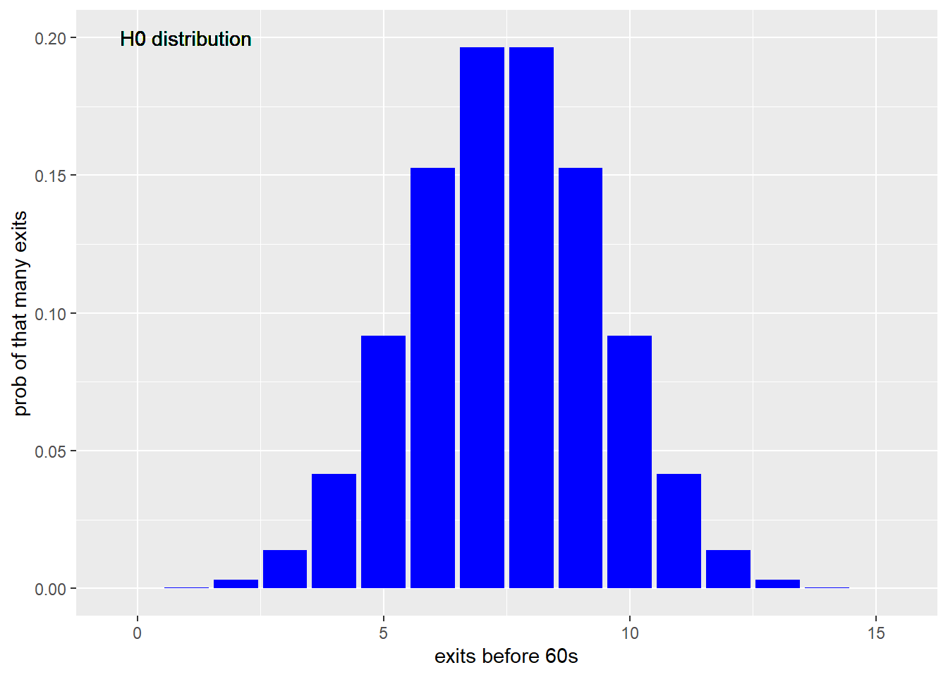
Figure 21.1: Distribution of chamber exits in a trial sized 15 for the null for a 50% chance of chamber exits priort to 60 seconds, on a binomial model.
And here is the distribution for the alternate hypothesis, given the effect size: If the drug were effective at reducing anxiety, we’d expect 80% would exit the chamber prior to 60 second.
data <- tibble(x = c(0:15),y=dbinom(c(0:15), 15, prob=0.8))

ggplot(data, aes(x, y))+
  geom_col(fill="green") +
  xlab("exits before 60s") +
  ylab("prob of that many exits") +
  geom_text(aes(x=1, y=.20,
                label="H1 distribution")
            )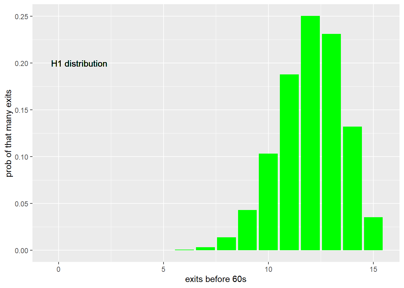
Figure 21.2: Distribution of chamber exits in a trial sized 15 for the alternate expectation that 80% would exit prior to 60 seconds, based upon the binomial.
This is to emphasize that the binomial distribution is used here as a model of the experimental data. Thus, we might also conclude that our data is consistent with a binomial distribution of 15 trials wherein the probability of event success is 80%.
21.4.2 Write Up
Here’s a way to write up the result.
Drug treatment increases fearlessness (one-sided binomial test, p = 0.01759). The fraction exiting the chamber (0.8) is greater than expected for the null of 0.5 (95% CI = 0.55 to 1.0, Wilson’s CI)
21.5 Wilcoxon Sign Rank Test for One Group
The test statistic for the Wilcoxon Sign Rank is determined as follows.
- Assert a theoretical threshold value of the dependent variable, such as a median.
- Calculate the difference between the theoretical threshold value and the values recorded for each independent replicate.
- Rank those differences from lowest (rank = 1) to highest (rank = n).
- Assign a negative value to the replicate values that are less than the median.
- The test statistic
Vis the sum of the positive values. (software other thanwilcox.testin R may calculate W, the sum of the positive and negative values).
The test statistic V has a symmetrical discrete distribution. The cumulative function of V is psignrank and is used to compute p-values.
21.5.1 Wilcoxon Sign Rank Experimental Designs
This experimental design is similar to the Sign Rank test above except in one important detail: We actually measure the time it takes for the subjects to exit the chamber. No alarm sounds to end the game at 60 sec. If subjects dawdle about and take longer than 60 sec to exit, we wait and record that time!
Thus, because the data set is comprised of the actual values for the latency variable, rather than counts of a simple (+) or (-) score, the Wilcoxon Sign Rank design collects more information than does the Sign Rank Test.
Let’s say we have a chamber test on 7 subjects who’ve all been given an anti-anxiety drug. After placement in the chamber, their exit times (in seconds) are 3, 5, 8, 15, 19, 21 and 108. Based upon our scientific expertise, we assume exiting sooner than 60 s would represent fearlessness (less anxiety).
This test ranks each subject’s performance relative to that reference time and then “signs” it as negative or positive based on whether it’s original value was below or above the 60 second threshold.
In our data, only one subject exceeded that value…108 sec.
Our prediction is that less anxious subjects should exit the comfort of the dark chamber sooner than would be expected. The null hypothesis is that the “location”" of the null distribution is greater than or equal to 60 seconds. The alternate is the location of the distribution is “less” than 60 seconds, since less is everything that greater than or equal to cannot be.
We run the Wilcoxon Sign Rank test to test this hypothesis using the arguments below.
wilcox.test(x=c(3,5,8,15,19,21,108),
            mu=60,
            alternative = "less",
            conf.level = 0.95,
            conf.int = 0.95
            )
##
## Wilcoxon signed rank exact test
##
## data: c(3, 5, 8, 15, 19, 21, 108)
## V = 4, p-value = 0.05469
## alternative hypothesis: true location is less than 60
## 95 percent confidence interval:
## -Inf 61.5
## sample estimates:
## (pseudo)median
## 1421.5.2 Interpretation
The value of the test statistic, V is four. How extreme is that? It is pretty far to the left on the test statistic distribution (see below) for this particular sample size. However, the p-value is above the threshold of 5%. The evidence is not enough to reject the null hypothesis. Otherwise, the probability of making an error doing so would be 0.05469.
What does V = 4 mean? It is the value corresponding to the sum of the positively signed ranks in the sample. The pseudo-median of the latency time is 14 seconds. The one-sided 95% confidence ranges from -infinity to 61.5.
Here’s a null signrank distribution for a sample size of 7. The values of the x scale are V, the test statistic. These are all the possible values that V can take on, given the sample size. For example, if all the signed ranks were positive…if every subject took longer than 60 sec to exit)…then V would equal 28. If all subjects exited before 60 sec, then V would equal zero.
Which is to say the location of this distribution is, by coincidence, also centered on 14. The value of 4 is less than this location, but not extremely-enough lower to be considered as belonging to some other distribution with a different location! The 95% confidence interval of the location on the V test statistic ranges from -infinity to 62.5.
psignrank(q=4, n=7)## [1] 0.0546875psignrank(q=1, n=7)## [1] 0.015625# sign rank distribution for sample size of 7
upper <- 28
n <- 7
df <- tibble(x=0:upper, y=dsignrank(0:upper, n))
ggplot(df, (aes(x,y)))+
geom_col() +
xlab("V") +
scale_x_continuous(breaks=(seq(0,upper,1)))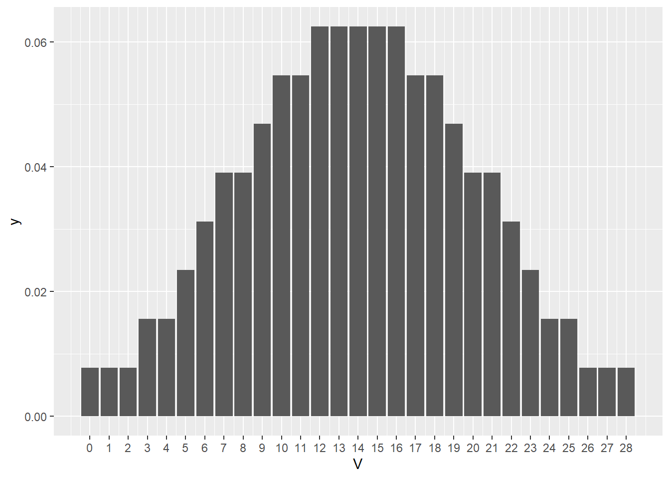
Figure 21.3: Null sign rank test statistic distribution for sample size of 7
21.5.3 Write Up
Analysis of the chamber test results indicates the anti-anxiety drug has no effect (Wilcoxon Signed Rank test, V = 4, n = 7, p= 0.0547)
21.6 Wilcoxon Mann Whitney Rank Sum Test for 2 independent groups
This nonparametric test, often referred to simply as the Mann-Whitney test, is analogous to the parametric unpaired t-test.
It is for comparing two groups that receive either of 2 levels of a predictor variable. For example, in an experiment where one group of m independent replicates is exposed to some control or null condition, while a second group with n independent replicates is exposed to some treatment. More generally, the two groups represent two levels of a predictor variable given to m+nindependent replicates.
The rank sum is calculated as follows:
- The data are collected from any scale, combined into a single list, whose values are ranked from lowest (rank 1) to highest (rank
m+n), irrespective of the level of the predictor variable. - Let \(R_1\) represent the sum of the ranks for the one level of the predictor variable (eg, group2).
- Let \(U_1\) represent the number of times a data value from group2 is less than a data point from group1.
- \(U_1=m*n+\frac{m(m+1)}{2}-R_1\)
- And \(U_2=m*n-U_1\)
The rank sum test computes two test statistics, \(U_1\) and \(U_2\) that are complementary to each other.
Here’s another in the line of the mighty mouse experiments.
55 independent subjects were split into two groups. One group received an anti-anxiety drug and the second a vehicle as control. The subjects were run through the dark chamber test. The scientific prediction is the drug will reduce anxiety levels and so the drug treated mice will exit the chamber more quickly compared to the control mice.
Since this is a parameter-less test, the null hypothesis is that location of the distribution of the drug-treated population is greater than or equal to the location of the vehicle distribution. The alternative hypothesis is that the location of the distribution of the drug-treated population is less than that of the vehicle distribution. The alternative is consistent with our scientific prediction and represents an outcome that is exclusive and comprehensive of the null!
We choose the “less” option for the alternative argument in the test.
mightymouse <- read_csv("datasets/mightymouse.csv")## Rows: 24 Columns: 3## -- Column specification --------------------------------------------------------
## Delimiter: ","
## chr (1): Group
## dbl (2): Time, Rank##
## i Use `spec()` to retrieve the full column specification for this data.
## i Specify the column types or set `show_col_types = FALSE` to quiet this message.# note use of naming variables with the formula syntax
wilcox.test(Time ~ Group,
data = mightymouse,
alternative ="less",
conf.level=0.95,
conf.int=T)##
## Wilcoxon rank sum exact test
##
## data: Time by Group
## W = 55, p-value = 0.1804
## alternative hypothesis: true location shift is less than 0
## 95 percent confidence interval:
## -Inf 6
## sample estimates:
## difference in location
## -9.821.6.1 Interpretation
The test statistic you see in the output, \(W\), warrants some discussion. \(W\) is equal to \(U_2\) as defined above.
By default, R produces \(U_2\) (labeled W!) as the test statistic. Most other software packages use \(U_1\), which in this case would be 88 (easy to compute in the console given \(U_2\)).
Think of \(W\) as a value on the x axis of a rank sum distribution for a sample size of m+n. The rank sum distribution has a function in R called dwilcox. Here it is (note the large value this distribution can take on is m*n and the smallest is zero):
df <- tibble(x=0:143, y=dwilcox(0:143, 11, 13))

ggplot(df, (aes(x,y)))+
  geom_col()+
  xlab("W")+
  scale_x_continuous(breaks=c(55, 88))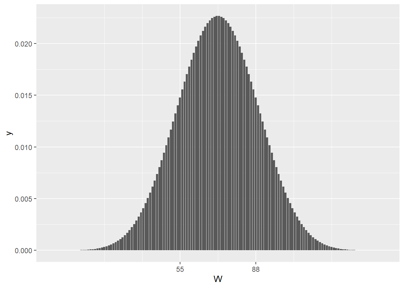
Figure 21.4: The null rank sum test statistic distribution for a sample size of m=11 and n=13
All this can seem confusing, but it is very elegant. First, the rank sums of samples, like the rank signs of samples, take on symmetrical, normal-like distributions. The greater the sample sizes, the more normal-like they become.
Second, the bottom line is the same as for all other statistical tests: test statistic values at either extreme of these null distributions are associated with large effect sizes.
The non-extreme-ness of the test statistic value for our sample is illustrated in that plot. Clearly, W=55, it is well within the null distribution. I calculated it’s symmetrical counterpart, \(U_1\) = 88, from the relationship above. As you can see, the value of the test statistic and 88 frame the central location of this null ranksum distribution null quite nicely:
The p-value for W=55 indicates that the probability of creating a false positive by rejecting the null is 18.04%, well above the 5% type1 error threshold. So we should not reject the null given we’d have a 1 in 5 chance of being wrong if we did!
The “effect size” is in the output is the magnitude of the difference between the location parameters (pseudo-medians) of the two groups, on the scale of the original data.
The 95% confidence interval indicates there is a 95% chance the difference in locations is between negative infinity and 6. Since the 95% confidence interval includes zero, the possibility exists that there is zero difference between the two locations. That provides additional statistical reasoning not to reject the null.
21.6.2 Write Up
There is no difference in performance using the closed chamber test between subjects randomized to anti-anxiety drug (n=11) or to vehicle (n=13) (Mann-Whitney test, W = 55, p = 0.1804).
21.6.3 Plot
This is a two group experiment. Every data point represents an independent replicate.
The aes function defines the plot axis. The x-axis is the factor “Group” and it has two levels, “Drugs” and “Vehicle.” The y-axis is “Time” in seconds.
It is customary to illustrate summary statistics of nonparametric data with box plots. By default these illustrate the median (mid horizontal bar), interquartile ranges (outer horizontal bars) and full ranges (verticle bars). The small dot is a value the geom_boxplot function recognizes as an outlier. It can be surpressed with an argument.
It is becoming customary to show all data points. Thus, overlaying the points on a box plot shows all the data and its summary. The visualization illustrates quite well the deviant data. Nonparametric analysis handles this well. This isn’t suitable for a t-test.
ggplot(mightymouse, aes(x=Group, y=Time))+
  geom_boxplot(width=0.3)+
  geom_jitter(height=0,
              width = 0.1,
              size = 4,
              alpha=0.4)
## Warning in (function (kind = NULL, normal.kind = NULL, sample.kind = NULL) :
## non-uniform 'Rounding' sampler used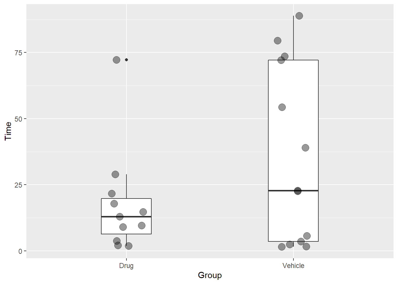
Figure 21.5: A minimal configuration for plotting a 2 group nonparametric experimental design.
21.7 Wilcoxon Sign Rank Test for paired groups
The classic paired experimental design happens when two measurements are taken from a single independent subject.
For example, we take a mouse, give it a sham treatment, and measure it’s latency in the chamber test. Later on we take the same mouse, give it an anti-anxiety drug treatment, and then measure its latency once again.
This kind of design can control for confounding factors, like inter-subject variability. But it can also introduce other confounds. For example, what if the mouse “remembers” that there is no real risk of leaving the dark chamber?
Pairing can happen in many other ways. A classic pairing paradigm is the use of identical twins. Individuals of inbred mouse strains are all immortal clones. Two litter mates would be identical twins and would also be, essentially, clones of their parents and their brothers and sisters from prior litters! Two dishes of cultured cells, passed together and now side-by-side on a bench are intrinsically-linked. All of these can be treated, statistically, as pairs.
In this example, we take a pair of mice from each of 6 independent litters produced by mating two heterozygotes of a nogo receptor knockout. One of the pair is nogo(-/-). The other is nogo(+/+). We think the nogo receptor causes the animals to be fearful, and predict animals in which the receptor is knocked out will be more fearless.
The independent experimental unit in this design is a pair. We have six pairs, Therefore, the sample size is 6 (even though 12 animals will be used!)
We’ll measure latency in the dark chamber test. Our random variable will be the difference in latency time between the knockout and the wild type, for each pair.
Here’s the data, latency times are in sec units. Each animal generates two measurements and has an id value:
# enter the data by hand, no need to use csv files

mmko <- tibble(
  id=c("a", "b", "c", "d", "e", "f"),
  knockout=c(19, 24, 4, 22, 15, 18),
  wildtype=c(99, 81, 70, 62, 120, 55)
  )

#create a long data fram to do formula arguments in wilcox test

mmkotidy <- pivot_longer(mmko,
                         - id,
                         names_to = "genotype",
                         values_to = "latency"
                         )
Scientifically, we predict there will be a difference in latency times within the pairs. Specifically, the knockout will have lower times than their paired wild-type. The null hypothesis is that the difference within pairs will be greater than or equal to zero. The alternative hypothesis is the difference will be less than zero.
wilcox.test(latency ~ genotype,
            data=mmkotidy,
            paired=T,
            conf.level=0.95,
            conf.int=T,
            alternative="less"
            )
##
## Wilcoxon signed rank exact test
##
## data: latency by genotype
## V = 0, p-value = 0.01563
## alternative hypothesis: true location shift is less than 0
## 95 percent confidence interval:
## -Inf -40
## sample estimates:
## (pseudo)median
## -61.521.7.1 Interpretation
Note that this is not a rank sum test as for the Mann-Whitney, but a signed rank test.
So we have seen the V test statistic before. It’s value of 0 is as extreme as can be had on the null distribution, as is evident in the distribution below! That happened because in each of the six pairs, the knockout had a lower latency time than its paired wildtype. All of the signed ranks were negative!
In terms of position differences, it is as strong of an effect size as possible.
upper <- 21
n <- 6

df <- tibble(x=0:upper,
             y=dsignrank(0:upper, n)
             )

ggplot(df, (aes(x,y)))+
  geom_col() +
  xlab("V") +
  scale_x_continuous(breaks=(seq(0,upper,1)))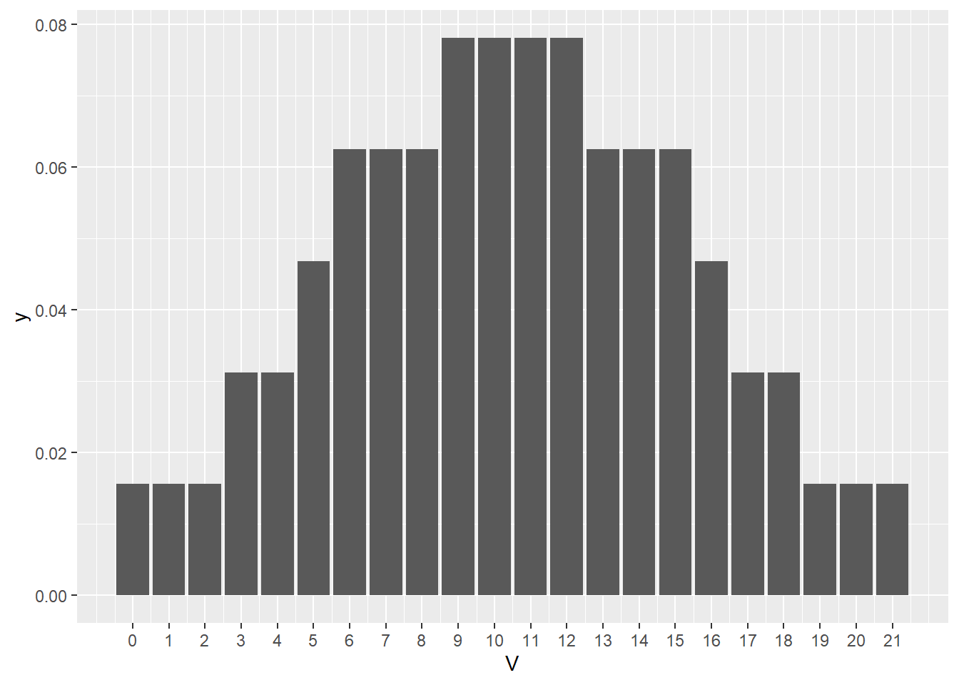
Figure 21.6: Null sign rank test statistic distribution when n= 6 pairs.
The p-value is exact…and it can never be lower, given this sample size. We can reject the null since it is below our 5% threshold and it says the probably that we are accepting a type1 error is 1.563%.
The pseudo-median is in units of latency time. It represents the median for the differences in latency within the pairs. In other words, there are six values of differences, one difference value for each pair. -61.5 is the median of those 6 differences.
There is a 95% chance the true median of the differences lies between negative infinity and -40. Note that the 95% CI does not include the value of zero.
21.7.2 Write up
Dark chamber test latency differs markedly within pairs of knockout and wildtype subjects (Wilcoxon Signed Rank Test for pairs, n=6, V = 0, p=0.01563)
21.7.3 Plot
Since this is a paired experimental design we create a dot-line-dot plot that illustrates this point. A very common mistake is for people who have a paired experiment to plot means of the two groups, or two bars, without connecting the paired data.
The statistical test, in fact, is not performed on the latency values for the two groups.Group means or medians are irrelevant. Instead, it is performed on the differences within the pairs. In other words, the test is run, essentially, on sign ranked values related to the slopes of the red lines, not on the values of the dots.
The plot should always reflect the experimental design.
Here is a minimal concept for this. The group aesthetic is the key and definitely a trick worth remembering. If you want to really bob ross this, add color = id to the aesthetics.
ggplot(mmkotidy, aes(genotype, latency, group=id))+
  geom_line(color="red")+
  geom_point(size=4)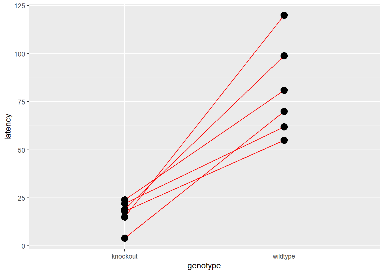
Figure 21.7: Paired experimental designs should always be plotted dot-line-dot.
21.8 Kruskal-Wallis
The kruskal.test is a non-parametric method for comparing 3 or more treatment groups. It serves as an omnibus test for the null hypothesis that each of the treatment groups belong to the same population. If the null is rejected, post hoc comparison tests are then used to determine which groups differ from each other.
A post hoc test for this purpose in base R is pairwise.wilcox.test. The PMCMRplus package has others. Documentation within the PMCMRpackage vignette provides excellent background and instructions for these tests.
The Kruskal-Wallis test statistic is computed as follows. Values of the outcome variables across the groups are first converted into ranks, from high to low. Tied values are rank-averaged. The test can be corrected for large numbers of tied values.
The Kruskal-Wallis rank sum test statistic is H:
\[H=\frac{12}{n(n+1)}\sum_{i=1}^k\frac{R_{i}^2}{n_i}-3(n+1)\]
\(n\) is the total sample size, \(k\) is the number of treatment groups, \(n_i\) is the sample size in the \(ith\) group and \(R_i^2\) is the squared rank sum of the \(ith\) group. Under the null, \(\bar{R_i} = (n+1)/2\).
Because it is, effectively, the sum of a squared value, the H statistic is approximated using the \(\chi^2\) distribution with \(k-1\) degrees of freedom to produce p-values.
21.8.1 The experimental design
Let’s analyze the InsectSprays data set, which comes with the PMCMRplus package. This is a multifactorial experiment in which insects were counted in agricultural field plots that had been sprayed with 1 of 6 different insecticides. Each row in the data set represents an independent field plot.
Do the insecticides differ?
ggplot(InsectSprays, aes(spray, count))+
  geom_violin(fill="blue",
              color="red",
              size = 1.5)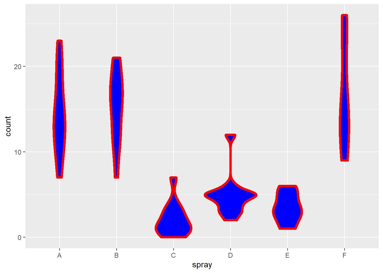
Figure 21.8: Violin plot for counts of insects in crop fields somewhere in Kansas following treatment with different insecticides.
The violin plots (modern day versions of box plots) illustrate how the groups have unequal variance. Such data are appropriate for non-parametric analysis.
#insectsprays <- read.csv("insectsprays.csv")
kruskal.test(count ~ spray,
             data=InsectSprays
             )
##
## Kruskal-Wallis rank sum test
##
## data: count by spray
## Kruskal-Wallis chi-squared = 54.691, df = 5, p-value = 1.511e-10kwAllPairsConoverTest(count ~ spray,
data=InsectSprays,
p.adjust ="bonf"
)## Warning in kwAllPairsConoverTest.default(c(10, 7, 20, 14, 14, 12, 10, 23, : Ties
## are present. Quantiles were corrected for ties.##
## Pairwise comparisons using Conover's all-pairs test## data: count by spray## A B C D E
## B 1.000 - - - -
## C 5.6e-13 4.5e-14 - - -
## D 4.7e-07 3.6e-08 0.021 - -
## E 1.1e-09 8.5e-11 1.000 1.000 -
## F 1.000 1.000 2.1e-14 1.7e-08 3.9e-11##
## P value adjustment method: bonferroniWe first do a Kruskal-Wallis rank sum omnibus test to test the null hypothesis that the locations of the insect distributions for several insecticide groups are the same.
The null is rejected given the large \(\chi^2\) test statistic, which has a p-value well below the threshold of 5% type1 error.
That’s followed by a pairwise post hoc test with a p-value adjustment. The number of pairwise tests for 6 groups is choose(6, 2)= 15.
Each pairwise test is a single hypothesis test associated with 5% type1 error risk. If we don’t make a correction for doing the multiple comparisons, the family-wise type1 error we allow ourselves would inflate to \(15 x 5% = 75%\)!
The Bonferroni adjustment is simple to understand. It multiplies every unadjusted p-value by 15, the number of comparisons made. Thus, each of the p-values in the grid is 15X larger than had the adjustment not been made.
Every p-value less than 0.05 in the grid is therefore cause for rejecting the null hypothesis those two compared groups. The highest among these is the comparisons between sprays C and D, which has a p-value of 0.03977.
21.8.2 Write Up
A non-parametric omnibus test establishes that the locations of the insecticide effects of the six sprays differ (Kruskal-Wallis, \(\Chi^2\) = 54.69, df=5, p=1.511e-10). Posthoc pairwise multiple comparisons by the Mann-Whitney test (Bonferroni adjusted p-values) indicate the following sprays differ from each other: A v(0.00058), D(0.00117), E(0.0051), …and so on
21.9 Friedman test
The Friedman test is used for nonparametric analysis of three or more levels of an independent variable for experimental designs that involve repeated/related measures. These are otherwise known as block designs. The Friedman test is a nonparametric analog of the one-way repeated/related measures ANOVA.
The test statistic is calculated in a multistep process from matrix-like data \({x_{i,j}}\). Each row, \(n_i\), is an independent block within which repeated/related measures are collected. Each column, \(k_j\) represents one level of the independent variable.
The friedman.test function works as follows: The first step involves ranking response values in ascending order within each row, transforming into a matrix of ranks, \(r_{i,j}\). The mean ranks are derived for each column \(\bar r_j=\frac{1}{n}\sum_{i=1}^n(r_{i,j})\).
The Friedman test statistic is then \[Q=\frac{12n}{k(k+1)}\sum_{j=1}^k(\bar r_j-\frac{k+1}{2})^2\]
Note how this is in the form of a sum of squared values. The distribution of \(Q\) is therefore approximately \(\chi^2\).
The function output is very simple: a p-value derived from the \(\chi^2\) distribution.
21.9.1 Blocked experimental design
Protein kinase A activity (PKA) was measured in extracts of cultured VSMC after exposure to either of four possible treatments.
There are a few critical questions this experiment hopes to answer. Does isoproterenol stimulate activity? Does the presence of a GFP_PKI inhibit stimulated activity? Is that inhibitory effect absent in a negative control for GFP_PKI?
Each week serves as a block, which is an independent replicate wherein all recorded measurements are more related to each other than they are to measurements in other weeks. The VSMC used each week have a common source, are treated in parallel, and are subject to vagaries peculiar to that week for the multi-step protocol.
The results are entered in the code below, creating a wide format data frame:
pki <- tibble(
  replicate=c('week1', 'week2', 'week3', 'week4', 'week5'),
  basal=c(20.0, 5.0, 2.1, 9.0, 23.7),
  isoproterenol=c(38.3, 9.1, 3.6, 15.5, 38.9),
  iso_GFP_PKI=c(27.5, 6.7, 2.7, 12.1,28.0 ),
  iso_GFP=c(36.1, 8.5, 4.2, 16.0,39.9 )
)
Here is a plot of the VSMC data. Note how it was converted to long format within the ggplot function:
ggplot(pki %>%
         pivot_longer(-replicate,
                      names_to="stimulus",
                      values_to ="pka"),
       aes(stimulus, pka, group=replicate, color=replicate)
       )+
  geom_point(size=4)+
  geom_line()+
  labs(y="PKA activity, pmole/mg/min")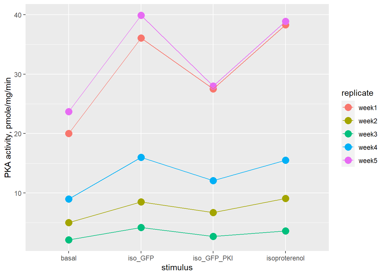
Figure 21.9: PKA activity in VSMC, note related measures within each replicate.
| replicate | basal | isoproterenol | iso_GFP_PKI | iso_GFP |
|---|---|---|---|---|
| week1 | 20.0 | 38.3 | 27.5 | 36.1 |
| week2 | 5.0 | 9.1 | 6.7 | 8.5 |
| week3 | 2.1 | 3.6 | 2.7 | 4.2 |
| week4 | 9.0 | 15.5 | 12.1 | 16.0 |
| week5 | 23.7 | 38.9 | 28.0 | 39.9 |
As seen in the graph and the table, for a given predictor variable there is as much as a 10-fold difference in activity from week to week. But within each row are consistent fold-differences between treatments.
The inconsistent levels of raw enzymatic activity from week-to-week make this suitable for nonparametric testing, whereas the weekly block design calls for related measures analysis. Thus the Friedman test.
The Friedman test can answer this question: Do any of these treatments differ? The test does not provide information on which groups differ, serving instead as an omnibus. The test output is simply a p-value, derived from the so-called Friedman chisquare.
There are a couple of options for performing the test.
The first involves converting the data to a matrix, omitting the values of the replicate variable, and passing that matrix of responses into the friendman.test function. The final row names decoration is not essential for friedman.test, but does help the posthoc tests play nicer.
pkiM <- pki %>%
  select(basal:iso_GFP) %>%
  as.matrix()
rownames(pkiM) <- 1:5friedman.test(pkiM)##
## Friedman rank sum test
##
## data: pkiM
## Friedman chi-squared = 13.56, df = 3, p-value = 0.00357The second approach is the so-called formula method, which we’ll use a lot when we get to regression. First, convert the data to a long format data frame.
pkiL <- pki %>%
  pivot_longer(-replicate,
               names_to = "stimulus",
               values_to="pka")
Now pass that format into friedman.test. In English, this formula reads, “run the Friedman test on pka activity by stimulus levels, with related measures by replicate.”
friedman.test(pka~stimulus|replicate,
              data=pkiL)
##
## Friedman rank sum test
##
## data: pka and stimulus and replicate
## Friedman chi-squared = 13.56, df = 3, p-value = 0.00357Because this p-value is below a 5% type1 error threshold, this result indicates that levels of the stimulus variable cause differences in PKA activities.
However, posthoc comparison tests are necessary to find out which differences between stimulus levels are reliable.
frdAllPairsConoverTest(pkiM,
                       p.adjust="bonf")
##
## Pairwise comparisons using Conover's all-pairs test for a two-way balanced complete block design## data: y## basal isoproterenol iso_GFP_PKI
## isoproterenol 0.087 - -
## iso_GFP_PKI 1.000 0.733 -
## iso_GFP 0.056 1.000 0.489##
## P value adjustment method: bonferroniYou’ll find a handful of pairwise posthoc comparison functions like the two used in this chapter in the PMCMRplus package. They are based upon different formulas and perform differently. It is not possible to conclude that one is better than another, except those that allow for a p-value adjustment should be used.
In this particular case, we have an ambiguous and underpowered data set. If you play with this data on your own machine, you’ll find there is ample latitude for prosperous p-hacking in the post hoc testing.
For example, if the p-values are unadjusted for multiple comparisons, all of the post hoc functions yield statistical differences. But unadjusted comparisons are not very stringent.
Alternately, certain post hoc tests with other p-value adjustment options yield statistical differences.
The question is not “which one is better?” The approach to take is to run realistic simulations in advance of collecting data, learn about the options by playing with familiar variables, and choose accordingly. Write down your choices for how you you intend to post hoc once the new data is collected, and stick with that plan.
21.9.2 Interpretation
Because the p-value of the Friedman test statistic is below the 5% threshold, we can reject the null that there are no differences in PKA activity caused by the four stimulus conditions.
However, the post hoc multiple comparison testing, with appropriate p-value adjustment, is inconclusive. The bloody obvious evidence (as seen by inspecting the table and figure) that the GFP-PKI construct inhibits PKA is unsupported by the statistical analysis. The experiment is underpowered. There are too few independent replicates.
Although there is a proverbial “trending towards significance”7 for two of the comparisons, neither of these speak to the most important outcome, which is to observe that GFP-PKI inhibits PKA activity.
It turns out transfection inefficiency explained this failure. The data reflect that the inhibitor was working, just not in enough cells. This was overcome by a significant protocol adjustment so that more cells expressed the inhibitor.8
21.9.3 Write up
Although a positive nonparametric Friedman test indicates there are differences in PKA activity among levels of the stimuli (Friedman chi-squared = 13.56, df = 3, p-value = 0.00357), no statistical differences are observed in pairwise post hoc comparisons, likely because the effects are small and the experiment is underpowered (Conover test with Holm p-value adjustment, experimentwise type 1 error threshold of 5%).
21.10 Nonparametric power calculations
The function below, nonpara.pwr is configured to simulate the power of nonparametric one- and two-group comparisons using the Wilcoxon test function of R.
The intended use of this function is to establish a priori the sample size needed to yield a level of power that you deem acceptable.
The function simulates a long run sample results at a given sample size, running a statistical test on each. Power is simply the fraction of these tests that have p-values below a chosen threshold. This is a Monte Carlo method.
The function strictly takes the argument of a sample size value and returns an experimental power that sample size generates. For example, after loading the function in your environment, typing nonparam.pwr(n=5) in the console will return the power for the test you configured.
That configuration customization of the function’s initialization. Do this by entering estimates for parameters of the population you expect to sample. All you need for that is a scientific hunch about the values for the outcome variable you expect your experiment will produce.
21.10.1 How it works
Monte Carlo is general statistical jargon for repeated simulation. This is a technique widely used in many applications across statistics and data science.
In this course, Monte Carlo power calculations means that we are mostly running repeated simulations to determine a sample size for a planned experiment.
21.10.1.1 tl;dr
- Simulate a random sample.
- Run a statistical test on the sample.
- Collect the p-value from that test.
- Repeat steps 1 through 3 ~1000 times or more.
- Count the p-values that are below a type1 threshold, such as 0.05.
21.10.2 Simulating response data
Nonparametric tests are useful for a diverse array of data types. So it is useful to know there are many ways to mimic this diversity. What’s most important is mimicking the effect sizes (eg, differences) and variation as realistically as possible.
Using the random number generator functions of the various probability distributions in R is suitable for many cases. Bear in mind, the base distributions we cover in this course are just tip of the iceberg.9
For other problems, random sampling functions like sample can be configured to do the trick.
For example, use rnorm for measured variables for which you believe you can predict means and standard deviations. Make sure your sd estimate is realistic. Most people underestimate sd.
# simulate a sample size of 5 for a normally-distributed
#variable with mean of 100 units and standard deviation of 25 units
control.1 <- rnorm(n=5, mean=100, sd=25)
treatment.1 <- rnorm(n=5, mean=150, sd=25)
sim.set1 <- tibble(control.1,
                   treatment.1)
sim.set1
## # A tibble: 5 x 2
## control.1 treatment.1
## <dbl> <dbl>
## 1 118. 154.
## 2 106. 157.
## 3 52.9 120.
## 4 61.5 133.
## 5 94.1 152.Use rpois to simulate variables that represent discrete events, such as frequencies. How many depolarizations do you expect at baseline? How many more (or less) do you think your treatment will cause?
#simulate 5 events, where each occurs at an average frequency of 7.

control.2 <- rpois(n=5, lambda=7)
treatment.2 <- rpois(n=5, lambda=10)
sim.set2 <- tibble(control.2, treatment.2); sim.set2
## # A tibble: 5 x 2
## control.2 treatment.2
## <int> <int>
## 1 5 20
## 2 7 11
## 3 9 12
## 4 9 11
## 5 6 11Use rlnorm to simulate variables that have log normal distributions, which just happens a lot in biological systems. It takes some playing to get used to simulating with rlnorm but the results can look scary realistic compared to rnorm.
# simulate 5 events, from a log normal distribution
control.3 <- rlnorm(n=5, meanlog=0, sdlog=1)
treatment.3 <- rlnorm(n=5, meanlog=2, sdlog=1)
sim.set3 <- tibble(control.3, treatment.3); sim.set3
## # A tibble: 5 x 2
## control.3 treatment.3
## <dbl> <dbl>
## 1 1.19 5.32
## 2 1.19 12.4
## 3 1.06 9.27
## 4 1.36 4.70
## 5 0.352 6.62It’s even possible to simulate ordinal data, such as the outcome of likert tests. The sample() function can be configured for this purpose. Note how a probability vector argument is used to cast expected distributions of the values
#simulate 6 replicates scored on a 5-unit ordinal scale,
#where 1 is the lowest level of an observed outcome and 5 is the highest.

control.4 <- sample(x=c(1:5), size=6,
       replace=T, prob=c(.70, .25, .05, 0, 0))
treatment.4 <- sample(x=c(1:5), size=6,
       replace=T, prob=c(0, 0, 0.15, 0.70, 0.15))
results <- tibble(control.4, treatment.4); results
## # A tibble: 6 x 2
## control.4 treatment.4
## <int> <int>
## 1 3 4
## 2 3 5
## 3 1 3
## 4 1 5
## 5 1 4
## 6 1 4If a more sophisticated simulation of ordinal data is needed, you’ll find it is doable but suprisingly not trivial.
Please recognize that simulating data for these functions mostly depends upon your scientific understanding of the variables. You have to make scientific judgments about the values your variable will take on under control and treatment conditions.
To get started statistically, go back to the basics. Is the variable discrete or continuous. Is it measured or ordered or sorted? What means and standard deviations, or frequencies, or rank sizes should you estimate? Those are all scientific judgments.
Either select the values you predict will occur, OR enter values that you believe would be a minimal, scientifically meaningful effect size.
21.10.3 An example
Let’s say we study mouse models of diabetes. In non-diabetic control subjects, mean plasma glucose concentration is typically ~100 mg/dL and the variability tends to be quite low (15 mg/dL).
Most everybody in the field agrees that average blood glucose concentration of 300 mg/dL represents successful induction of diabetes in these models.
However, experience shows these higher levels of glucose are associated with considerably greater variability (SD=150 mg/dL) than under normal states. Large differences in variability between two groups are called heteroscedaticity. The presence of heteroscedaticity can preclude the use of parametric statistical tests since it raises type1 error risk. Thus, nonparametric testing would be used when expecting such outcomes.
Let’s say you want to test a new idea for diabetes induction. What sample size would be necessary, assuming an nonparametric testing and an unpaired design, to reliably detect a difference between these two groups at 80% power or better?
The function below calculates the power of experiments that might be expected to generate such results, at given sample sizes.
21.10.4 nonpara.pwr
Running this first code chunk reads the custom function into the environment. There’s no output, yet. You’ll see some code later that uses this function.
Read it line-by-line to see if you can follow the logic. Or read the comments which explain it.
nonpara.pwr <- function(n){

#Intitializers. Place expected values for the means and standard deviations of two groups to be compared here. These values will be called by the function a few lines below

  m1= 100 #mean of group 1
  sd1= 10 #standard deviation of group 1

  m2= 300 #mean of group 2
  sd2= 150 #standard deviation of group 2


  # the monte carlo just repeats the random sampling i times. It runs a t-test on each sample, i, grabs the p-value and places it in a growing vector, p.values[i]
  ssims=1000

  #The function below produced p-values. This empty vector has to exist before the first p-value is generated. It will be filled successfully with p-values as the repeat component below...repeats.

  p.values <- c()

  #This repeat function is a function inside a function. It repeats the simulation ssims times, collecting a p-value each time, and depositing that new p-value in our growing vector. Importantly, change the arguments for the statitical test to suit your experimental design. Want to simulate a "greater" hypothesis? Change it here. What about a paired model? Change it here, not after you run an experiment.

  i <- 1
  repeat{
    x=rnorm(n, m1, sd1); # random data generator motifs
    y=rnorm(n, m2, sd2);
    p <- wilcox.test(x, y,
                paired=F,
                alternative="two.sided",
                var.equal=F,
                conf.level=0.95)$p.value
    p.values[i] <- p

    if (i==ssims) break
    i = i+1
    #This calculates the power from the values in the p.value vector.
    pwr <- length(which(p.values<0.05))/ssims
  }
  return(pwr)

}
To get some output, pass a sample size of n= 5 per group into the function.
# test it!
set.seed(1234)
nonpara.pwr(5)
## [1] 0.626At this seed, the power is 62.6% for a sample size of 5 per group. YMMV if on a Mac.
A slightly higher power would be desirable. Change the value of n in the test it code chunk to see what’s necessary to get 80% power.
Or, more easily, just run nonpara.pwr over a range of sample sizes, plotting a power vs sample size curve.
There are a couple of keys here. First, make a simple dataframe with only one variable, a bunch of n values.
#frame is a data frame with only one variable, sample size
frame <- tibble(n=2:50)
Second, use R’s apply function to, row by row, calculate power for each value of n. This will take some time to run. Hopefully just a few seconds if you have a decent machine.
#data is a data frame with two variables, sample size and a power value for each
data <- bind_cols(frame,
                  power=apply(frame, 1, nonpara.pwr))
Now plot it out!
#plot
ggplot(data, aes(n, power))+
  geom_point() +
  scale_y_continuous(breaks=c(seq(0, 1, 0.1)))+
  scale_x_continuous(breaks=c(seq(0,50,2)))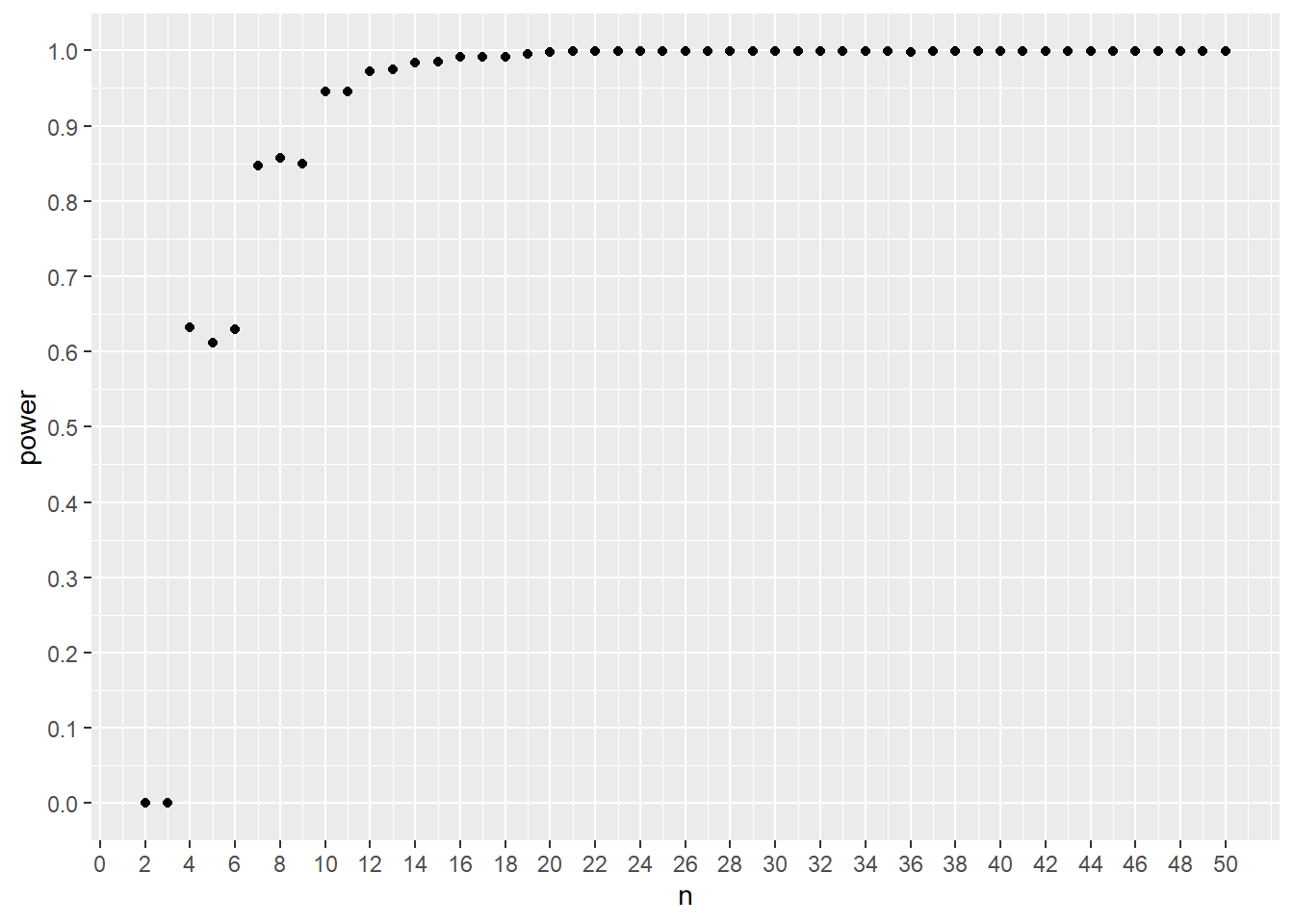
Figure 21.10: A power curve for simulated Wilcox testing for an antidiabetic drug effect.
This result shows that a sample size of 7, 8, or 9 per group would give ~85% power. Thus, a sample size of 7 per group would be the minimal size necessary to test the two-sided null that there is no difference between the groups, at a 95% confidence level.
Notice how the power is discrete for the early runs? That’s a byproduct of the discrete nature of nonparametric sampling distributions.
Think about the general way this Monte Carlo technique worked: simulate, test, repeat that many times, count up the p-values.
It shouldn’t be much of a leap for you to realize this approach can be run for any experimental design. If you know what experiment you want to run, you can simulate how it will work thousands of times in just a few seconds. Minutes at the worst.
21.11 Summary
If you’re used to comparing means of groups, nonparametrics can be somewhat disorienting. There are no parameters to compare! And the concept of location shifts or vague differences seems rather abstract.
The tests transform the values of experimental outcome variables into either sign rank or into rank sum units. That abstraction can be disorientating, too. But it is important to recognize that sign ranks and rank sum distributions are approximately normal.
Therefore, perhaps its best to think of nonparametrics as a way to transform non-normal data into more normal data, from which predictable p-values can be derived.
The nonparametrics are powerful statistical tests that should be used more widely than they are.
Power analysis is really important when designing experiments. It allows you to determine a proper sample size to give your idea the severe test it deserves. The process can also help you evaluate the feasibility and even cost of an experiment. Are there enough mice in the world to test your idea? Will you still be young after doing your laborious protocol on as many replicates as the power analysis suggests is necessary?
Embrace the Monte Carlo technique if you agree it is better to try to work out these questions over the course of a few hours coding in R, rather than jumping into a rabbit hole and hoping for an exit.
For a comprehensive list of distribution functions in R see https://cran.r-project.org/web/views/Distributions.html↩︎