Chapter 49 Classification
library(tidyverse)
library(factoextra)
library(viridis)
library(cluster)
library(clustertend)
Data classification is an important first step in exploratory data analysis. The various statistical classification methods share in common an ability to build explanatory groups data sets that have many measurements. The motivations to do this are many-fold: segmentation analysis, identifying underlying structure, reducing complexity to fewer explanatory dimensions.
These classification techniques replace impulses to draw groupings arbitraily. As such they are referred to by the jargon term “unsupervised.” The researcher supervises the algorithm and setting up the data, but thereafter the algorithm operates unsupervised, drawing the groupings where the groupings best fit.
Recently, it has become common to refer to cluster analysis as unsupervised machine learning.
49.1 Distances
Cluster analysis is based upon minimizing distances between coordinates of centroids (imaginary points representing the centers of a cluster) and the coordinate pairs for every point within a cluster. These distances are no different than the variates or deviates or residuals that we’ve encountered already in the course.
There are several options for calculating these distances. Like many things in statistics, these just represent different ways to solve the same problem.
The code below illustrates how distance calculations are made using Euclidian, Manhattan and Pearson methods. The Pearson method, of course, is also known as correlation, and has been covered previously. If optional for a given function, iterating through these or other distance calculations can sometimes help drive a solution for balky datasets.
set.seed(1234)
x <- sample(11:20, replace=F)
y <- sample(1:10, replace=F)
paste("Euclidian:", sqrt(sum((x-y)^2)))
## [1] "Euclidian: 34.2636833980236"paste("Manhattan:", sum(abs(x-y)))## [1] "Manhattan: 100"paste("Pearson:", 1-(sum((x-mean(x))*(y-mean(y))))/(sqrt(sum((x-mean(x))^2*sum((y-mean(y))^2)))))## [1] "Pearson: 1.05454545454545"49.2 Clustering methods
Cluster analysis is the most common classification technique. Clustering’s goal is to separate data groups in a way that minimizes intragroup variation while maximizing intergroup variation.
Cluster analysis techniques themselves can be clustered! Partition clustering includes k-means, partition around medioids (PAM) and clustering large applications (CLARA). Heirarchical clustering can be either agglomerative or divisive.
In clustering, although the researcher is not involved in deciding which data points belong in which clusters or dendroids, it is sometimes necessary to make a decision on how many clusters to include in the model.
49.3 Principal component analysis
Principal component analysis (PCA) is a method used in identifying the number of clusters to model. The method works to reduce the dimensional complexity of a matrix of measurements. A simple experiment with 4 explanatory groups each generating many measurements (for example, measuring the expression of many genes simultaneously), \(p\), has \(p(p-1)/2 = 6\) dimensions. These could be viewed, for example, by drawing all 6 possible correlations between the 4 groups.
If you’ve ever looked at a large correlation matrix you probably got lost pretty quickly.
PCA offers the ability to reduce the complexity to a fewer number of principal explanatory dimensions. We can think of these as latent grouping variables. The more groups in the experiment, the more necessary it becomes to be less concerned about dimensions of the data that don’t allow for much explanatory insight. NCSS has a very thorough mathematical and practical treatment of principal components if you are interested in learning more.
49.4 Synthesize some data
Simulated data are used here to illustrate how to run cluster analysis using R. We’ll see how well the technique works to identify the four groups that are built into the dataset.
The data below are 1000 simulated random normal measurements (rows) for each of 4 groups (columns). Each group is built to have a unique combination of measurements from a continuous scale. The four groups correspond to four variables called “foo,” “fu,” “foei,” and “fuz.”
You can imagine what df might be. For example, every row might represent a unique mRNA id. Every column might represent a different cell type or tissue. Every value is an expression level in some kind of units. Obviously, from the code, we can see they each are sampled from N(mu, sigma).
Note, df is a matrix object, not a dataframe.
#create a matrix
set.seed(1234)
df <-  rbind(
cbind(rnorm(250, 1, 10),
      rnorm(250, 3, 10),
      rnorm(250, 10, 10),
      rnorm(250, 30, 10)
      ),
cbind(rnorm(250, 30, 10),
      rnorm(250, 10, 10),
      rnorm(250, 3, 10),
      rnorm(250, 1, 10)
      ),
cbind(rnorm(250, 1, 10),
      rnorm(250, 30, 10),
      rnorm(250, 3, 10),
      rnorm(250, 100, 10)
      ),
cbind(rnorm(250, 3, 10),
      rnorm(250, 10, 10),
      rnorm(250, 30, 10),
      rnorm(250, 100, 10)
      )
)
Some housekeeping: Add column names. Randomize the row to order in the data set just to mix things up. Add row names after randomizing the cases. Note that the final product is a matrix, not a data frame. Because we need to feed a matrix into the cluster analysis functions.
#add column names
colnames(df) <- c("foo", "fu", "foei", "fuz")

#randomize cases by row

df <- df[sample(1:nrow(df)), ]

#add case id's to each row. note how this keeps the overall dataset matrix.

row.names(df) <- paste("S", 1:nrow(df), sep="")
49.5 Visualize the data set
First some housekeeping: Create a data frame because ggplot needs one, which includes creating an id variable for the x-axis. Make it long.
id <- row.names(df)
df1 <- data.frame(id,df) %>%
  pivot_longer(-id,
               names_to="variable",
               values_to="value")
This is just a plot of some randomly selected rows. To some extent, they just look like random crappy data. The point is, looking at this you wouldn’t probably imagine these datapoints come from a dataset with an underlying clustered structure.
ggplot(df1, aes(id, value, color=variable))+
  geom_point(shape=1,size=4)+
  scale_color_viridis_d()+
  scale_x_discrete(limits=c("S3", "S232", "S236", "S582", "S704", "S757" ))+
  labs(y="value of variable", x="case id", title="4 variables (by color) measured in each of 6 cases (for examples)")+
  theme_classic()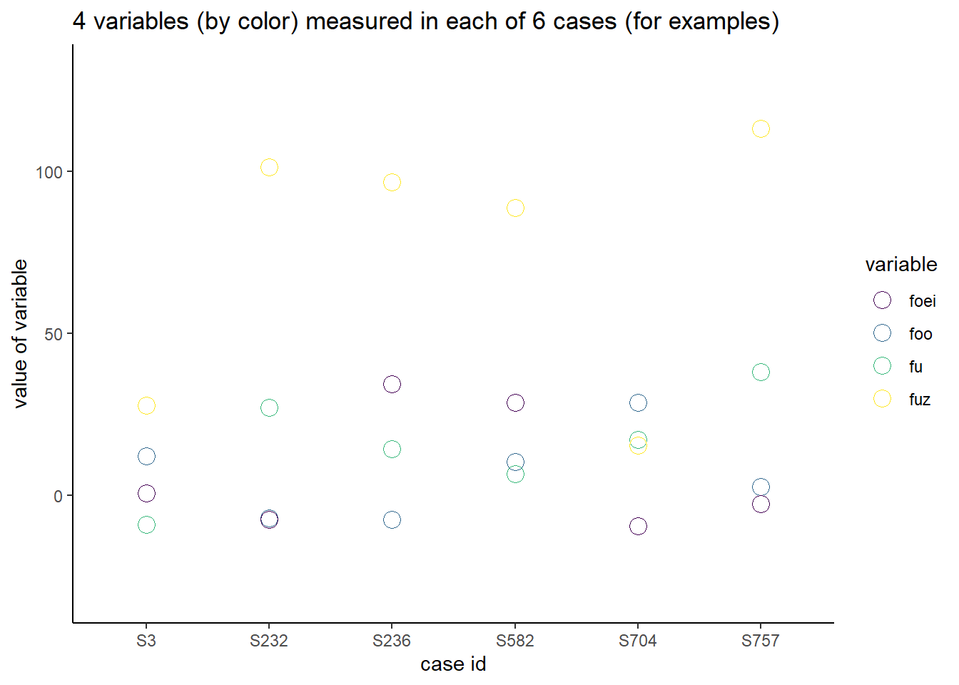
Figure 49.1: Representative row samples drawn from data set.
Now here is a plot of all the data. It is a bit more evident of some structure. Many, but not all, of the fuz variable is much higher than the others. But with the others it is hard to see any structure.
ggplot(df1, aes(id, value, color=variable))+
  geom_point(shape=1, size=2)+
  scale_color_viridis_d()+
  scale_x_discrete(breaks=NULL)+
  labs(y="value of variable", x="case id", title="4 dependent variables (by color) measured in each of 1000 cases")+
  theme_classic()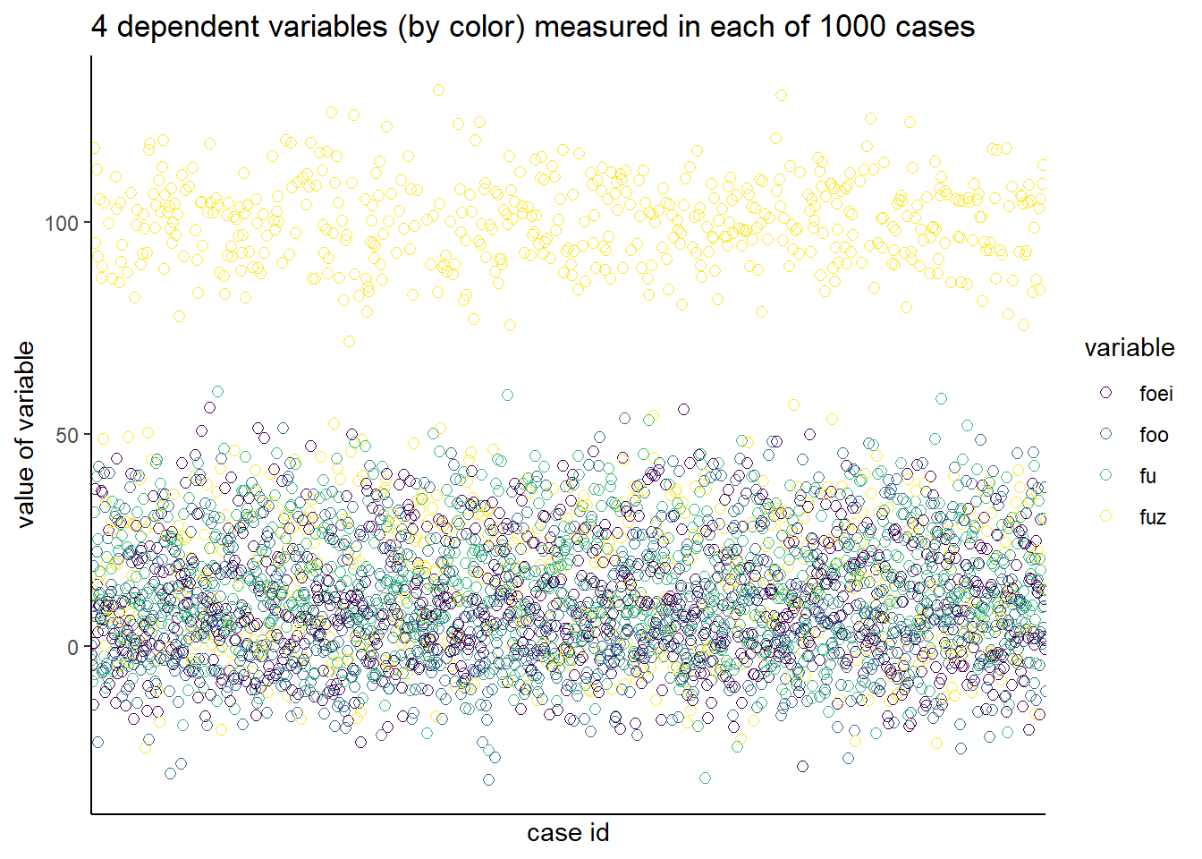
Figure 49.2: All of the data values plotted.
49.6 Rescaling data
Each dependent variable needs to be on the same scale as all others. That’s accomplished by rescaling the data. One way is z-standardization. This z-transforms each column of df. Note how this is a matrix. We’ll be passing this matrix into the clustering functions.
df2 <- scale(df)But first, let’s look at the standardized data. we have to first make a dataframe out of the df2 matrix. Still a hint of some structure due to fuz, otherwise, not so much.
df3 <- data.frame(id, df2) %>% pivot_longer(-id, names_to="variable", values_to="value")

ggplot(df3, aes(id, value, color=variable))+
  geom_point(shape=1, size=2)+
  scale_color_viridis_d()+
  scale_x_discrete(breaks=NULL)+
  labs(y="z-score variable", x="1000 cases", title="4 STANDARDIZED variables (by color) in each of 1000 cases")+
  theme_classic()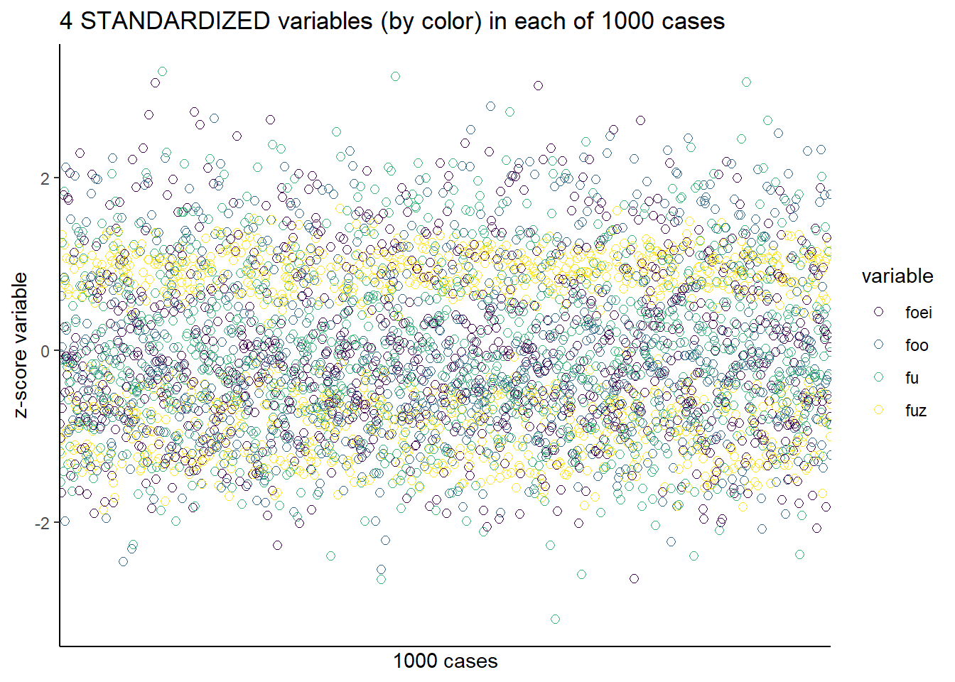
Figure 49.3: Log transformed data set.
49.7 Are there clusters?
Principal component analysis identifies the principal components, which will be used to decide how many clusters to model.
pr <- prcomp(df2, scale. = F, center = T)
summary(pr)
## Importance of components:
## PC1 PC2 PC3 PC4
## Standard deviation 1.3589 1.0926 0.8308 0.51918
## Proportion of Variance 0.4616 0.2984 0.1725 0.06739
## Cumulative Proportion 0.4616 0.7601 0.9326 1.00000From the summary output we see that the first principal component explains 46.16% of the variance, PC2 explains 29.84% of the variance, while PC3 and PC4 explain successively less variance.
The default output of the prcomp is the “rotation” table. The values are the eigenvalues of the covariance matrix. They are best thought of as the coefficients (linear predictors) for each of the eigenvectors.
pr## Standard deviations (1, .., p=4):
## [1] 1.3588598 1.0926165 0.8307504 0.5191753
##
## Rotation (n x k) = (4 x 4):
## PC1 PC2 PC3 PC4
## foo 0.5534303 -0.11290119 0.7485530 -0.3473279
## fu -0.3168913 -0.75306737 0.3375968 0.4674375
## foei -0.3761199 0.64094934 0.5509381 0.3797170
## fuz -0.6721820 -0.09657536 0.1488758 -0.7188050The \(x\) table is perhaps the most useful. It provides the \(x,y\) coordinates for plotting clusters for all of the replicates.
head(pr$x)## PC1 PC2 PC3 PC4
## S1 1.081396 0.49837980 -1.4214491 0.05566199
## S2 2.166028 -0.08855379 0.1352516 -0.33131648
## S3 1.328890 0.80113921 -0.8603810 -0.58532180
## S4 -1.893312 0.45258854 0.4644622 0.24081669
## S5 1.340275 0.45462150 0.7926811 0.22741040
## S6 -1.043440 1.00173799 2.1027785 0.29594449Here’s a way to visualize all of the data on the basis of it’s first two principal components: Dim1 and Dim2. We’ll always see the greatest separation by running a correlation plot between the first two dimensions.
fviz_pca_ind(prcomp(df2),
geom="point")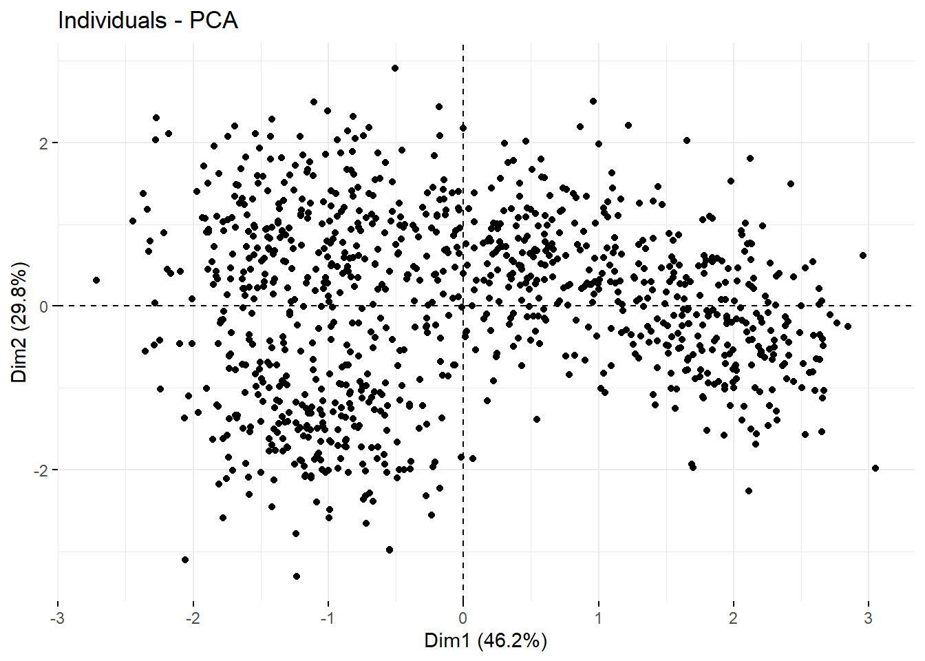 Here’s correlation plot between the first two principal components for a uniform distribution of objects, for comparison. It would take an active imagination to draw out clusters from this. It’s pretty uniform.
set.seed(12345)
sn <- matrix(c(rnorm(1000, 0,1), rnorm(1000, 0, 1)), ncol=2, nrow=500)
prcomp(sn, scale. = F, center = F)
## Standard deviations (1, .., p=2):
## [1] 1.0073077 0.9932779
##
## Rotation (n x k) = (2 x 2):
## PC1 PC2
## [1,] -0.1470789 0.9891248
## [2,] 0.9891248 0.1470789fviz_pca_ind(prcomp(sn),
geom="point")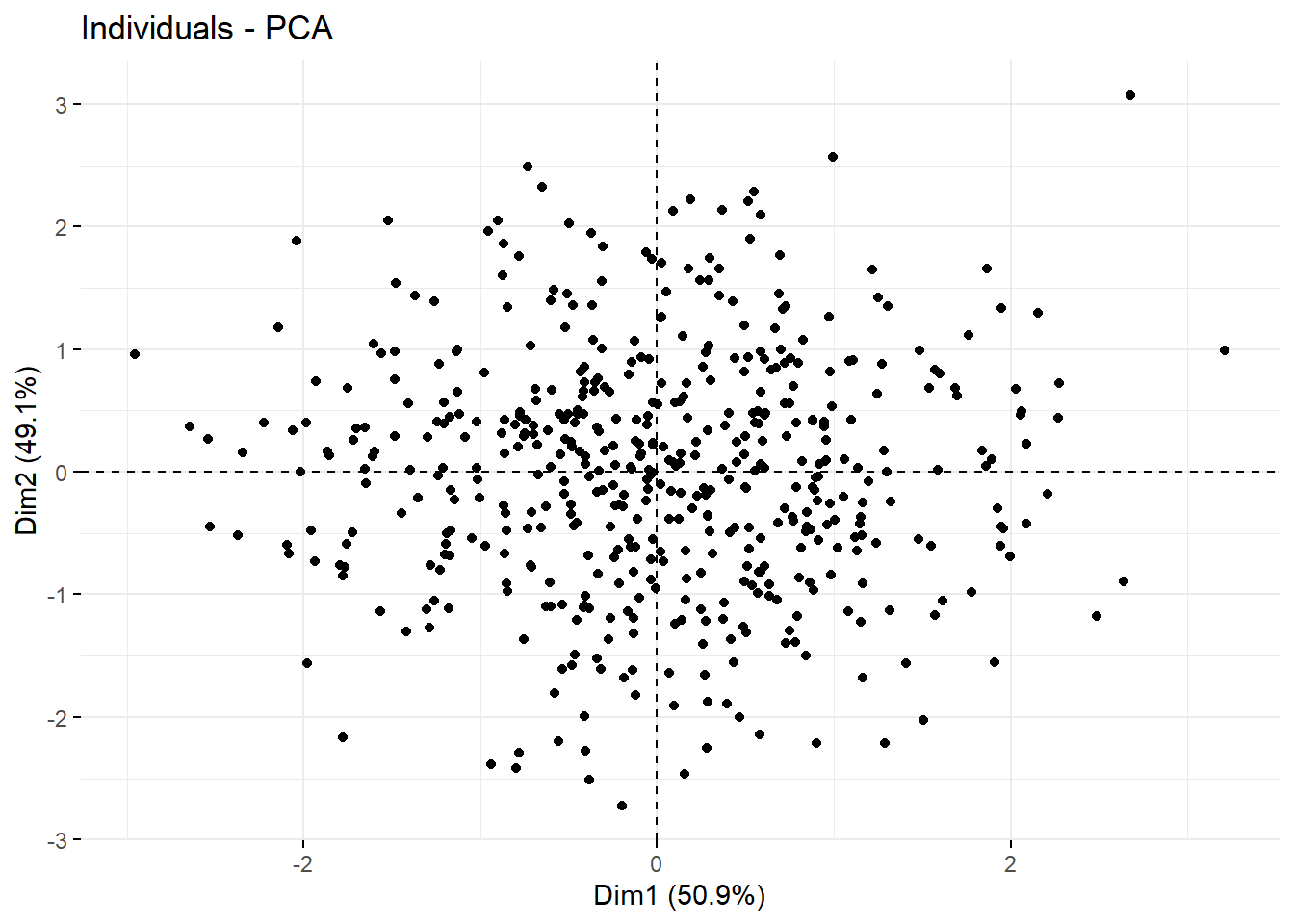
49.8 How many clusters?
fviz_nbclust(df2, kmeans, method="wss")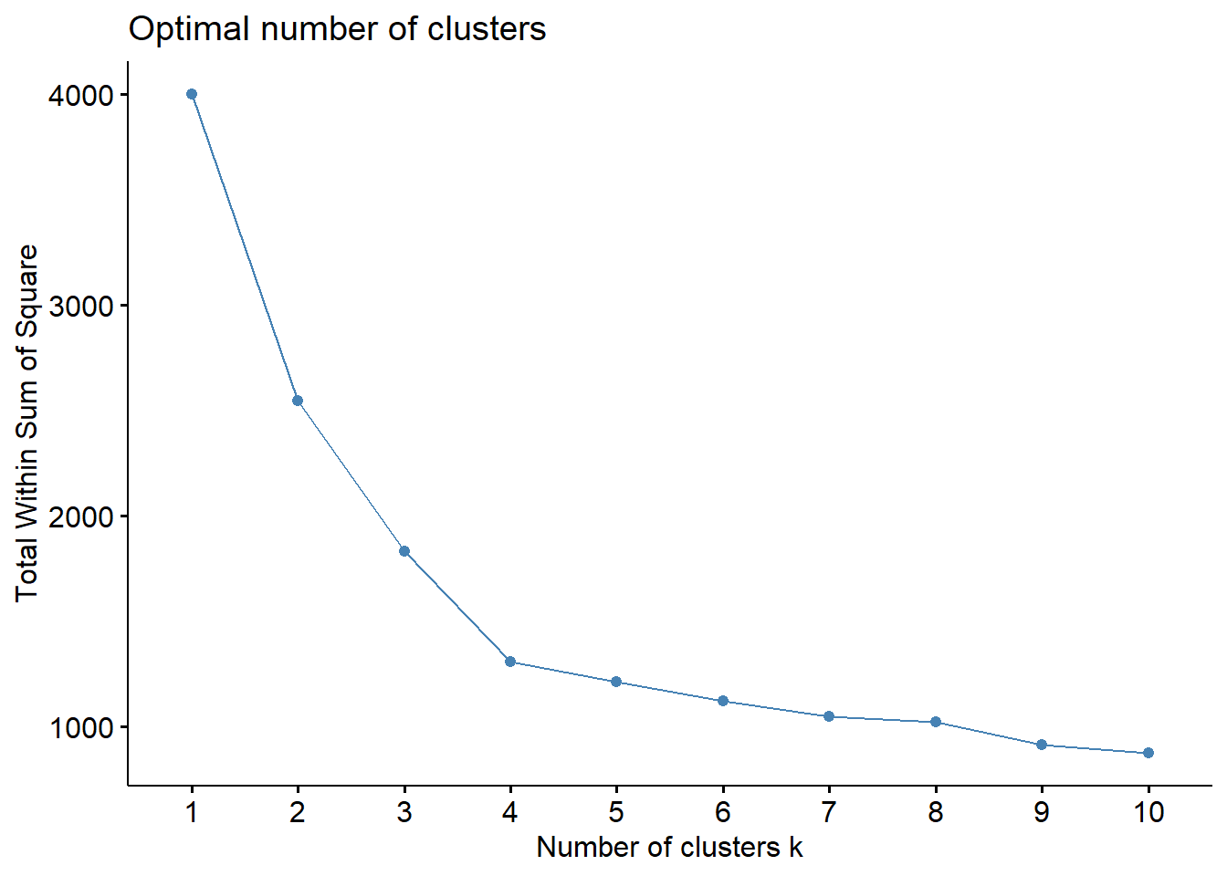
This is known as a “scree” plot. It’s useful as a tool to make decisions about how many clusters to model. It shows the amount of variation each dimension can explain.
The critical question in clustering is how many dimensions should be modeled? If we model them all we can explain all of the variation by a large number of clusters. But that’s over-fitting. Statistical models with too many parameters are always harder to interpret and to explain.
Let’s move through the points from the top left on down the curve. The segment between points 1 and 2 explain a LOT of variation; more than a quarter and less than one-half of the total variation. We can think of this segment as the first principal component or the first dimension of the data set.
The segment between points 2 and 3 explains a lot more variation, but less variation than explained by the first. Perhaps not quite 1/4th of the overall variation is explained by this second principal component, or 2nd dimension.
So does the segment between points 3 and 4 seems to explain about 1/8th of the overal variation. It is the 3rd principal component, or 3rd dimension.
The segment between points 4 and 5 accounts for a lot less variation, as do the segments through each of the succeeding points.
At the “elbow” the additional segments are not explaining that much more variation. In other words, to model more clusters becomes something of an over-fit. It’s arguable to say the segment between 4 and 5 is really explaining a good amount of variation.
The take away from this scree plot is that the data are explained probably by 3 clusters, maybe by 4 clusters. The bloody obvious test will be used to decide.
The silhouette method is another way to decide on the number of clusters. The idea is to the peak average silhouette width == the number of clusters to model. YMMV. If not, the number just below the peak.
fviz_nbclust(df2, kmeans, method="silhouette")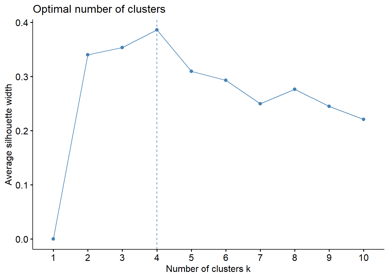
49.9 Clustering
The function kmeans does the clustering given a number of clusters to model. Here it is instructed fit a 3 cluster model to the data. It assigns every row to one of these 3 model clusters.
Explore the object kmdf2, because it is packed with information. Note how it assigns every row to a cluster.
km.df2 <- kmeans(df2, centers=3, nstart=100)Aggregate is a good way to subset the clusters by the grouping variables. Aggregate says, "Given the three clusters, here are their values for each of the grouping variables. If you prefer, you could add the cluster ID to a dataframe along with df2, and then use group_by and summarize to do the same thing.
aggregate(df, by=list(cluster=km.df2$cluster), mean)## cluster foo fu foei fuz
## 1 1 0.8173983 30.669165 2.263343 97.62785
## 2 2 1.5462796 9.145715 27.293735 86.44426
## 3 3 19.1839140 6.814412 3.746465 12.90336For example, the average values of the foo variable in each of the 3 clusters are 1.5, 0.8 and 19.2.
And we can visualize the clusters. Note, we’re passing in the kmeans model of 3 clusters into this. Toggle the ellipse argument
fviz_cluster(km.df2, data=df,
             palette=c("#440154FF", "#39568CFF", "#1F968BFF", "#73D055FF"),
             geom="point",
             ellipse=F,
             shape=1,
             pointsize=4,
             ggtheme=theme_bw())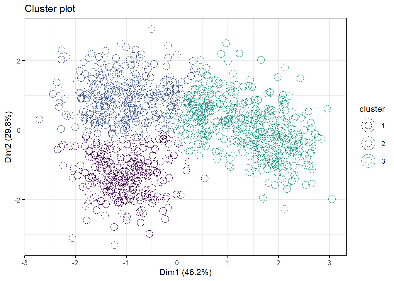
Now let’s model this with 4 clusters. We recreate the km.df2 object, check the aggregate. Toggle the ellipse on and off. What do you think? Is this a better fit than 3 clusters?
km.df2 <- kmeans(df2, 4, nstart=100)
aggregate(df, by=list(cluster=km.df2$cluster), mean)
## cluster foo fu foei fuz
## 1 1 1.1075641 31.329134 2.434274 99.879498
## 2 2 30.0729920 10.759380 2.105854 4.179751
## 3 3 -0.2360265 2.161194 8.770106 29.889766
## 4 4 3.5135916 10.512234 29.754152 98.821411fviz_cluster(km.df2, data=df,
palette=c("#440154FF", "#39568CFF", "#1F968BFF", "#73D055FF"),
geom="point",
ellipse=F,
shape=1,
pointsize=4,
ggtheme=theme_bw())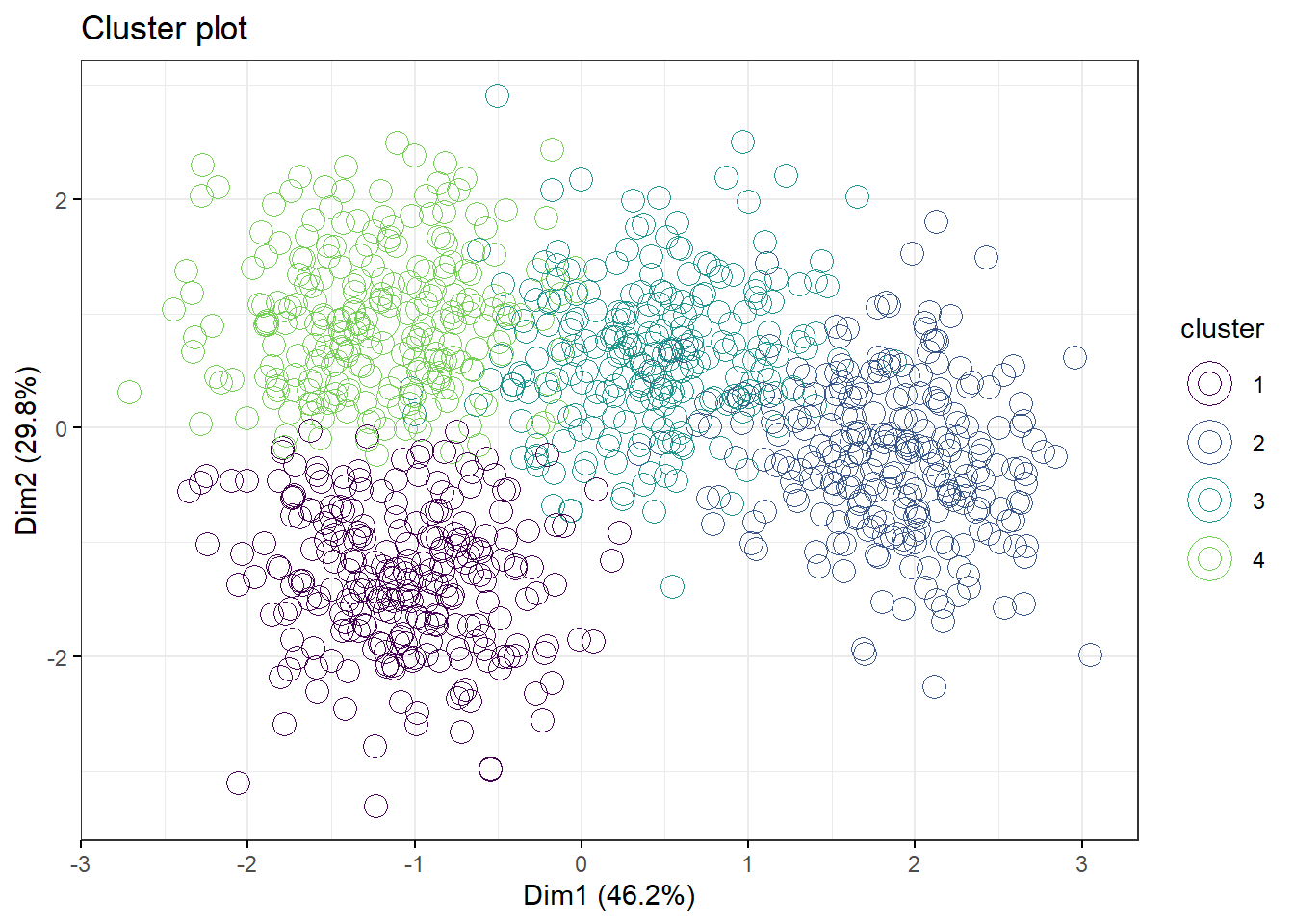
49.10 PAM and CLARA
PAM and CLARA are alternative algorithms to kmeans. All three are likely to correlate pretty well but note how PAM and kmeans differ quite markedly in the 3 cluster model, yet arrive at about the same clustering for the 4 cluster model.
pam.df2 <- pam(df2, 4)
fviz_cluster(pam.df2,
             palette=c("#440154FF", "#39568CFF", "#1F968BFF", "#73D055FF"),
             geom="point",
             ellipse=F,
             shape=1,
             pointsize=4,
             ggtheme=theme_bw())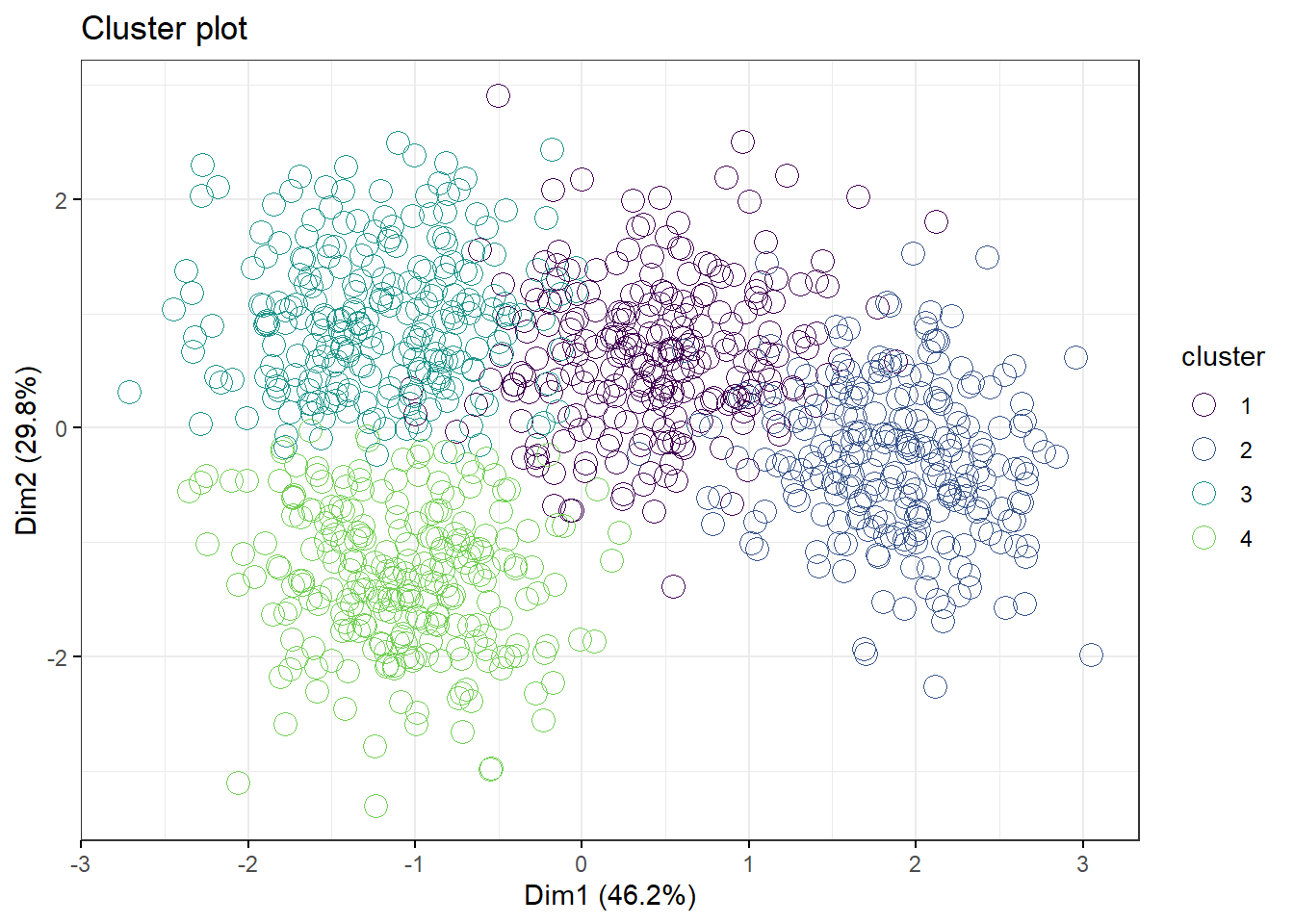
pam.df2 <- pam(df2, 3)
fviz_cluster(pam.df2,
             palette=c("#440154FF", "#39568CFF", "#1F968BFF", "#73D055FF"),
             geom="point",
             ellipse=F,
             shape=1,
             pointsize=4,
             ggtheme=theme_bw())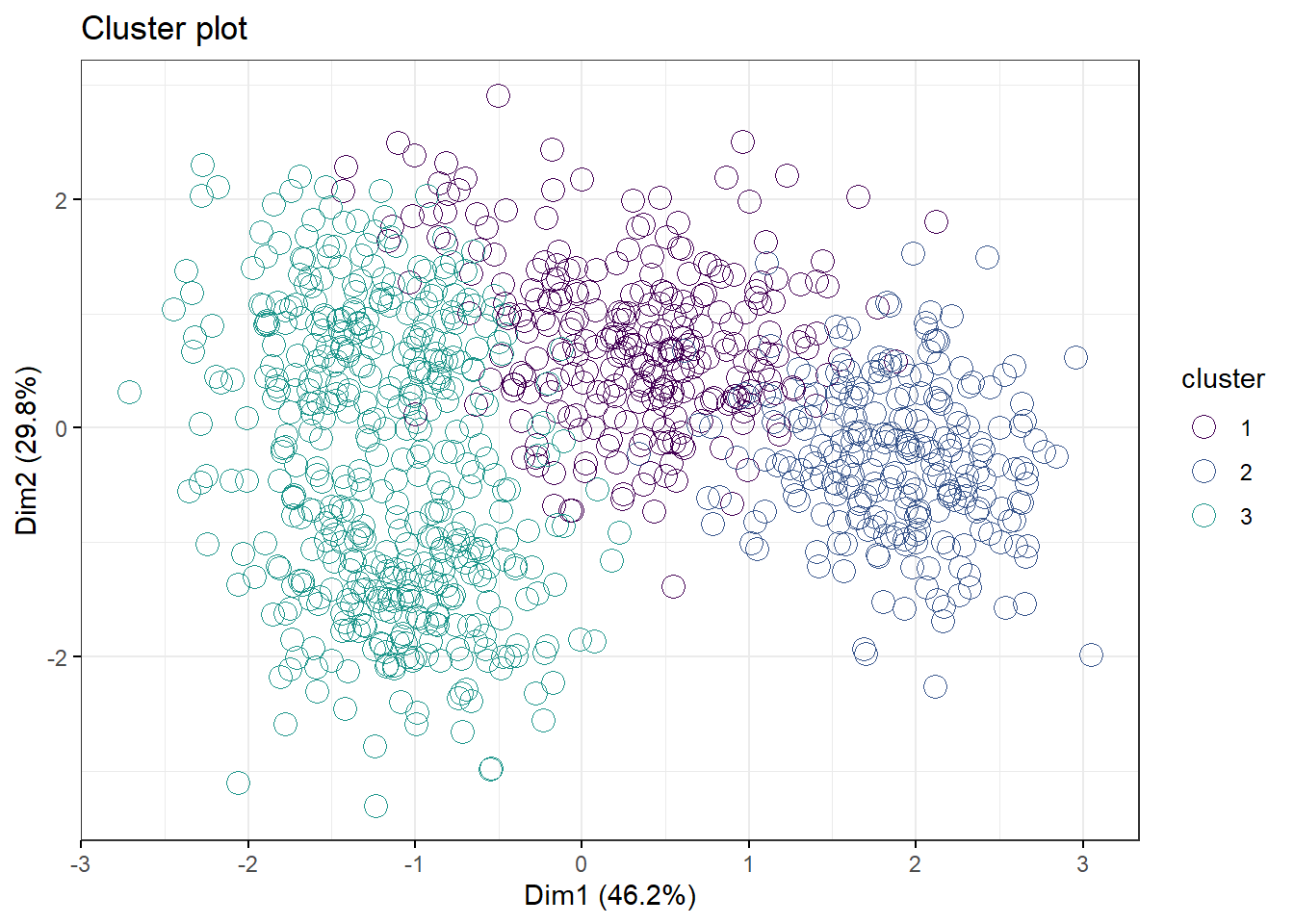
49.11 Hierarchical clustering
Hierarchical clustering is a step more informative than kmeans clustering because it provides information about relationships between clusters.
We start with the data set matrix, dffrom above. Agglomerative hierarchical clustering is performed using the agnes function. Agglomerative operates by using each measurement as a seed, to which the most similar other measurements are merged. This turns out to be fairly intensive, computationally, compared to the previous techniques. Exect delays.
As in kmeans, we define the number of clusters the algorithm should model.
rag <- agnes(x=df, stand=T, metric="euclidian", method="ward")
fviz_dend(rag, cex=0.01, k=4)
## Warning: `guides(<scale> = FALSE)` is deprecated. Please use `guides(<scale> =
## "none")` instead.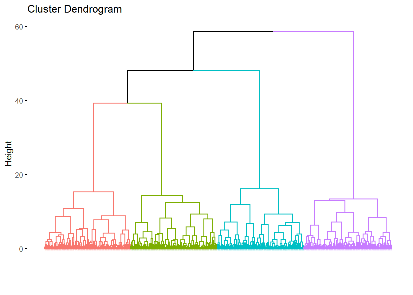
The interpretation of these output is fairly straight forward. Any two closely linked elements have less distance between them than to elements to which they are less closely linked.
For example, in the figure above the orange and green clusters are more related to each other than they are to the blue, and all three are more related than any one is to the purple.
Divisive hierarchical clustering is performed using the diana function. This operates opposite of agglomerative clustering. All measurements begin in a single cluster and then are successively divided into heterogenous clusters.
rdi <- diana(x=df, stand=T, metric="euclidian")
fviz_dend(rdi, cex=0.01, k=4, method="ward")
## Warning: `guides(<scale> = FALSE)` is deprecated. Please use `guides(<scale> =
## "none")` instead.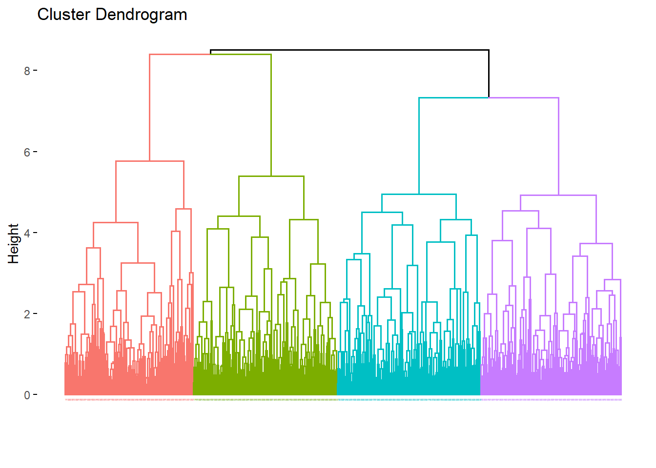
The output differences between the two hierarchical techniques are subtle but clearly evident. They are different algorithms and therefore they provide different results. Neither is more wrong than the other.
There are several additional hierarchical vizualizations that are possible, phylogenic trees, circular dendrograms, and more.
49.12 Heatmaps
Heatmaps are just a visual descriptive technique to pair the magnitude of measurements with hierarchical clusters. This particular function is also performing some clustering. This viz pretty much makes the case for four clusters. But the function’s arguments could be modified to see how well that holds.
heatmap(df2, scale="column")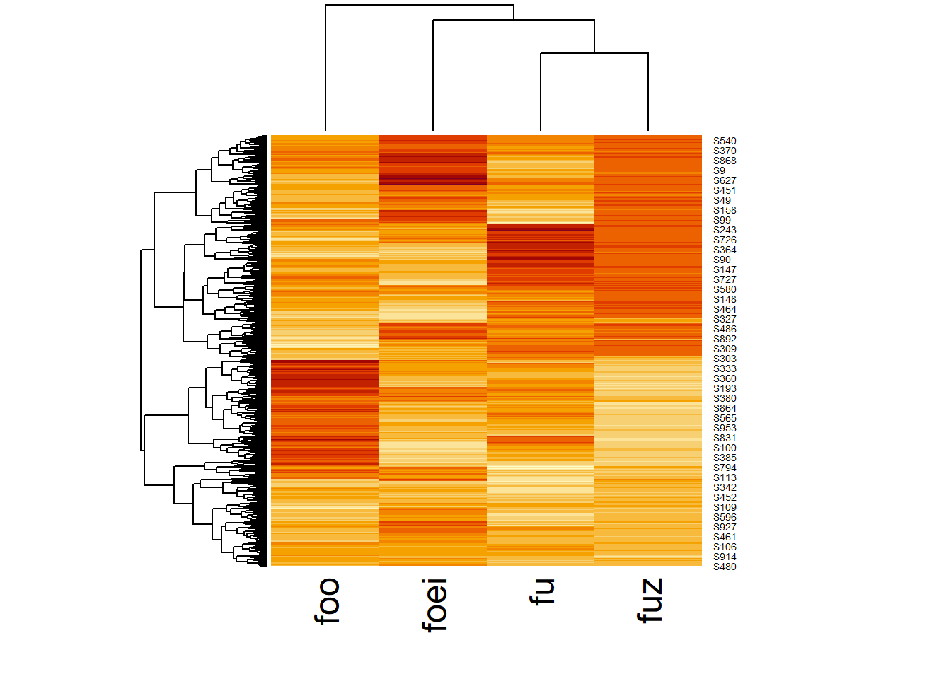
49.13 Summary
Classification techniques using R are probably the main gateway to exploratory data analysis. Once cluster grouping has been determined, the sky is the limit for how that information can be explored further.
We haven’t talked about inferential methods. It is possible to make inferential decisions about the value of some outcome, particularly in consideration of alternatives.