Chapter 42 Nested-model nonlinear regression
It’s like the difference between a glove that has five fingers instead of three. When you have five fingers, you’d expect a five finger glove to fit better. If you were missing two fingers, a three finger glove would be a better fit.
library(tidyverse)
library(broom)
library(minpack.lm)
library(viridis)
library(knitr)
library(nlfitr)
The most common approach to estimating nonlinear model parameter values is to perform a regression on each independent replicate of an experiment.
After several of these we have a list of replicate values for the parameter of interest. A regression parameter is the dependent variable of the experiment.
In this chapter I’ll go over a nonlinear regression analysis of data from a drug metabolism assay in rat microsomes. The purpose of the assay is to estimate the rate constant for degradation of a drug. The rate constant is the dependent variable for experiments that test hypotheses on factors that might influence metabolism of the drug.
In the next chapter, I’ll illustrate how to work with parameter values from independent replicates in hypotheses tests on whether some condition changes the parameter. In that case, we’ll ask if exposure to tobacco smoke changes theophylline metabolism (it should)
In this chapter I want to illustrate deciding on which of two related nonlinear models serves as a better fit of the data.
The theopOneRep.csv data set is an example of a single replicate of an experiment performed with duplicate measurements of the outcome variable. We’ll use that one replicate to illustrate how to do a nonlinear regression.
The data are from an in vitro drug metabolism assay. A rat liver microsome prep was spiked with the drug theophylline (an ingredient of tea and coffee). At 2 minute intervals over a 2.5 hr period aliquots were withdrawn to measure remaining theophylline levels.
In this instance, the microsomes were derived from a rat that had been treated in a microenvironment laden with cigarette smoke. Hydrocarbons in smoke are known to induce a cytochrome p450 enzyme, CYP1A2, that metabolizes theophylline more rapidly than occurs normally.
The main objective of the nonlinear regression is to determine the rate constants for theophylline decay. The prediction is that exposure of the rats to cigarette smoke will cause two distinct phases of theophylline decay in the microsomes, one with a short half-life, and a second with a longer half-life. These would represent, respectively, the more rapid and the slower metabolism phases.
42.1 Read and plot the data
Get familiar with the structure of the data set.
The data have four variables: * min is time, a continuous predictor variable. * smoke is a discrete predictor variable with only one value in this set where Y = exposed to cigarette smoke. * id is a value assigned to identify the duplicate values, r1 or r2 * theo is theophylline concentration levels, in ng/ml
The data represent one independent replicate with duplicate measurements per time point.
theopOne <- read.csv("datasets/theopOneRep.csv")
str(theopOne)
## 'data.frame': 152 obs. of 5 variables:
## $ X : int 1 2 3 4 5 6 7 8 9 10 ...
## $ min : int 0 2 4 6 8 10 12 14 16 18 ...
## $ smoke: chr "Y" "Y" "Y" "Y" ...
## $ id : chr "r1" "r1" "r1" "r1" ...
## $ theo : num 94.2 80.8 88.5 70.9 63.8 57.1 55.9 65.3 56.9 53.2 ...Here’s a plot of all the data. Notice how the duplicate values from the assay are shown. The curves are on-the-fly nonlinear regression fits that are run within the ggplot function. Below, we’ll run these again to generate results.
ggplot(theopOne, aes(x=min, y=theo))+
  geom_point()+
  #one-phase decay model
  stat_smooth(method="nlsLM",
              method.args=list(
                start=c(yhi=100, ylo=10, k=0.03)),
              formula="y~ylo+((yhi-ylo)*exp(-k*x))",
              se=F #you need this argument to generate nls smooths!!
              )+
  #two-phase decay model
  stat_smooth(method="nlsLM",
              method.args=list(
                start=c(yhi=100, ylo=10, kf=0.05, ks=0.005, pf=0.5)),
              formula="y~ylo + (pf*(yhi-ylo)*(exp(-kf*x))) + ((1-pf)*(yhi-ylo)*(exp(-ks*x)))",
              se=F,
              color="red"
              )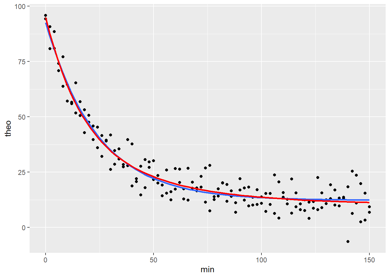
The formulas for the nonlinear models are for both a one-phase first order decay process (blue) and a two-phase process (red). By the bloody obvious test the two seem equivalent fits. But we’ll be able to test, statistically, whether a two-phase first order decay model provides a better fit.
Plotting and running the regression itself are hand-in-glove work tasks. It is hard to overstate the importance of creating these preliminary graphs with regression curves before conducting the regression analysis. Seeing how well your model formula fits the data helps ensure you’ve written the formula correctly. This process will help you interpret the regression output.
A forewarning: Getting these models to regress onto data properly for these plots takes some patience.
Some tips:
Sometimes it’s possible to draw a curve without providing a start list for parameter estimates in the
method.argsargument. Usually it is not. If having trouble also theselfStartargument innlsLM.Note the formula in ggplot is of the general form
y ~ xrather thantheo ~ min. Use the general form notation in these stat_smooth functions!Make sure the formula segments are properly demarcated using parenthesis. For example
yhi-ylo*exp(-k*x)is not the same as(yhi-ylo)*exp(-k*x).Curves won’t draw in ggplot without the
se=Fargument! Be sure to add it.Does it fail to converge on a solution? Try different algorithms (
plinearorport) rather than the Gauss-Newton default. You might also try using thenlsLMfunction for itsL-Malgorithm, which is not available innls.Fix the values of nonessential parameters. For example, set
yhi=100, particularly if the data have already been transformed to %max.The data may just be crappy. You may need more or better data points for a curve to run.
The more parameters you need to fit, the less likely the formula converges to a solution.
If stat_smooth() fails to draw a curve, use stat_function(), which involves writing the function and imputing some values for the parameters.
42.2 Which model is a better fit?
The main goal here is to derive drug half-life values. Also, because smoking induces CYP1A2 which metabolizes theophylline more rapidly, we have reason to believe these data might be better fit by a two-phase first order decay model, rather than a one-phase decay model.
We’ll run regressions for both models to derive estimates for the parameter values for each. Then we’ll do an F test to see if the two-site model serves as a better fit. On the basis of this latter test, we’ll make the decision on which parameter values to report for this replicate.
42.2.1 Nonlinear models
Here’s a one-phase model fit. The nls object contains a lot of information. See the broom package to understand the some reporting functions. They’re useful. For example, we could take the augment output directly into ggplot to create a residual plot for the fitted model.
fit1 <- nlsLM(formula=theo~(((yhi-ylo)*exp(-k*min))+ylo),
            data=theopOne,
            start=list(yhi=100, ylo=15, k=0.693/20)
)
fit1
## Nonlinear regression model
## model: theo ~ (((yhi - ylo) * exp(-k * min)) + ylo)
## data: theopOne
## yhi ylo k
## 92.55738 12.32320 0.04196
## residual sum-of-squares: 4596
##
## Number of iterations to convergence: 5
## Achieved convergence tolerance: 1.49e-08Here’s a two-phase model fit.
fit2 <- nlsLM(
  theo~((pf*((yhi-ylo)*exp(-kf*min)))+
          ((1-pf)*((yhi-ylo)*exp(-ks*min)))+
          ylo),
            data=theopOne,
            start=list(
              yhi=115,
              ylo=15,
              pf=0.4,
              kf=0.06,
              ks=0.02)
)
fit2
## Nonlinear regression model
## model: theo ~ ((pf * ((yhi - ylo) * exp(-kf * min))) + ((1 - pf) * ((yhi - ylo) * exp(-ks * min))) + ylo)
## data: theopOne
## yhi ylo pf kf ks
## 94.86701 10.27262 0.62339 0.06155 0.02267
## residual sum-of-squares: 4505
##
## Number of iterations to convergence: 4
## Achieved convergence tolerance: 1.49e-0842.2.2 The nlfitr alternative
The main advantage of using nlfitr is it saves from painstaking formula entry. Otherwise the output is the same. Because it is the same function as above.
nlfit1 <- fitdecay1(min, theo, theopOne,
                    k=0.693/20, ylo=15, yhi=100,
                    weigh=F)
nlfit1
## Nonlinear regression model
## model: theo ~ (yhi - ylo) * exp(-1 * k * min) + ylo
## data: data
## k ylo yhi
## 0.04196 12.32320 92.55738
## residual sum-of-squares: 4596
##
## Number of iterations to convergence: 5
## Achieved convergence tolerance: 1.49e-08print("###############break##################")## [1] "###############break##################"nlfit2 <- fitdecay2(min, theo, theopOne,
k1=0.06, k2=0.0001,
range1=10, range2=65,
ylo=15, weigh=F)
nlfit2## Nonlinear regression model
## model: theo ~ range1 * exp(-1 * k1 * min) + range2 * exp(-1 * k2 * min) + ylo
## data: data
## k1 k2 range1 range2 ylo
## 0.06155 0.02267 52.73411 31.86024 10.27268
## residual sum-of-squares: 4505
##
## Number of iterations to convergence: 31
## Achieved convergence tolerance: 1.49e-0842.2.3 Troubleshooting the regression
These nonlinear regressions worked. Sometimes they don’t.
Some of the same tips for plotting a curve apply apply to running the function. In addition, toggling weighting can help when the regression fails to converge. Note here we use the variable names in the data set, rather than \(y\) and \(x\) in the plots.
See for more tips to get the regression to converge to a solution.
42.2.4 Interpreting the parameters
Each model has a table of parameter estimates.
The one-phase model has three parameters, \(yhi\), \(ylo\) and \(k\), the rate constant. The difference between \(yhi\) and \(ylo\) is the dynamic signal range, or span, of the results.
The two-phase model estimates values for these span limits along with three other parameters. \(pf\) estimates the fraction of decay that is in a rapid component. \(kf\) and \(ks\) represent the fast and slow decay rate constants. They correspond to \(k1\) and \(k2\) in nlfitr function.
42.2.4.1 Driven by science
It’s important to put on the scientists hat. Everyone gets one when the start grad school.
Our scientific objectives determine which of these parameters are important to you. Sometimes we are interested in the dynamic range. Other times you are interested in rate constants. Sometimes we are interested in both. Whichever to focus on depends on why we ran the experiment in the first place.
Whether the t-tests in the parameter table have any utility depends upon the experimental design. Recall, they only test whether the value of the parameter differs from zero.
If every data point were independent of every other data point they would have some inferential utility. In this case, where all data points are intrinsically-linked, the t-tests only offer technical utility.
When the value is not different from zero, then that parameter has no predictive effect on values of the response variable. Plug a value of zero into the equation for that parameter to see what it does. This result is our first hint that the two-phase fit is not good.
summary(nlfit2)##
## Formula: theo ~ range1 * exp(-1 * k1 * min) + range2 * exp(-1 * k2 * min) +
## ylo
##
## Parameters:
## Estimate Std. Error t value Pr(>|t|)
## k1 0.06155 0.04129 1.491 0.1382
## k2 0.02267 0.03066 0.739 0.4608
## range1 52.73411 65.61905 0.804 0.4229
## range2 31.86024 63.22695 0.504 0.6151
## ylo 10.27268 3.94703 2.603 0.0102 *
## ---
## Signif. codes: 0 '***' 0.001 '**' 0.01 '*' 0.05 '.' 0.1 ' ' 1
##
## Residual standard error: 5.536 on 147 degrees of freedom
##
## Number of iterations to convergence: 31
## Achieved convergence tolerance: 1.49e-08In contrast, the parameter values for the one-phase fit are different than zero.
summary(nlfit1)##
## Formula: theo ~ (yhi - ylo) * exp(-1 * k * min) + ylo
##
## Parameters:
## Estimate Std. Error t value Pr(>|t|)
## k 0.041957 0.002152 19.50 <2e-16 ***
## ylo 12.323204 0.723317 17.04 <2e-16 ***
## yhi 92.557383 2.177071 42.52 <2e-16 ***
## ---
## Signif. codes: 0 '***' 0.001 '**' 0.01 '*' 0.05 '.' 0.1 ' ' 1
##
## Residual standard error: 5.554 on 149 degrees of freedom
##
## Number of iterations to convergence: 5
## Achieved convergence tolerance: 1.49e-08In this case, these t-tests, which are negative for the rate constants and the fraction parameter, signal that the two-phase fit is not a good one for these data. These t-tests, which are just signal to noise ratios, signal that the parameter estimates for the two-phase model are unreliable.
That is not the case for the one-phase model.
However, we’ll do an F test (below) to conduct formal inference on which model fits better. You’ll see that result is consistent with the technical interpretation of the t-tests.
42.2.5 Residual plots to compare fits
Residual plots are useful to compare fits. Here, the horizontal line at zero represents either model. The residuals for either model are also plotted. These represent the differences between the values of the data and the predicted values for the model at the same levels of \(X\).
The red points are the residuals for the one-phase model. The blue points are the residuals for the two phase model.
We don’t see any remarkable residual differences from their models. Visually, as for the curves, it’s difficult to conclude one model fits better than the other.
#for plotting, create one dataframe with residuals for both models
fits <- bind_cols(augment(nlfit1),
                  augment(nlfit2)[,3:4]) %>%
  rename(fit1=.fitted...3,
         resid1=.resid...4,
         fit2=.fitted...5,
         resid2=.resid...6)
## New names:
## * .fitted -> .fitted...3
## * .resid -> .resid...4
## * .fitted -> .fitted...5
## * .resid -> .resid...6fits## # A tibble: 152 x 6
## theo min fit1 resid1 fit2 resid2
## <dbl> <int> <dbl> <dbl> <dbl> <dbl>
## 1 94.2 0 92.6 1.64 94.9 -0.667
## 2 80.8 2 86.1 -5.30 87.3 -6.55
## 3 88.5 4 80.2 8.34 80.6 7.90
## 4 70.9 6 74.7 -3.80 74.5 -3.63
## 5 63.8 8 69.7 -5.88 69.1 -5.28
## 6 57.1 10 65.1 -7.96 64.2 -7.06
## 7 55.9 12 60.8 -4.92 59.7 -3.84
## 8 65.3 14 56.9 8.38 55.7 9.56
## 9 56.9 16 53.3 3.57 52.1 4.76
## 10 53.2 18 50.0 3.17 48.9 4.33
## # ... with 142 more rowsggplot(fits, aes(min,resid1))+
geom_point(color="red")+
geom_point(aes(min, resid2), color="blue")+
geom_hline(yintercept=0)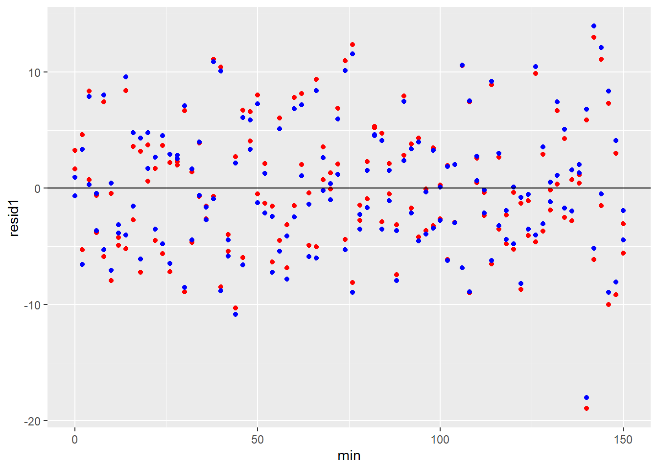 ### F test for model comparison
There are a few ways to choose whether one regression model fits the data better than another. Only one of these methods should be used, and typically, that choice is made in advance of performing an analysis in order to limit bias.
One way to decide which model provides a better fit to the data is using the extra sum of squares F-test.
This F test is constructed as follows: \[F_{df_1, df_2}=\frac{\frac{SSR1-SSR2}{df_1-df_2}}{\frac{SSR2}{df_2}}\]
\(SSR1\) is the sum of the squared residuals for the simpler model, \(SSR2\) is the sum of the squared residuals for the more complex model, and \(df_1\) and \(df_2\) are the degrees of freedom for each, respectively.
Hopefully, you’ve reached a point in your statistical knowledge that you’re getting a good grasp on the concept of residuals, what they mean, and how they are used to calculate variance. They are simply the difference between the data point and the value of the model at a given level of x.
Perhaps it now seems intuitive to you that the best fit model would the the one that produces the lowest residual variance. It’s like the difference between a glove that has five fingers instead of three. When you have five fingers, you’d expect a five finger glove to fit better. If you were missing two fingers, a three finger glove would be a better fit.
Models that fit better have lower residual variance.
This F ratio tests whether the variance of the difference between two models (the numerator) is greater than the variance of the model having more parameters (the denominator).
Or you can think about it like this: The more the fits of the two models differ, the greater the ratio of the variance of the differences to the variance of the model having more parameters.
This test is run by passing the model fits into the anova function as follows:
anova(nlfit1, nlfit2)## Analysis of Variance Table
##
## Model 1: theo ~ (yhi - ylo) * exp(-1 * k * min) + ylo
## Model 2: theo ~ range1 * exp(-1 * k1 * min) + range2 * exp(-1 * k2 * min) + ylo
## Res.Df Res.Sum Sq Df Sum Sq F value Pr(>F)
## 1 149 4595.5
## 2 147 4504.6 2 90.902 1.4832 0.2303The F tests the null hypothesis that the variance for the difference between the two fits is the same as the variance of the two-phase fit.
That F-test value is not extreme for a null F distribution with 2 and 147 degrees of freedom. In terms of decision-making, this test generates a p-value that is greater than the typical type1 error threshold value of 0.05.
Therefore, we elect not to reject the null hypothesis that the ratio of variances of the two fits are the same.
Which all means the the two-phase decay model is unsupported by the data and that we should accept the one-phase model as the better alternative.
This means that the parameter values from the two-phase fit are not interpretable. Their values should be ignored.
42.2.6 Compare AIC
An alternative approach to decide which of two model fits the data better is to compare the Akaike information criterion (AIC) between two models. The BIC is a highly related computation.
The AIC statistic attempts to quantify the quality of the fit for a model by simultaneously accounting for its maximum likelihood and the number of model parameters.
AIC is not standardized, so the value of any one AIC calculation alone is not readily interpreted. However, a comparison to another AIC for a related model can be interpreted. Furthermore, there is no p-value associated with AIC comparison. Instead a sliding scale is used for inference rather than a single threshold.
The AIC is calculated using \(n_{par}\), the degrees of freedom for the log-likelihood estimate which can be derived from the output of running a logLik test on the model fit; \(k\), a per parameter penalty, which is usually set at 2; and the log-likelihood value of a fit, \(logLik\): \[AIC=kn_{par}-2logLik\]
kable(
fits.2 <- bind_rows(
  glance(nlfit1),
  glance(nlfit2)) %>%

  add_column(
    fit=c("fit1", "fit2"),
    .before=T)
)| fit | sigma | isConv | finTol | logLik | AIC | BIC | deviance | df.residual | nobs |
|---|---|---|---|---|---|---|---|---|---|
| fit1 | 5.553593 | TRUE | 0 | -474.7593 | 957.5187 | 969.6142 | 4595.518 | 149 | 152 |
| fit2 | 5.535670 | TRUE | 0 | -473.2409 | 958.4819 | 976.6252 | 4504.616 | 147 | 152 |
The difference between two AIC values compares two fits, always subtracting the fit with the minimal AIC value from the other.
deltaAIC <- fits.2[2,6]-fits.2[1,6]
deltaAIC
## AIC
## 1 0.9632172A loose scale to interpret the difference between two AIC values has been developed based upon an information theory method for comparing distributions called the KL divergence.
To summarize that: When
\(\Delta AIC < 2\) there is substantial support for the model with the larger AIC. \(2<\Delta AIC < 4\) there is strong support for the model with the larger AIC. \(4<\Delta AIC < 7\) there is less support for the model with the larger AIC. \(\Delta AIC > 10\) there is almost no support for the model with the larger AIC.
In practice, you’ll find that application of the AIC comparison process forces you to accept the most parsimonious model unless there is overwhelming evidence that one with more parameters fits better.
You’ll find it works in a way that is very similar to the bloody obvious test.
In the case of our present example, the \(\DeltaAIC\) of 0.96 indicates that their can be little doubt that the one-phase model is the better fit.
42.2.7 Other ways to compare models
For further information on comparing regression models, here’s an excellent resource
42.2.8 Interpretation of this one replicate
These types of experiments generate a lot of data and statistical output. It’s easy to be overwhelmed or to think there is more going on (or needs to be done) than there really is.
Just keep the focus on the scientific objective for the experiment. In this case, all we want is to derive an estimate for a drug half life for this single replicate.
We know from the test of the one- vs- two-phase fits that the parameters from the one-phase model is most appropriate for our objective.
This experiment will be repeated independently multiple times, including analysis of theophylline decay in microsomes prepared from control subjects, unexposed to cigarette smoke. The half-life values will serve as the response variables for this comparison. That’s all done in the next chapter.
That half-life is related to the decay rate constants in the output above by the relationship \(k=\frac {log(2)}{t_{1/2}}\).
To keep things less confusing, let’s stick to solving this by discussing the \(k\) values for now. We’ll calculate \(t_{1/2}\) once that decision is made.
42.2.8.1 Which rate constant parameter is our estimate?
We have to make a decision about which is the right \(k\) value out of all the \(k\) values in the output above.
Because cigarette smoke is known to induce an enzyme that more rapidly metabolizes theophylline, there was a scientific basis to believe that the data might be better fit by a two-phase decay model. That model produces two \(k\) values, \(kf\) and \(ks\). The one-phase model produces only a single \(k\) value.
Which of these models to accept?
I’m a fan of the F-test approach, mostly because I’ve used it a lot in the past. I’m agnostic about whether this or the AIC comparison is a better way to go about selecting the best fit. I’d need to run some simulations to convince my self one is better than the other for a given problem.
The results of the anova F test comparing the two fits guide the decision. That results indicates that the difference in residual variation between the one and two phase models is not greater than would be expected if the two models fit the data differently.
Therefore, we accept the most parsimonious model as the appropriate fit for the data, which is the one-phase model.
Let’s call the regression coefficients up from that one-phase model fit to have another look:
kable(tidy(nlfit1))| term | estimate | std.error | statistic | p.value |
|---|---|---|---|---|
| k | 0.0419568 | 0.0021520 | 19.49628 | 0 |
| ylo | 12.3232038 | 0.7233171 | 17.03707 | 0 |
| yhi | 92.5573834 | 2.1770713 | 42.51463 | 0 |
For this replicate, \(k=0.04195679\).
That’s it. All that data and all of this analysis boils down to extracting just that one simple number.
In fact, we really don’t need anything else in the table. The span between yhi and ylo in this particular problem has no great biological importance. It just says the signal to noise in the system is about an 8X range.
The t-test statistics in the table are created by dividing the estimate value by the standard error. They tests the null hypothesis that the parameter estimate value is equal to zero.
However, this serves no real inferential purpose from this one replicate because this is just an n=1 experiment. All of the data points within this sample are intrinsically-linked. This t-test would only be useful if each data point were independent of all other data points. But that’s not this experimental design.
42.2.9 Alternate analysis
In the example above we did the regression on the average of the technical replicates. That’s not a bad idea sometimes, particularly when the degrees of freedom are fairly low (which is not the case here).
First, average the technical reps for each time point:
#first, average the duplicates
theopOne.avg <- theopOne %>%
  group_by(min) %>%
  summarise(theo=mean(theo)) %>%
  add_column(id="R", .before=T)
Next, run a one-phase first order decay nonlinear regression on the technical replicates. What you’ll see is that the parameter estimates are identical to their values when the duplicates were regressed. :
fit1a <- nlsLM(
  theo~(((yhi-ylo)*exp(-k*min))+ylo),
  data=theopOne.avg,
  start=list(
    yhi=100,
    ylo=15,
    k=0.693/20)
  )

kable(tidy(fit1a), caption="One-phase Fit on Average of Duplicates")| term | estimate | std.error | statistic | p.value |
|---|---|---|---|---|
| yhi | 92.5573833 | 1.6364812 | 56.55878 | 0 |
| ylo | 12.3232038 | 0.5437097 | 22.66504 | 0 |
| k | 0.0419568 | 0.0016177 | 25.93663 | 0 |
kable(glance(fit1a), caption="One-phase Fit on Average of Duplicates")| sigma | isConv | finTol | logLik | AIC | BIC | deviance | df.residual | nobs |
|---|---|---|---|---|---|---|---|---|
| 2.951872 | TRUE | 0 | -188.5743 | 385.1486 | 394.4716 | 636.0889 | 73 | 76 |
fit2a <- nls(
  theo~((pf*((yhi-ylo)*exp(-kf*min)))+
          ((1-pf)*((yhi-ylo)*exp(-ks*min)))+
          ylo),
            data=theopOne.avg,
            start=list(
              yhi=115,
              ylo=15,
              pf=0.4,
              kf=0.06,
              ks=0.02)
)

kable(tidy(fit2a), caption="Two-phase Fit on Average of Duplicates")| term | estimate | std.error | statistic | p.value |
|---|---|---|---|---|
| yhi | 94.8670140 | 2.1294364 | 44.550292 | 0.0000000 |
| ylo | 10.2726207 | 2.9085073 | 3.531922 | 0.0007295 |
| pf | 0.6233894 | 0.5583784 | 1.116428 | 0.2680029 |
| kf | 0.0615519 | 0.0304242 | 2.023119 | 0.0468272 |
| ks | 0.0226730 | 0.0225941 | 1.003492 | 0.3190314 |
kable(glance(fit2a), caption="Two-phase Fit on Average of Duplicates")| sigma | isConv | finTol | logLik | AIC | BIC | deviance | df.residual | nobs |
|---|---|---|---|---|---|---|---|---|
| 2.884241 | TRUE | 7e-06 | -185.7572 | 383.5144 | 397.4988 | 590.6379 | 71 | 76 |
The regression arrives at the exact same value for the rate constant, \(k\) as it does for when the regression was on the duplicates. The deviance (SS) and other measures of variability are lower, as are the degrees of freedom.
42.3 Summary
In this chapter we went through the fairly common problem of running an analysis on technical duplicate measurements within one sample replicate. The first step is to visualize the data and to try to plot a regression line on it. That points you in the right direction in terms of regression model selection.
In this case, we went through a process of running regressions on two nested models before deciding which fit better. That’s something that should be planned in advance because it involves some decisions that could generate biased solutions. Sometimes the scientific issue of choosing between models is not there, and you’d just fit a model and grab the parameters of interest.