Chapter 18 The lognormal distribution
library(cowplot)
library(tidyverse)
18.1 tl;dr
The lognormal distribution is the best way to simulate biological data for power analysis.
18.1.1 Importance
The importance of the lognormal distribution in biology and medicine cannot be over-emphasized. Many of the variables we study in biological systems are inherently lognormal distributed. Lognormal just seems to be the way a lot of biology is wired.
How is lognormal defined?
A variable \(X\) on its natural scale is lognormal distributed when its logarithm, \(Z=ln(X)\), is normal distributed.
Log transformation of \(X\) creates a normal distributed variable \(Z\) that has a mean \(\mu\) and a variance \(\sigma^2\) and a standard deviation \(\sigma\).
Throughout this chapter keep in mind these Greek symbols denote parameters of \(Z\) , the log-transformed variable.
Reciprocally, when \(Z\) is normally distributed then \(X = exp(Z)\) is lognormal distributed.
Although the natural log is used throughout this chapter, this reciprocal relationship of lognormal distributed variables and their log transformations applies for any positive log base value greater than 1. For example, \(X=10^Z\) is lognormal when \(Z=log10(X)\) is normal.
To generalize, a variable \(X\) is lognormal on base \(b\) when
\[\begin{equation} log_b(X) \sim N(\mu,\sigma^2) \tag{18.1} \end{equation}\]18.1.2 Practical importance of this reciprocal relationship
First, it is perfectly fine to conduct parametric statistical testing on log-transformed data rather than on skewed data on its natural scale. Because the log transformed values are less dispersed than the data on its natural scale they tend to better conform to the normality and equal variance assumptions of parametric tests. This is much preferred over throwing away outliers after normality tests.
Second, when planning experiments to determine sample size, for example using Monte Carlo simulations, using lognormal random value generators will better mimic anticipated results than using normal random value generators. Put another way, a sample of lognormal data whose size was planned on the basis of normal data may be underpowered.
18.2 dlnorm
The lognormal probability density function is
\[\begin{equation} p(x)=\frac{1}{x\sigma\sqrt{ 2\pi}}exp(-\frac{(\ln x-\mu)^2}{2\sigma^2}) \tag{18.2} \end{equation}\]Here \(x\) represents the values of the lognormal variable \(X\) on its natural scale. \(\mu\) and \(\sigma\) are the mean and standard deviation of \(\ln X\), which as mentioned above is normally-distributed.
The dlnorm function takes a value \(x\) and returns the value \(p(x)\), which is usually called the density of \(x\). The most likely values of \(X\) will have the highest density values.
Arguments in the the R function dlnorm need careful attention to understand. meanlog and sdlog are NOT the mean and sd of the values of \(X\) on its natural scale. They are the mean and sd of the log-transformed variable \(Z\). They correspond to \(\mu\) and \(\sigma\) as defined above.
Another way to view it is meanlog <- mean(log(X)) and sdlog <- sd(log(X)). Put yet another way, meanlog and sdlog are the mean and standard deviation of the variable \(X\) when transformed onto the log scale.
So dlnorm is a bit mind-blowing. Its argument x is/are value(s) of the variable \(X\) on its natural scale. And its arguments meanlog and sdlog are values of the variable \(Z\), which is log scale.
18.2.2 Using dlnorm
Let’s imagine we study expression of a gene using a fluorescent reporter that we can quantify in arbitrary light units. Let’s imagine that the fluorescent signal is linear over the range of values from 0 to 5, and significant to three digits right of the decimal. The variable has a large dynamic range. Finally, when log transformed, a large collection of values have a meanlog of 0.8 and sdlog of 1.2.
If one day we measured fluorescence and its value is 0.555. It would be weird, but we might want to know the density of that one signal value?
dlnorm(x=0.555, meanlog=0.8, sdlog=1.2)## [1] 0.3066124Alone, a single density for a given value \(x\) is either kind of hard to interpret or not particularly useful. Actually, it is both.
However, densities calculated over a range of of \(x\) values better illuminates the dlnorm function. Because it illustrates the shape of the distribution that the values can take on. In particular, note how the distribution differs for variables with a few alternative values for \(meanlog\) and \(sdlog\). This illustrates that lognormal data can come in an infinite array of shapes and sizes.
range <- c(0,5)
ggplot(data.frame(x=range), aes(x)) +
  stat_function(fun=dlnorm,
                args = list(meanlog=0, sdlog=1), color = "black")+
  stat_function(fun=dlnorm,
                args = list(meanlog=0, sdlog=2), color = "blue")+
  stat_function(fun=dlnorm,
                args = list(meanlog=0.8, sdlog=1.2), color = "brown")+
  scale_y_continuous(name="p(x)", n.breaks=20)+
  scale_x_continuous(name="X", n.breaks=10)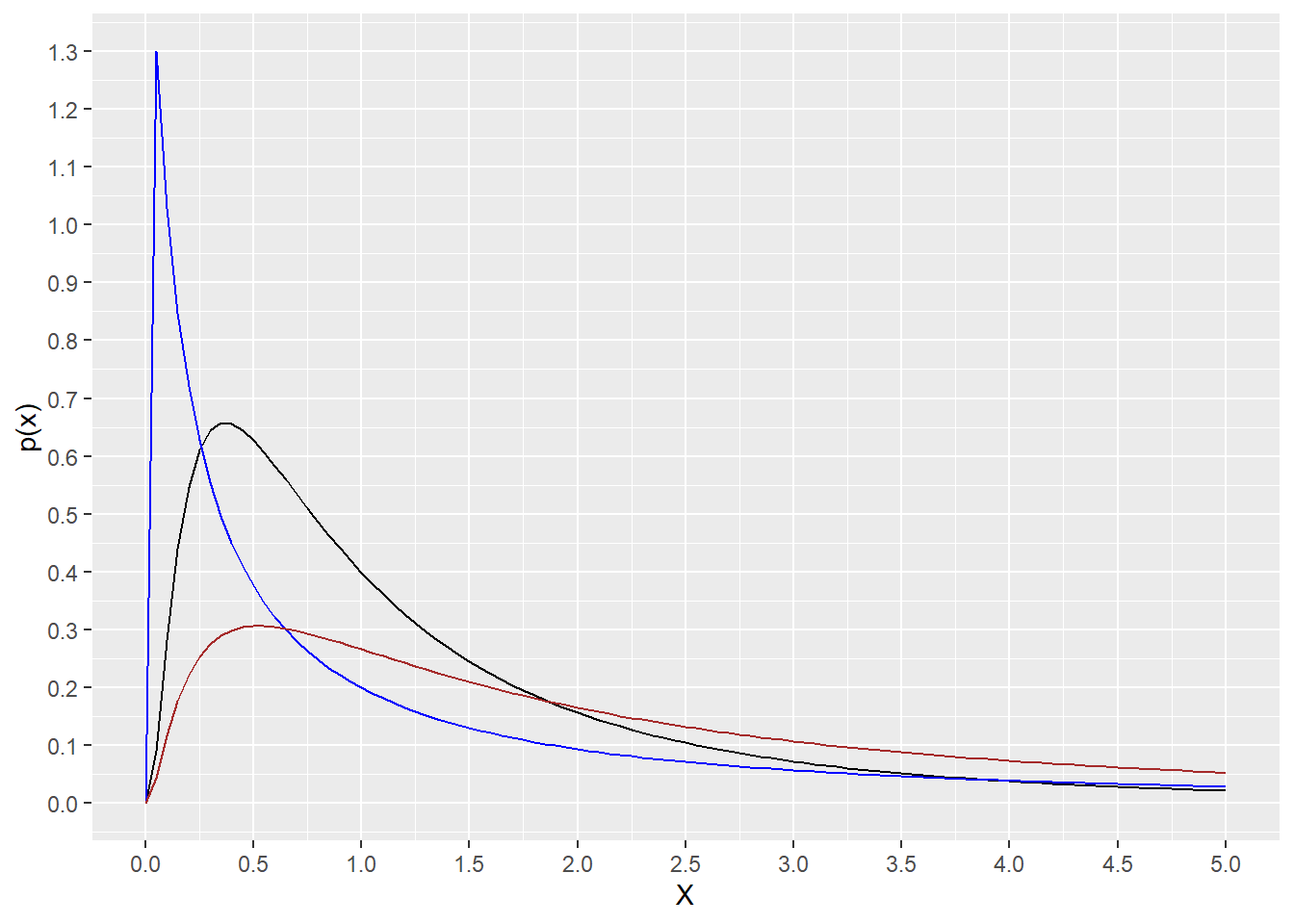
Figure 18.1: Theoretical distributions of variables X that are lognormal.
18.3 plnorm
The lognormal cumulative distribution function is:
\[\begin{equation} p(x) = \Phi(\frac{\ln x}{\sigma}) \tag{18.3} \end{equation}\]where \(\Phi\) is the CDF for the normal distribution (see the pnorm function 17.2).
We use this function to calculate the area under the distribution curve, to the right or left of the quantile entered.
For example, the script below answers the question: What fraction of the area under the curve is to the right of q=0.555
plnorm(0.555, meanlog=0.8, sdlog=1.2, lower.tail=F)## [1] 0.8764297And what fraction is to the left of that value of q?
plnorm(0.555, meanlog=0.8, sdlog=1.2, lower.tail=T)## [1] 0.1235703range <- c(0,5)
ggplot(data.frame(q=range), aes(q)) +
stat_function(fun=plnorm,
args = list(meanlog=0, sdlog=1), color = "black")+
stat_function(fun=plnorm,
args = list(meanlog=0, sdlog=2), color = "blue")+
stat_function(fun=plnorm,
args = list(meanlog=0.8, sdlog=1.2), color = "brown")+
scale_y_continuous(name="p(x)", n.breaks=20)+
scale_x_continuous(name="X", n.breaks=10)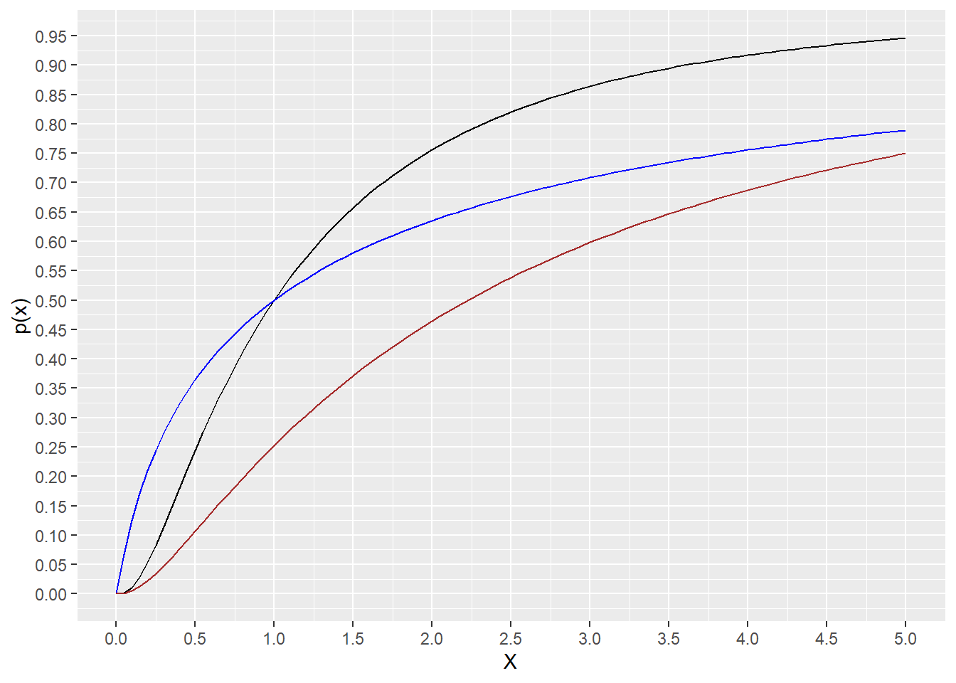
Figure 18.2: Plots of the cumulative distribution for 3 lognormal distributions. See script for details.
18.4 qlnorm
The qlnorm function in R is the inverse of the cumulative distribution function plnorm.
This function takes a percentile as an argument and returns values of the lognormal variable on its natural scale.
The output can answer this question: What value of a lognormal distributed variable on its native scale corresponds to the 50th percentile?.
qlnorm(0.5, meanlog=0.8, sdlog=1.2)## [1] 2.225541Thus, half of all values of \(X\) are less than 2.225541.
range <- c(0,1)
ggplot(data.frame(p=range), aes(x=p)) +
  stat_function(fun=qlnorm,
                args = list(meanlog=0, sdlog=1), color = "black")+
  stat_function(fun=qlnorm,
                args = list(meanlog=0, sdlog=2), color = "blue")+
  stat_function(fun=qlnorm,
                args = list(meanlog=0.8, sdlog=1.2), color = "brown")+
  scale_y_continuous(name="X", limits=c(0, 10), n.breaks=20)+
  scale_x_continuous(name="p(x)", n.breaks=10)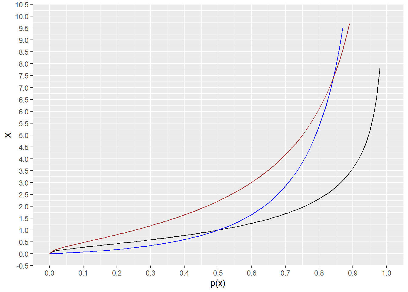
Figure 18.3: Plots of the inverse cumulative distribution
18.5 rlnorm
R’s rlnorm function is used to simulate \(n\) values of a lognormal variable with any parameter values for \(meanlog\) and \(sdlog\). The values generated by the rlnorm function are on the natural scale of the variable.
Let’s imagine 100 measurements of that fluorescent reporter gene in arbitrary light units. A scatter plot of the simulated data on its natural scale, sampled from a lognormal population along with the data log-transformed, would look something like this:
set.seed(8675309)
p1 <- ggplot(data=tibble(fluorescence=rlnorm(n=100, meanlog=0.8, sdlog=1.2),
                   gene="gene"),
       aes(x=gene, y=fluorescence))+
  geom_jitter(width = 0.2, size=3, alpha=0.5)
p2 <- ggplot(data=tibble(log_fluorescence=log(rlnorm(100, meanlog=0.8, sdlog=1.2)),
                   gene="gene"),
       aes(x=gene, y=log_fluorescence))+
  geom_jitter(width = 0.2, size=3, alpha=0.5)
plot_grid(p1, p2)
## Warning in (function (kind = NULL, normal.kind = NULL, sample.kind = NULL) :
## non-uniform 'Rounding' sampler used
## Warning in (function (kind = NULL, normal.kind = NULL, sample.kind = NULL) :
## non-uniform 'Rounding' sampler used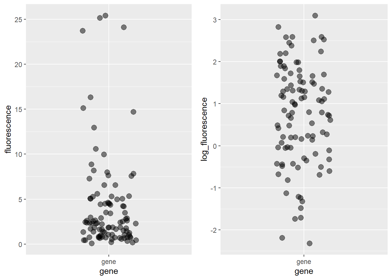
Figure 18.4: Left panel: Simulated lognormal distributed fluorescence data. The units are fluorescence in arbitrary light units. Note their skewness. Right panel: The same data after log transformation. Note the symmetry. The plot on the right has a mean of ~ 0.8 and sd ~1.2, in units of log_fluorescence.
It takes some trial and error when using rlnorm to simulate a variable, as one might within a Monte Carlo function.
Here are some approaches.
Ideally, one has a pilot lognormal dataset. Calculate the mean and sd of the log transformed data. Those are the meanlog and sdlog values for the rlnorm function.
Estimate a median for a lognormal distributed variable on its natural scale. Its log can serve as a meanlog value and select a sdlog value by trial and error.
For power/sample size estimation, think of minimally relevant scientific effects as differences between medians, rather than means.