Chapter 27 Simulating correlated variables
library(pwr)
library(tidyverse)
Experimental designs involving paired (or related/repeated) measures are executed when two or more groups of measurements are expected to be intrinsically-linked.
Take for example, a before and after design. A measure is taken before the imposition of some level of a predictor variable. Then the measure is taken afterwards. The difference between those two measures is the size of the effect.
Those two measures are intrinsically-linked because they arise from a common subject. Subjects are tuned differently. You can imagine a subject who displays a low basal level of the measure will generate a low-end response after some inducer, whereas one with a high basal level will generate a high-end response.
Statistically, these intrinsically-linked measurements within such designs are said to be correlated.
Monte Carlo simulations of experimental power afford the opportunity to account for the level of correlation within a variable. Building in an expectation for correlation can dramatically impact the expected power, and thus the sample size to plan for.
27.1 Estimating correlation between two variables
How to estimate correlation?
Inevitably you’ll run an experiment where the actual values of the dependent variables, at first blush, differ wildly from replicate to replicate.
But on closer inspection, a more consistent pattern emerges. For example, an inducer seems to always elicits close to a 2-fold response relative to a control, and this response is consistently inhibited by about a half by a suppressor. That consistency in the fold-response, irrespective of the absolute values of the variable, is the mark of high correlation!
Here are some data to illustrate this problem. Four independent replicates of the same experiment that measures NFAT-driven luciferase reporter gene output, on each of 4 different passages of a cultured cell line. The data have several other treatment levels, but those corresponding to vehicle and drug represent negative and positive responses, respectively.
Luciferase reacts with luciferin to produce light. The values here are in arbitrary light units on a continuous scale beginning at zero and linear for up to at least 5 orders of magnitude higher. Thus, values of the variable can be assumed to be normally-distributed.
Here’s the experimental data:| id | vehicle | drug |
|---|---|---|
| P11 | 20.2 | 38.3 |
| P12 | 5.7 | 9.1 |
| P13 | 2.1 | 3.6 |
| P14 | 9.9 | 15.5 |
The data show that the luciferase values in response to vehicle wanders substantially across passages over a 10-fold range. Yet the drug response as a ratio to the vehicle is more consistent from passage to passage.
In fact, the two variables, vehicle and drug, are actually very highly correlated:
cor(df$vehicle, df$drug)## [1] 0.9955158ggplot(df, aes(vehicle, drug))+
geom_point(size=4, color="#012169")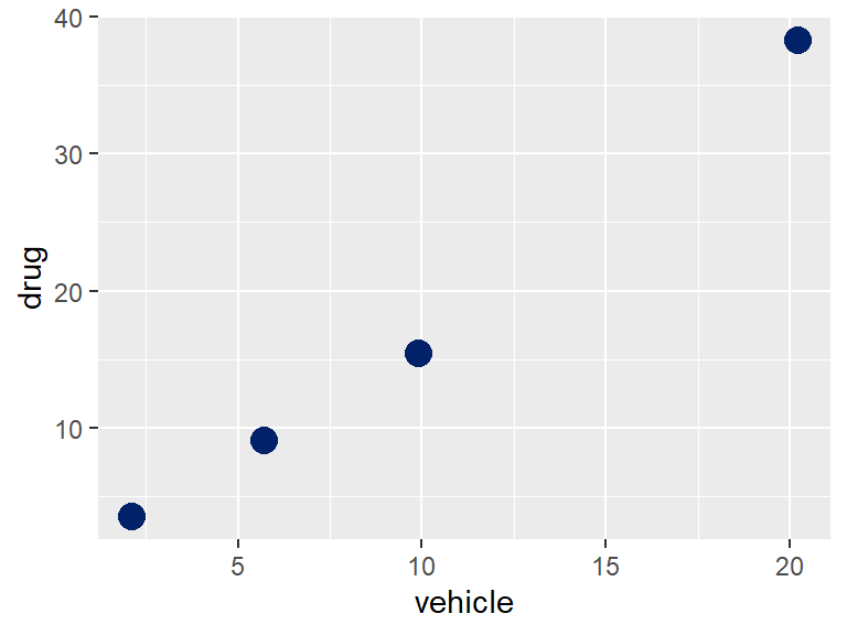
This example points to how you can derive an estimate for the correlation coefficient between two variables. Simply plot out their replicates as \(XY\) pairs and calculate their correlation coefficient using R’s cor function.
Where do you find values for these variables? They can come from pilot or from published data.
27.2 Simulating correlated variables
It can be shown that when the correlation coefficient between a pair of random variables \(X, Y\) is \(r\), then for each \(x_i, y_i\) pair, a correlatd value of \(y_i\) can be calculated as \(z_i\) by \[z_i=x_ir+y_i\sqrt{1-r^2}\]
Thus, we can first simulate a random pair of \(X,Y\) values, then convert the values of \(Y\) into \(Z\), such that the \(X,Z\) values are correlated.
Using the luciferase example above, here’s some code to accomplish that. Each pair is initially uncorrelated, but then becomes correlated after using the relationship above.
There is a slight twist in this. When using an rnorm function with the means and sd estimates from the table above, negative values will be produced. However, the luciferase values are a ratio scale, with an absolute 0 value. The code below uses the absto simulate only positive values. This generates a skewed normal distribution
#first simulate and view uncorrelated random variables
set.seed(1234)
x <- abs(rnorm(10000, 10, 8))
y <- abs(rnorm(10000, 17, 15))
cor(x,y)
## [1] 0.004357573#scatter plot the simulated vectors
ggplot(data.frame(x,y), aes(x,y))+
geom_point()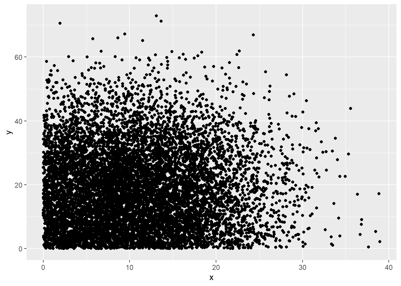
#now convert y to z, so that it correlates to x
r=0.99
k<- sqrt(1-r^2)
z <- r*x+k*y

#confirm the correlation
ggplot(data.frame(x,z), aes(x,z))+
  geom_point()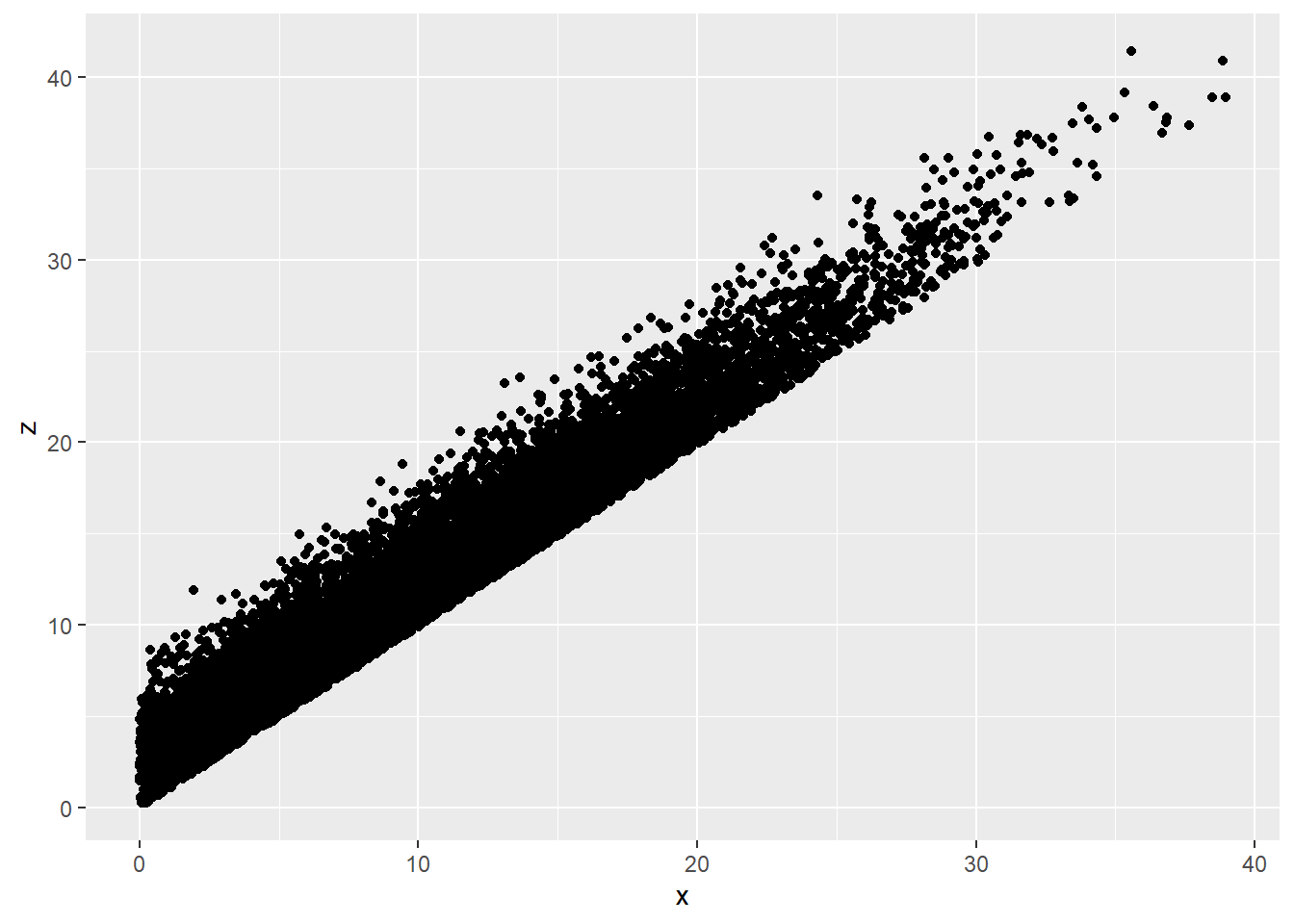
cor(x, z)## [1] 0.9673284#explore the distribution of z
ggplot(data.frame(x,z))+
geom_histogram(aes(z))+
geom_histogram(aes(x))## `stat_bin()` using `bins = 30`. Pick better value with `binwidth`.
## `stat_bin()` using `bins = 30`. Pick better value with `binwidth`.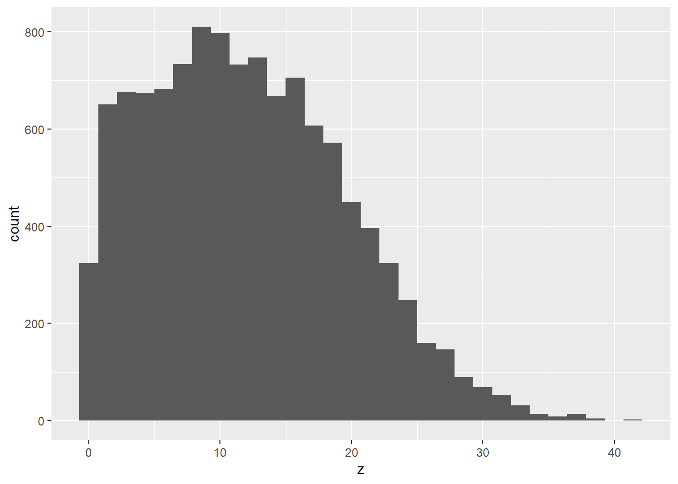
27.3 Monte Carlo simulation
Here’s a Monte Carlo simulation of a paired t-test between an A and a B group. The “true” effect size programmed to be very modest. The code also factors in a fairly strong correlation between the two measures of the variable.
#Initial Parameters
# sample A intial true parameters
nA <- 3
meanA <- 1.5
sdA <- 0.5

# sample B intial true parameters
nB <- 3
meanB <- 2.0
sdB <- 0.5

alpha <- 0.05
nSims <- 10000 #number of simulated experiments
p <-numeric(nSims) #set up empty container for all simulated p-values

# correlation coefficient
r <- 0.8

# the monte carlo function

for(i in 1:nSims){ #for each simulated experiment
  x<-rnorm(n = nA, mean = meanA, sd = sdA) #produce n simulated participants
  #with mean and SD
  y<-rnorm(n = nB, mean = meanB, sd = sdB) #produce n simulated participants
  #with mean and SD
  #correlated
  w <- r*x+sqrt(1-r^2)*y
  z<-t.test(x,w, paired=T) #perform the t-test
  p[i]<-z$p.value #get the p-value and store it
}

# the output

hits <- length(which(p < alpha));hits
## [1] 7027power <- hits/nSims;power## [1] 0.7027#now plot the histogram
#main="Histogram of p-values under the null",
hist(p, col = "blue", ylim = c(0, 10000), xlim = c(0.0, 1.0), main ="Histogram of simulated p-values", xlab=("Observed p-value"))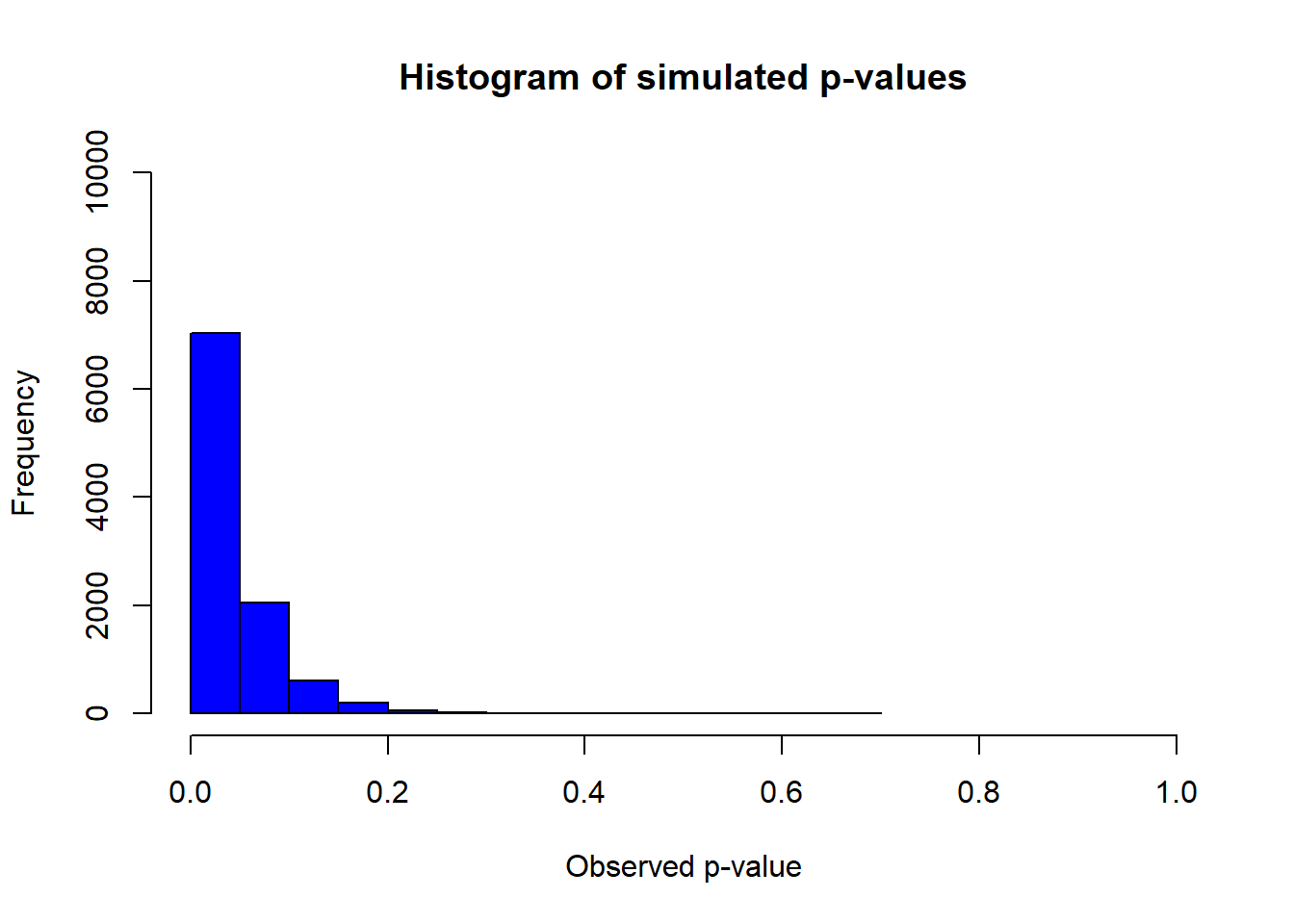
The result as written above is a bit underpowered, but not too shabby.
Now run the code by dialing down the correlation to an r = 0. How much more underpowered is the planned experiment? Factoring in the correlation between variables makes a huge difference.