Chapter 13 P Values
library(tidyverse)The p-value represents the probability that your dataset is too small.
-Karendeep Singh on twitter
The p-value is an instrument by which a decision will be made. As such, it is worth understanding how that instrument works.
Within the frequentist inferential framework we use for this course, hypothesis-driven experiments are designed to test the null hypothesis. That null will be falsified when the effect size we measure in our data is large enough to generate what we classify as an extreme value for a given test statistic. The p-value is the basis of that classification.
Strictly, the p-value is the area under the curve drawn by a distribution function for a given test statistic. The p-value is just an integral for the frequency of a test statistic over a specific range of values. In R, as for most statistical software, a cumulative distribution function of a test statistic is used to calculate p-values.
That’s all just math and computation.
How that area under the curve is re-interpreted as an an error probability comes from inferential theory.
13.1 Definition
This is probably the most widely accepted definition:
A p-value is the probability that a test statistic value could be as large as it is, or even more extreme, under the null hypothesis.
This definition includes some inferential slight of hand.
The test statistic probability distributions are also called sampling distributions, because they represent all of the test statistic values that could be produced from an infinite number of experimental samples.
And the probability it represents represents what is also called an error probability because every time we do an experiment we assume we are sampling from a null distribution.
The p-value is therefore taken as the probability we would “mistakenly declare there to be evidence against the null” in our data.4
Read further below to understand that one.
Mathematically, p-values are just simple frequency probabilities. Areas under the curve of a function. They convey what proportion of the total area under a curve is represented by a range of test-statistic values.
They take on additional inferential meaning only when the intention is to test a hypothesis.
13.2 Null test statistic distributions
The first thing to know about all test statistics is they all represent a conversion of experimental data into something resembling a signal-to-noise value.
Second, there are many test statistics. Each has a corresponding sampling distribution function in R: t (dt), F (df), z (dnorm), \(\chi^2\) (dchisq), sign rank (dsignrank), and more.
Third, R also has cumulative probability functions for each test statistic (eg, for the t-statistic, this function is pt). The cumulative probability functions are useful to calculate the area under the distribution curve to the right (lower.tail = F) or to the left (lower.tail =T) of a given test statistic value. The output of these functions is therefore the proportion of the total area under the curve to the right or left of a given test statistic value.
Fourth, when our intentions move to using p-values to draw inference on experimental data, all of these sampling distributions are meant to represent the distribution of test statistic values under the null hypothesis. And the p-values take on added meaning as error probabilities, rather than proportions of area.
The script below simulates the behavior of null test statistics.
It repeatedly compares the means of random samples drawn from two identical populations. What follows is based upon sampling from two populations that we know are identical (because they are coded as such), unlike in real life.
Using the rnorm function, the code repeatedly conducts a random sampling to compare two groups, A and B, at 5 replicates per group per sample. These two groups are coded to have the same populaton parameter values, \(\mu=100\) and \(\sigma=10\). A test statistic value (and also a p-value) is collected each time a random sample is generated.
Because we know the two groups are identical, we have no inference to make. No matter how extreme, every test between any samples generated from them will be null.
The question is, what is the distribution of test statistic values under this condition?
The gray histogram in the figure below is distribution of 10,000 null test statistic values. Think of this as the insanity of performing 10,000 individual experiments comparing the means of two identical groups, such as placebo v a drug that doesn’t work (like hydroxychloroquine for Covid).
You can see the test statistic frequency distribution fits favorably to the perfect curve drawn from the theoretical t-statistic distribution function (dt(df=8)).
The average value of t is about zero (no signal to noise), which we would expect if comparing two identical populations. But there is a lot of dispersion around that mid point. About 2/3rds of the t-statistic values are within +/- a standard deviation. About 95% of these values are within two standard deviations, and so forth. That’s not surprising for a random process.
To be sure, of the 10,000 comparisons between these two identical groups, at relatively low frequencies, there appear some extreme test statistic values. Some are very extreme. And they are extreme on both sides of the center line.
But we know even these extreme values are null, because the code is set up to compare two identical populations.
We can conclude those extreme test statistic values simply arise by random chance.
A real life experiment comparing two populations is very different. The most important difference is we don’t know for sure whether the two populations differ. The othr important difference is we only get to draw one sample, not 10,000, and we have to conclude from that one sample whether the two populations differ. We could make an error doing that.
set.seed(1234) #this is for reproduciblity
  ssims=10000 #number of repeat cycles to run
  t <- c() #empty vector, to be filled in the repeat
  p <- c() #ditto
  i <- 1   #an index value, for counting
 repeat{
    groupA <- rnorm(5, mean=100, sd=10); #generates 5 independent random replicates from N(100,10)
    groupB <- rnorm(5, mean=100, sd=10); #ditto

    result <- t.test(groupA, groupB,
                paired=F,
                var.equal=F,
                alternative = "greater",
                conf.level=0.95)  #'result' is a list of t-test output
    t[i] <- result$statistic[[1]] #grabs t-test statistic value
    p[i] <- result$p.value        #ditto but for p-value
  if (i==ssims) break           #logic for ending repeat function
    i = i+1
  }
output <- tibble(t, p)  #need this to ggplot
#draws canvas, adds histogram, adds blue line, then customizes x scale
ggplot (output, aes(x=t))+
  geom_histogram(aes(y=..density..), binwidth=0.05)+
  stat_function(fun=dt, args=list(df=8), color="blue", size=1)+
  scale_x_continuous("t Statistic", breaks=-8:8)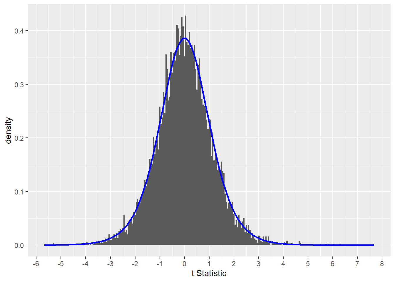
Figure 13.1: The distribution of null t-tests includes extreme values of the test statistic.
13.3 Computing p-values
P-values are derived from test statistic values, according to the cumulative probability distribution function for that statistic.
The easiest way to understand what the output means is by playing with R’s cumulative probability distribution functions. The pt function is that for the t-statistic. pt produces a p-value when fed a t-statistic value and the degrees of freedom for a test. See Chapter 26 for more on the R functions for the t- distribution.
To see how this works, let’s randomly select a t-statistic value from our function above, and then calculate a p-value for it.
set.seed(8675309)
paste("here's a random t-statistic:", sample(output$t, 1))
## [1] "here's a random t-statistic: 1.5364988920531"Now we’ll use pt to calculate the p-value.
paste("here is its p-value: ", pt(q=1.536499, df = 8, lower.tail =F))## [1] "here is its p-value: 0.0814845608085302"Viewed graphically, the p-value for t = 1.536499 is the gold shaded area under the blue curve.
Strictly, the gold area represents 8.1484…% of the total area under the blue curve.
So when stripped of all inferential meaning a p-value is just a fraction of the area under a test statistic distribution curve.
ggplot (output, aes(x=t))+
  geom_histogram(aes(y=..density..), binwidth=0.05)+
  stat_function(fun=dt, args=list(df=8), color="blue", size=1)+
  stat_function(fun=dt, args=list(df=8), geom="area", xlim=c(1.536499, 8), fill="gold")+
  scale_x_continuous("t Statistic", breaks=-8:8)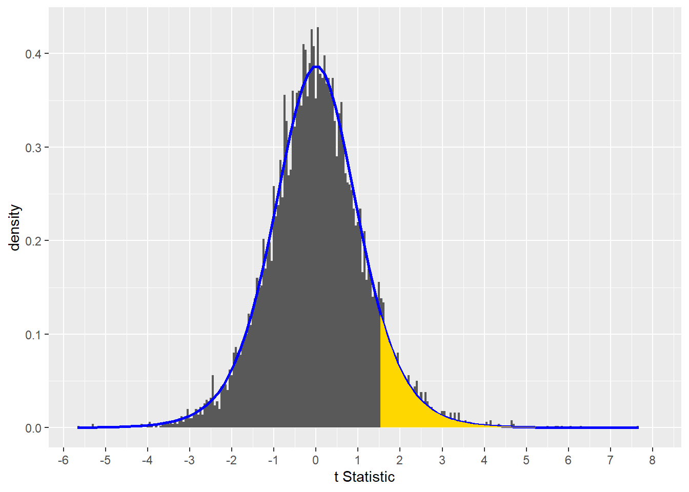
Figure 13.2: The p-value for t = 1.536499 is the gold shaded area under the curve.
13.4 P-values from null tests are uniform
Now one last really important point about p-values from null tests.
Let’s make a histogram of the distribution of p-values from those 10,000 null tests above. Clearly, no p-value occurs more frequently than another. They have a classic uniform distribution.5
ggplot(output, aes(x=p))+
  geom_histogram(color="black", fill="blue", binwidth=0.05, na.rm=T)+
  scale_x_continuous("p-value", limits=c(0,1))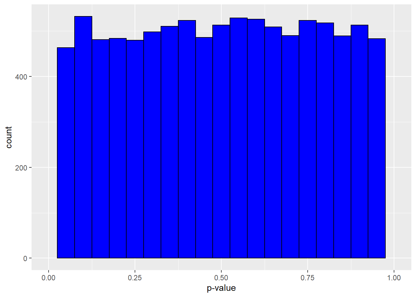
Figure 13.3: The distribution of p-values from tests between identical populations is uniform.
When testing between two identical populations a low p-value (<0.05) is just as likely as a high p-value (>0.95) or as an intermediate p-value (0.50).6
Importantly, note how there are even very low p-values. By random chance, even though the two populations are identical, it is possible to draw a sample whose test generates a p-value below, hmmm…searching for some meaningful threshold, I dunno, say, 0.05.
13.5 How P-values become error probabilities
When the intention of the researcher is to test a hypothesis, our interpretation of the p-value morphs from a proportion of area under the curve to a probability.
Mathematically, it is derived from the same function and is still a proportion. It just takes on additional meaning.
Now let’s pretend, in the simulation above, that we don’t know that the two populations are actually the same. Let’s also imagine that we want to test the hypothesis that the mean of one of the simulated populations is greater than the mean of the other. Let’s also imagine we only draw a single random sample, just like in a real life experiment.
Let’s also imagine that we make a rule that we will declare one of the population means will be statistically greater if the p-value associated with our single test is less than 0.05.
Imagine by random chance, we just happen to draw a sample that causes a very extreme test statistic value. The p-value is very low.
output %>% filter(t==max(t))## # A tibble: 1 x 2
## t p
## <dbl> <dbl>
## 1 7.67 0.0000313The test statistic value for this draw is extremely different from zero and the p-value is below our 0.05 threshold. On the basis of this outcome we would infer that the mean of one of the populations is greater than the other.
Of course, in fact, the two populations are identical.
An error is clearly made to conclude that one mean is statistically greater than the other.
We would go on to say that the probability of erroneously concluding that one group is larger, when in fact they are identical, is 3.131..e-05.
In other words, the error probability is 3.131..e-05.
13.6 P-values as dichotomous switches
We also shouldn’t frame p-values as signs of strength of evidence (that p-values of null tests are uniformally distributed should scare us away from there). In the same regard let’s not use p-values as measures of credibility (eg, “the p-value is very significant”)…p-values aren’t Bayesian probabilities. The uniform distribution of nul p-values and the fact that low p-values can come from null tests should scare us away from such practices.
Instead, p-values are instruments used in a dichotomous decision making process. When the p-value of a test falls below a preset threshold for type1 error, alpha, then we reject the notion that the sample belongs in the distribution of null tests.
In other words, our decision is based upon the assumption that our single test is a random draw from an infinite number of tests we might have otherwise conducted. When the result is extreme, it is less likely our sample belongs in the null distribution.
The p-value gives us a sense of how likely of a mistake it is to reject the null hypothesis.
P-values allow for this decision making process to be standardized across a variety of experimental designs and test statistics. Thus, learningn how to use them for one type of test puts us in good shape for others.
13.7 P-values in true effects
To emphasize the latter point, let’s no look at how p-values behave when there truly is a true effect?
Take the simulation script from above and change only one element. Now the mean of Group A is higher than the other, by 25 units.
The first thing to note is the distribution of test-statistic values is right-shifted, dramatically, away from the null distribution for the test statistic.
Higher test statistic values are more likely when group differences are true. But note how they are not all extreme. With random sampling it is possible to generate test statistic values consistent with the null distribution, even when differences are true. Those are type2 errors, of course.
set.seed(1234)
  ssims=10000
  t <- c()
  p <- c()
  i <- 1
  repeat{
    groupA <- rnorm(5, mean=125, sd=10); #the mean value is the only difference
    groupB <- rnorm(5, mean=100, sd=10);
    result <- t.test(groupA, groupB,
                paired=F,
                alternative="greater",
                var.equal=F,
                conf.level=0.95)
    t[i] <- result$statistic[[1]]
    p[i] <- result$p.value
    if (i==ssims) break
    i = i+1
  }
output2 <- tibble(t, p)
#I'll draw our new distribution next to the theoretical null
ggplot (output2)+
  geom_histogram(aes(x=t, y=..density..), binwidth=0.05, na.rm=T)+
  stat_function(fun=dt, args=list(df=8), color="blue", size=1)+
  scale_x_continuous("t-statistic value", limits = c(-8,30), breaks=-8:30)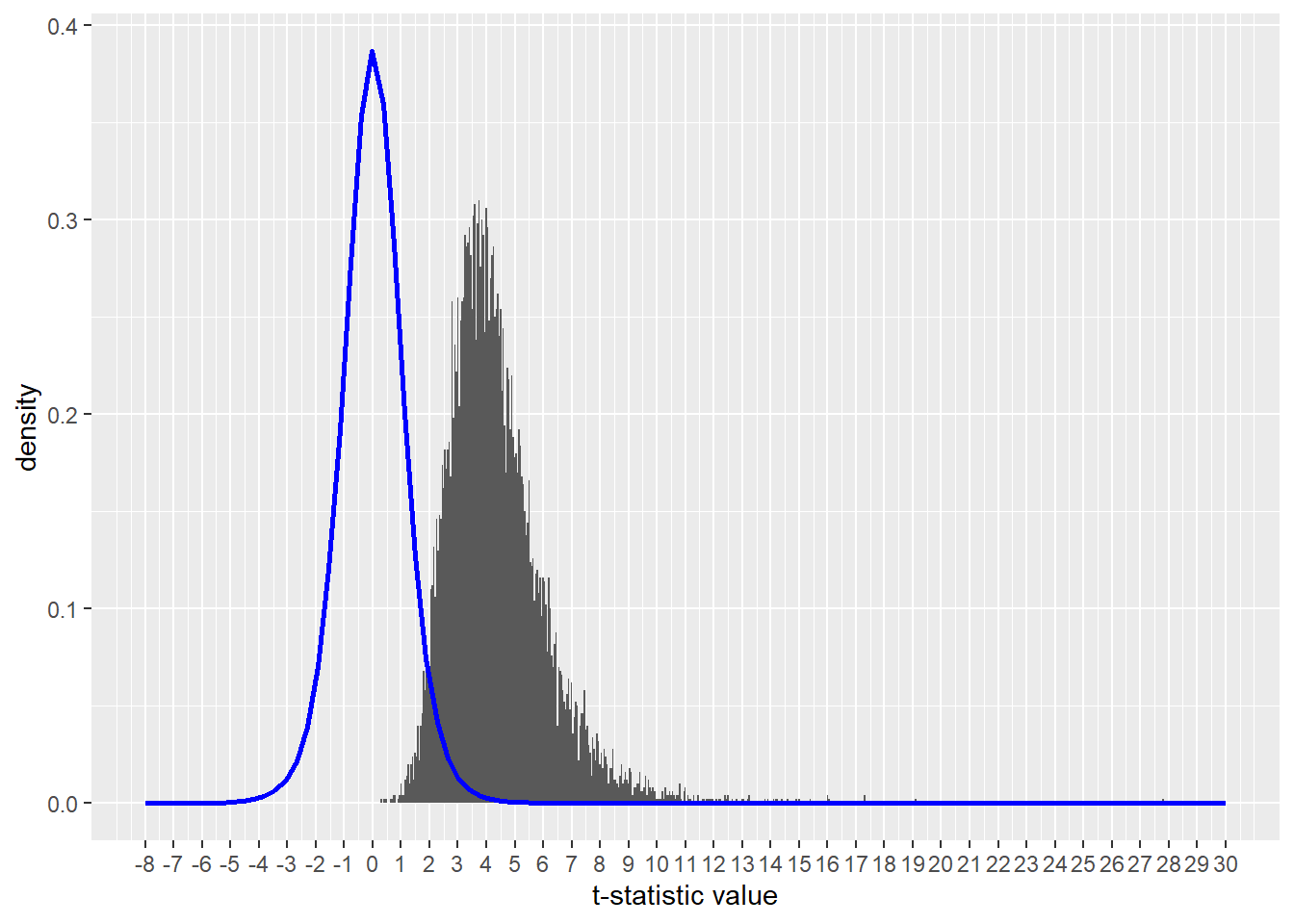
Figure 13.4: A true difference between groups generates many more extreme values of the test statistic than in tests of null groups.
The second thing to note is that the distribution of p-values in tests of non-null groups is not uniform, as was the case under the null distribution. They are much, much more skewed to lower values.
When there is a true effect we’re much more likely to generate low than high values.
ggplot(output2, aes(x=p))+
  geom_histogram(color="blue", binwidth=0.005, na.rm=T)+
  scale_x_continuous("p-value", limits=c(0, 1))+
  scale_y_continuous(limits = c(0, 3000))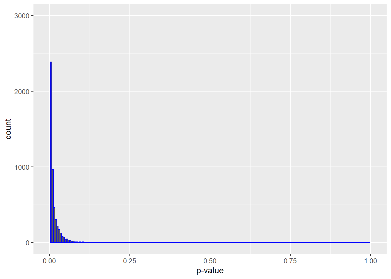
Figure 13.5: Tests of non-null groups yields skewed p-value distributions
The main take away is that when there is no difference between tested populations, we’re equally likely to generate high and low p-values. When there are true differences, we can expect to see low p-values at much higher frequencies.
13.8 Criticisms of p-values
There are several common criticisms of p-values, many of which are legitimate. I’ll address a few key ones here.
- They are too confusing, nobody understands them.
I confess that p-values are a struggle to teach in a way that’s simple and memorable. Especially for researchers who only consider statistics with any intensity episodically, perhaps a few times a year.
But like any tool they use in the lab, it is incumbent upon the researcher to learn how it works.
A good way to get a better intuitive understanding for p-values is to play around with the various test statistic probability and quantile distributions in R (pnorm, qnorm, pt, qt, pf, pf, pchisq, qchisq, psignrank, qsignrank etc). Use them to run various scenarios, plot them out…get a sense for how the tools work by using them.
- p-Values poorly protect from false discovery
This is undoubtedly true. Since David Colquhoun goes over this in blistering detail I won’t repeat his thorough analysis here.
The researcher MUST operate with skepticism about p-values.
Since Colquhoun’s argument is largely based on simulation of “typical” underpowered experiments. For well-powered experiments, p-values are far less unreliable. Using Monte Carlo simulation a priori, a researcher can design and run experiments in silico that strikes the right balance between the threshold levels she can control (eg, \(\alpha\) and \(\beta\)) and feasibility in a way that best minimizes the risk of false discovery. All that before ever lifting a finger in the lab.
- p-Values aren’t the probability I’m interested in
Researchers who raise this criticism generally are interested in something the p-value was never designed to deliver: the probability that their experiment worked, or the credibility for their observed results, or even the probability of a false discovery.
A p-value doesn’t provide any of that information because it is an error probability. It is meant to give the researcher a sense of the risk of making a type 1 error by rejecting the null hypothesis. The p-value is just a threshold device.
For these researchers, embracing Bayesian statistics is probably a better option.
- People use p-values as evidence for the magnitude of an effect.
It is common for people to conflate statistical significance with scientific significance. This criticism is really about mistaking a “statistically difference” p-value and as a “statistically significant” scientific finding.
A low p-value doesn’t provide evidence that the treatment effect is scientifically meaningful. If small, scientifically insignificant effect size is measured with high enough precision, that can come with a very low p-value.
Some low p-values are uninterpretable. A simple example of this comes from 2 way ANOVA F test analysis. When the test suggests a positive result for an interaction effect, low p-values for the factors individually are uninterpretable because they are confounded by the interaction effect.
Researchers should therefore always analyze p-values in conjunction with other parameters, such as effect and sample sizes and the confidence intervals, and always with scientific judgment.
13.9 Summary: How to use p-values
Before starting an experiment, we write in our notebook that we can tolerate some level of type1 error. Usually we choose 5% because everybody seems to choose that one, but we are free to use any value that we’re comfortable with. That’s our judgment to make and defend. We may be at a time or place in our career where we are willing to accept more or less error.
As aloof, unbiased, highly skeptical scientists, we go about running the experiment “under the null” or to “test the null.” This means that we operate, coolly and calmly, under the assumption that nothing will happen.
Better to plan not to be disappointed. No big deal. Whatever.
We make a decision rule. Our rule is that if p-value calculated from our test statistic falls below our threshold for type1 error (say, p < 0.05 or whatever is specified), we will reject the null hypothesis.
In effect, by rejecting the null, we declare that our random sample is too extreme to belong within a null distribution of test statistic values.
We now fully understand that the test statistic from null distributions can have extreme values all by chance alone. Such values, however, occur at acceptably low frequencies. We accept we might be in error in concluding a low p-values is associated with a true effect.
And that’s why the p-value is the probability we are making this error.
Over the long run of many experiments we could anticipate making that error 5% of the time. The next figure illustrates all of the samples that we would have reject as null, in error.
ggplot (output, aes(x=t))+
  geom_histogram(binwidth=0.05)+
  scale_x_continuous("t Statistic", breaks=-8:8)+
  geom_histogram(data=output %>% filter(t>0 & p<0.05), aes(x=t), binwidth=0.05, fill ="gold")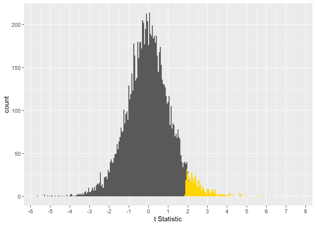
Figure 13.6: When the two populations are in fact identical, the samples we would erroneously declare as statistically different are gold colored. In a one-sided test
Cox, D. R. & Hinkley, D. V. (1974). Theoretical Statistics, London, Chapman & Hall., p66↩︎
To understand how a uniform distribution works, play with R’s uniform distribution functions:
dunif,punif,qunifandrunif↩︎Think about this the next time you hear someone declare, “disappointing result, but at least the p-value was trending toward significance.” It can be said equally that the p-values was trending toward non-significance.↩︎